Welcome to the Treehouse Community
Want to collaborate on code errors? Have bugs you need feedback on? Looking for an extra set of eyes on your latest project? Get support with fellow developers, designers, and programmers of all backgrounds and skill levels here with the Treehouse Community! While you're at it, check out some resources Treehouse students have shared here.
Looking to learn something new?
Treehouse offers a seven day free trial for new students. Get access to thousands of hours of content and join thousands of Treehouse students and alumni in the community today.
Start your free trial
Guil Hernandez
Treehouse TeacherForum Tip: Create a Sticky Navigation with CSS and jQuery
Hi everyone,
Several students have recently posted questions on how to create a sticky navigation header. So I created this tip that covers how to build a sticky navigation with just a few lines of CSS and JavaScript!
HUSSAIN MOHAMMED
2,675 PointsGreat tutorial...Thanks.
Eswaran Yogalingam
2,336 PointsThank you Guill.
Christian Erlebach
Full Stack JavaScript Techdegree Graduate 49,431 Pointsvery helpful for me, thank you Guill.
Omh MG
19,233 PointsGuill, you're awesome. Thanks a bunch.
Kelvin Latif
9,955 PointsThanks for the video tutorial :)
meurigbird
4,483 PointsI was one of those people, It's really great that you include these little tid-bits. I've been studying Java/HTML/CSS/Javascript for some time, but I always have "Writers Block" on how to build things from scratch. I think more videos on "how to approach important areas of websites" is important. Thank You for this.
Joel Birch
1,601 PointsI was just trying to figure out how to do this and sure enough, Team Treehouse came to the rescue.
It would be helpful to see how the HTML lays out outside of codepen. For example, calling the css and script sources so we can put the text into Sublime or another text editor and have it work. Thanks as always.
Eric Meerstra
3,078 PointsVideo was very well done. Very easy to follow, very informative.
Nick Ocampo
15,661 PointsThank you so much!!
Ryan Frizzell
14,527 Pointsawesome tip. thank you
Thai Huynh
15,293 PointsBeen reading up about this and ended up back here. Thanks Guil for this tutorial!
Fatemah Manji
4,195 PointsGreat Tips.. Thanx
Sean Wilson
3,791 PointsIs this a permanent tutorial? If not, it should be. Explained extremely well and very useful! Thanks!
Brian Morrison
16,524 PointsNice tip. Thank you.
Linus Karlsson
7,402 PointsI'm sorry but I cannot get this to work. I've followed the instructions as precisely as I can, and I have also tried it with my own tweaks for what I think the problem is, and also for what I need in my code.
Can somebody help me, please? I code in Sublime Text for Mac.
This is my own version of Guil's presentation:
HTML
<!DOCTYPE html>
<html>
<head>
<meta charset="utf-8">
<title>inResonance | always in tune</title>
<link rel="stylesheet" href="css/normalize.css">
<link href="https://fonts.googleapis.com/css?family=Dosis|Roboto+Slab" rel="stylesheet">
<link rel="stylesheet" href="css/main.css">
<meta name="viewport" content="width=device-width">
</head>
<body>
<header>
<a href="index.html"><img src="img/FINAL inRes logo with wifi symbol (with orange i).png" class="inresLogo"></a>
</header>
<nav class="nav">
<ul>
<li><a href="index.html">Latest</a></li>
<li><a href="suppliers.html">Suppliers</a></li>
<li><a href="us.html">Us</a></li>
</ul>
</nav>
<div class="container">
<h2>The latest updates</h2>
<p>Can you first read this?</p>
<br>
<br>
<br>
<br>
<br>
<br>
<br>
<br>
<br>
<p>Can you read this?</p>
<br>
<br>
<br>
<br>
<br>
<br>
<br>
<br>
<br>
<p>Can you read this?</p>
<br>
<br>
<br>
<br>
<br>
<br>
<br>
<br>
<br>
<p>Can you read this?</p>
<br>
<br>
<br>
<br>
<br>
<br>
<br>
<br>
<br>
<p>Can you read this?</p>
<br>
<br>
<br>
<br>
<br>
<br>
<br>
<br>
<br>
<p>Can lastly you read this?</p>
</div>
<footer class="footer">
<a href="https://www.facebook.com/InResonanceAB/"><img src="img/facebook-logo.png" alt="Facebook Logo" class="socialIcon"></a>
<a href="https://www.linkedin.com/in/ronny-carlsson-7311906/"><img src="img/linkedin-logo.png" alt="LinkedIn Logo" class="socialIcon"></a>
<div class="footerText">© inResonance AB 2017</div>
</footer>
<script type="text/javascript" src="script.js"></script>
</body>
</html>
CSS
/***********************************************************
GENERAL
************************************************************/

* {
    box-sizing: border-box;
}

body {
    font-family: 'Roboto Slab', serif;
}

a {
    text-decoration: none;
}

h2 {
    margin: 0;
    padding-top: 10px;
}


/***********************************************************
HEADING
************************************************************/

header {
    height: 60.2px;
}

.inresLogo {
    display: block;
    margin: 0 auto;
    padding: 6px 1.5em;
    width: 350px;
}

/***********************************************************
NAVIGATION
************************************************************/

.nav, .container {
    position: relative;
}

.navScrolled, .header {
    position: fixed;
    top: 0;
    width: 100%;
}

.nav {
    text-align: center;
    margin: 0;
    padding: 0;
    z-index: 150;
    box-shadow: 1px 1px 1px rgba(0,0,0, .4)
}

.nav a {
    font-weight: 800;
    padding: 10px 20px;
}

.nav ul {
    list-style: none;
    margin: 0;
    padding: 10px 0;
}

.nav li {
    display: inline-block;
    padding: 1px 1px;
}


/***********************************************************
SPECIFIC PAGE INFO
************************************************************/

.container {
    width: 99%;
    margin: auto;
    padding-bottom: 61px;
    background: url('../img/FINAL Smithdiagram.png') fixed no-repeat center;
    background-size: 99%;
}

.supplierLogos img {
    max-width: 200px;
    padding: 2% 0;
}

#grouppic img {
    width: 70%;
    margin: 5px 15% 1px 15%;
    border-radius: 25% 5%;
    border-style: solid;
    border-width: 3px 1px;
}


/***********************************************************
FOOTER
************************************************************/

.footer {
    position: fixed;
    bottom: 0;
    text-align: center;
    height: 61px;
    width: 100%;
    border-top-style: solid;
    border-width: 1px;
}

.socialIcon {
    width: 30px;
    margin: 6px 2px 0 2px;
}

.footerText {
    font-size: 0.75em;
    margin: 2px 0 6px 0;
}


/***********************************************************
COLORS
************************************************************/

/* site body */
body {

    color: #696969;
}

/* orange nav */
.header {
    background: #fff;
}

/* nav section */
.nav {
    background-color: #FF8100;
}

/* nav link */
.nav a, .nav a:visited {
    color: #fff;
}

/* hover nav link */
.nav a:hover {
    color: #FF5400;
}

/* specific pages */
.pageInfo {
    background-color: #fff;
}

.subHeading a, .subHeading a:visited {
    color: #696969;
}

.subHeading a:hover {
    color: #DDDDDD;
}

/* group pic */
#grouppic img {
    border-color: #FF8100;
}

/* darkgrey footer */
.footer {
    background-color: #fff;
    color: #696969;
    border-color: #FF9200;
}


/**************************************************************************************
MEDIA QUERIES                                                                                                                   MEDIA QUERIES
***************************************************************************************/

@media (min-width: 729px) {

    h2 {
        padding-top: 15px;
    }

    header {
        width: 80%;
        height: 84.27px;
        max-width: 1000px;
        margin: 0 10%;
    }

    .inresLogo {
        width: 450px;
        margin: 0;
        padding: 15px 55px;
    }

    .nav {
        width: 80%;
        margin-left: 10%;
        margin-right: 10%;
    }

    .nav li {
        margin: 0 5%;
    }

    .nav a {
        padding: 0;
    }

    .container {
        width: 67%;
        max-width: 1000px;
        margin: auto;
        padding-bottom: 76px;
        background-size: 58%;

    }

    #grouppic img {
        width: 50%;
        margin-right: 25%;
        margin-left: 25%;
    }

    .footer {
        height: 76px;
        width: 80%;
        margin-left: 10%;
        margin-right: 10%;
        max-width: 1000px;
    }

    .socialIcon {
        margin: 10px 1px -7px 1px;
    }

    .footerText {
        margin: 0;
        padding: 13px;
    }
}
JavaScript
var n = $(".nav");

$(window).scroll(function() {
    if( $(this).scrollTop() > 250 )  {
        n.addClass("navScrolled");
    }
    else {
        n.removeClass("navScrolled");
    }
});
37 Answers
Guil Hernandez
Treehouse TeacherYou're welcome, everyone. I'm really glad to hear that you enjoyed the tip, and learned a few things from it. :) I want to create many more of these, but I'd also like to make it part of the track/curriculum experience. What does everyone think about a stage dedicated to these CSS/JS tips, or a biweekly workshop where I cover a few tips?
Thanks, and have a great weekend!
Guil
Stephen Mariano Cabrera
5,932 PointsI think this sort of thing fits into a treehouse project very well.
In general I think the projects are really good because you see how something would be used in practice. I´m going through the CSS deep dive right now and while it´s a lot of great information, I´m a bit overwhelmed in terms of "when would I actually use this". Maybe it could be a project that reviews and applies some of the more advanced CSS and JS features like those covered in the deep dives. You´ve learned some of this more advanced CSS/JS now let´s see how we could use a bunch of these techniques to improve an existing website and add some advanced functionality, things that we see on modern websites and would like to know how to replicate. A few that come to mind for me:
Sidebars for expandable chat windows that open up to talk to customer support A pop up window that comes up when a user reading a blog gets halfway down the page, prompting them to subscribe if they like the blog
Thanks again, great video!
Preston Davis
5,932 PointsAbsolutely! Do it!
Aaron Stewart
6,691 PointsVery informative, thank you! I would love a stage dedicated to design tips and tricks such as this. Immediately after watching this video i couldn't resist implementing it into a project i'm working on and testing it out.
Martin Aasen
9,067 PointsA stage dedicated to these CSS/JS tips would be awesome!
Stephano Breitt
4,758 PointsVery cool Guil! Thanks! You guys should do more short videos like this covering specific website features
Tunde Adegoroye
20,597 PointsTreehouse should have a section for these tips
Guil Hernandez
Treehouse TeacherLet's also give props to Ariel Zengotita, for his awesome editing work on these! :)
Joel Birch
1,601 PointsI was just trying to figure out how to do this and sure enough, Team Treehouse came to the rescue. It would be helpful to see how the HTML lays out outside of codepen. For example, calling the css and script sources so we can put the text into Sublime or another text editor. Thanks as always.
Howard Slatter
8,049 PointsIt's very easy to pull the code out from codepen and put it into a single .html file using <style> and <script> tags...
<html>
    <head>
        <style type="text/css">
            **The CSS goes in here...**
        </style>
    </head>
    <body>
        <div>
            **The HTML goes in here....**
        </div>
        <script src="http://code.jquery.com/jquery-1.11.0.min.js"></script>
        <script>
         **The JavaScript goes in here....**
    </script>
    </body>
</html>
Michael Trilford
7,232 PointsDownload HTML 5 Boilerplate... that has the structure ready to go.
marshall carter
11,568 PointsGuil Hernandez, you're a Rockstar! thank you!
Phillip Gibson
13,805 PointsThis is very awesome. Thanks for the tip!
Saad Aleem
6,089 PointsThanks for this tutorial. It works perfect on codepen, but I couldn't get it to work on my pc. I don't know what seems to be the problem.
Santiago Gomez
2,496 PointsGreat Tip Guil! thanks for the help.
Damian Dabrowski
16,804 PointsGreat tutorial! Thanks Guil!
Anton Chernetskiy
3,924 PointsThanks, I was looking for something like this :)
Rajanand Ilangovan
3,226 PointsThanks for the tip, Guil.
Amila KASTHURIARACHCHI
1,088 PointsAwesome Guil !!!
kevinardo
Treehouse Project ReviewerThx Alot Guil the CSS master.
Jerry McClellan
2,278 PointsThat was awesome, thanks!
bdigital
6,155 PointsVery nice Guil :) Thank you.
Michael Trilford
7,232 PointsNice work! The Javascript was very interesting and simple.
Howard Slatter
8,049 PointsI was looking for something like this today, great video, Thanks very much,
Neil Salazar
5,014 PointsThank Guil! I was just looking up how to do this a couple weeks ago. This explanation and video explained how to do it simply, with such small amount of code. Awesome.
jscogg
16,949 PointsThanks, Guil! Awesome tip!
Gary Lubben
981 PointsShort, simple and to the point, great tutorial. I wish all tutorials were so succinct. Codepen is great resource.
Prathom Satapronpinyo
12,759 PointsThis is a great tip!, Thanks, Guil
Preston Davis
5,932 PointsNice! It's so easy I wonder why the referenced site uses a plugin.
Luis Felipe Lino
Full Stack JavaScript Techdegree Student 15,708 PointsThanks. Amazing tip.
Will Balladares
33 PointsAwesome!
Jerome Sedyn
5,221 Pointsvery cool effect ! and so simple !
Samuel Orf
8,747 PointsThanks for the bottom margin tip. I was having issues with the content jumping and this is a really clever solution. Thanks again.
Stephen DelBuono
11,264 PointsGreat video!
Howard Slatter
8,049 PointsThere's a full page button at the top of codepen.
Luis Rabines
20,308 Pointshello I have an issue with this project. I can't figure out why is the main-nav-scroll class not being deleted when i scroll down again.
After you scroll down once you can't see the header again because the main-nav stays in the top of the page.
Can someone please help me ?
Nick Ocampo
15,661 PointsHey Luis. Can you post your code? I would post it in a new forum question so there is a separate thread specific for you issue.
Luis Rabines
20,308 PointsNick Ocampo thank yNick but I figure it out
Nick Ocampo
15,661 PointsGood to hear!
Yuda Leh
7,618 PointsThe nav bar isnt sticking to the top of the screen! Can some please explain why?
Michael Trilford
7,232 PointsI can't remember the exact tutorial, but Inspect the code, and when you scroll do you see a class being added to the area you want fixed?
Guil Hernandez
Treehouse TeacherHi there,
Could you please post your code? :)
-- Guil
Yuda Leh
7,618 Points<!DOCTYPE html>
<html class=''>
<head>
<title>SOMETHING</title>
<link rel="shortcut icon" href="img/favicon.ico" type="image/x-icon">
<meta charset='UTF-8'>
<script src='http://s.codepen.io/assets/libs/prefixfree.min.js'></script>
<link rel='stylesheet prefetch' href=''>
<style class="cp-pen-styles">
* {
box-sizing: border-box;
}
body {
margin: 0;
padding-top: 250px;
font: 1em/1.5 sans-serif;
color: #444135;
}
p {
margin-bottom: 32px;
}
header {
height: 400px;
padding-top: 50px;
background:;
color: #f7f8ee;
}
header,
.main-nav {
text-align: center;
}
.main-nav a {
font-size: .9em;
text-decoration: none;
font-weight: bold;
text-transform: uppercase;
color: #444135;
display: inline-block;
margin: 24px 12px;
}
.main-nav a:hover {
color: #fff;
border-top: 4px solid black;
padding-top: 10px;
}
/*.main-nav a:first-child {
border-top: 2px solid #f07057;
padding-top: 10px;
}*/
.selected {
border-top: 2px solid black;
padding-top: 10px;
color: #fff;
}
.main h2 {
column-span: all;
}
.main-nav,
.main {
position: relative;
}
.main-nav {
background: #3498db;
height: 80px;
z-index: 150;
margin-bottom: -80px;
box-shadow: 0 2px 3px rgba(0,0,0,.4);
}
header,
.main-nav-scrolled {
position: fixed;
top: 0;
width: 100%;
}
.main {
background: #f2f2e8;
padding: 110px 50px 50px;
/*column-count: 2;
column-gap: 40px;*/
}
img {
height: 400px;
}
</style>
</head>
<body>
<header>
<!-- <h1>This is a Sticky Nav Demo!</h1>
<p>Creating one of these isn't so bad. Let's learn how with this sweet little demo!</p> -->
<img src="img/downres.png">
</header>
<br>
<br>
<br>
<br>
<br>
<nav class="main-nav">
<a href="index.html" class="selected">HOME</a>
<a href="#" class="">ABOUT US</a>
<a href="#">PROJECT</a>
<a href="#">CONTACT US</a>
</nav>
<div class="main">
</div>
<script src='//ajax.googleapis.com/ajax/libs/jquery/1.11.0/jquery.min.js'></script>
<script>
var mn = $(".main-nav");
$(window).scroll(function () {
if( $(this).scrollTop() > 250 ) {
mn.addClass("main-nav-scrolled");
} else {
mn.removeClass("main-nav-scrolled");
}
});
//@ sourceURL=pen.js
</script>
<script src='http://codepen.io/assets/editor/live/css_live_reload_init.js'></script>
</body>
</html>
Albert Terc
2,413 PointsRight when I added the margin-bottom property to my nav, the text in each of the nav items disappeared. How can I fix this?
Harry Beckwith
13,452 PointsNice tutorial Guil ! I have been asked to create a theme for work, this will help make the theme look awesome.
james white
78,399 PointsHi everyone,
I know this is an old forum post/tip, but alas Guil hasn't really provided an update.
So what I did was use the code from Guil's original CodePen:
http://codepen.io/Guilh/pen/JLKbn
..and I adjusted things a little to "tighten things up" a little.
So here's how to see the results...(either in Guil's codepen if you just want a "snapshot"
of what the code does live, or I would recommend using the "Fork" button
at the top of the code pen to create a copy (which allows saving the code
for later export, using the CodePen's export button in the lower right hand corner)
Making the codepen changes:
1.) Select all html in the code pen's HTML pane and delete it.
2.) Then paste this html code in the HTML window/pane:
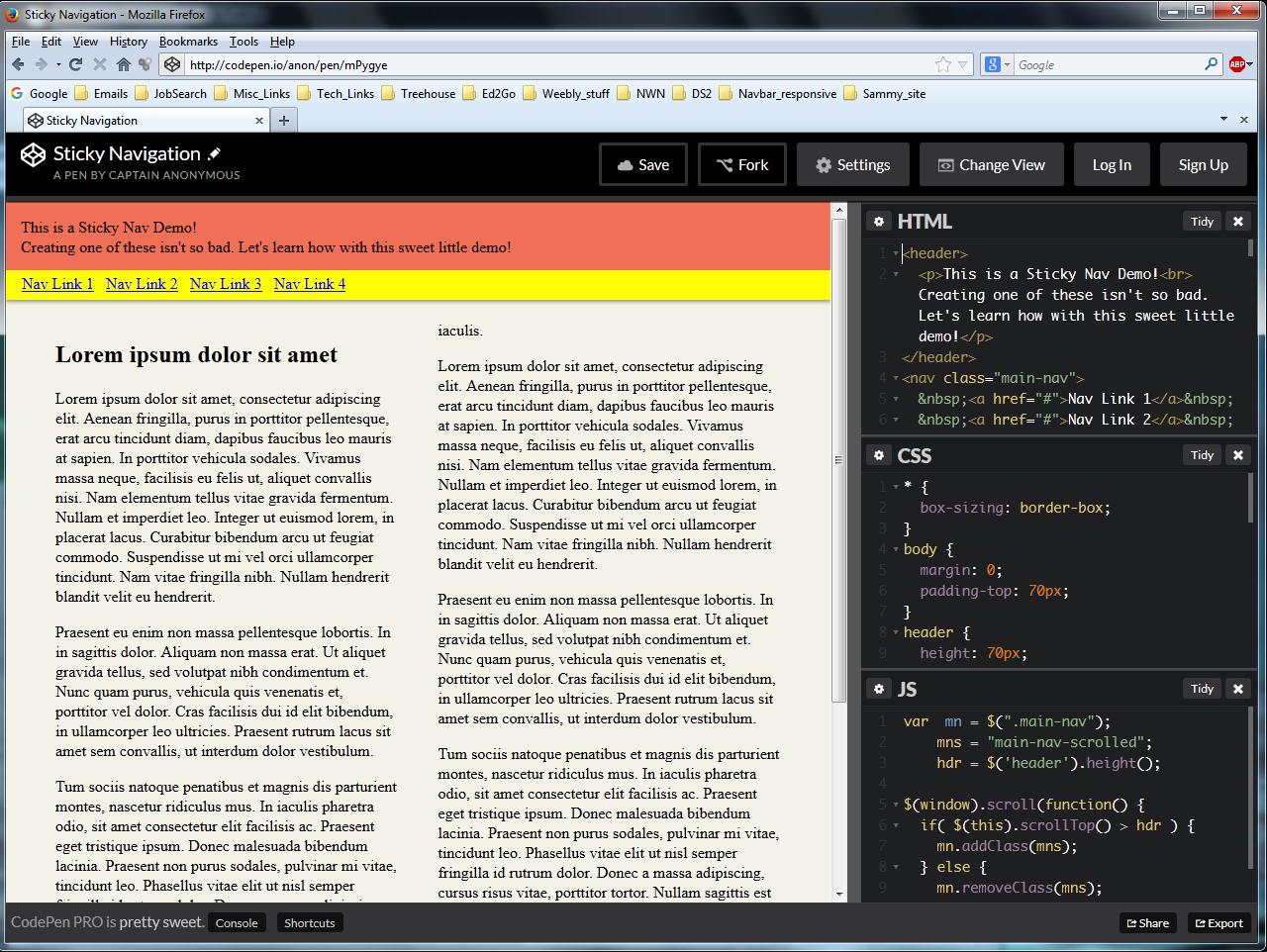
<header>
<p>This is a Sticky Nav Demo!<br> Creating one of these isn't so bad. Let's learn how with this sweet little demo!</p>
</header>
<nav class="main-nav">
<a href="#">Nav Link 1</a>
<a href="#">Nav Link 2</a>
<a href="#">Nav Link 3</a>
<a href="#">Nav Link 4</a>
</nav>
<div class="main">
<h2>Lorem ipsum dolor sit amet</h2>
<p>Lorem ipsum dolor sit amet, consectetur adipiscing elit. Aenean fringilla, purus in porttitor pellentesque, erat arcu tincidunt diam, dapibus faucibus leo mauris at sapien. In porttitor vehicula sodales. Vivamus massa neque, facilisis eu felis ut, aliquet
convallis nisi. Nam elementum tellus vitae gravida fermentum. Nullam et imperdiet leo. Integer ut euismod lorem, in placerat lacus. Curabitur bibendum arcu ut feugiat commodo. Suspendisse ut mi vel orci ullamcorper tincidunt. Nam vitae fringilla nibh.
Nullam hendrerit blandit velit eu hendrerit.</p>
<p>Praesent eu enim non massa pellentesque lobortis. In in sagittis dolor. Aliquam non massa erat. Ut aliquet gravida tellus, sed volutpat nibh condimentum et. Nunc quam purus, vehicula quis venenatis et, porttitor vel dolor. Cras facilisis dui id elit
bibendum, in ullamcorper leo ultricies. Praesent rutrum lacus sit amet sem convallis, ut interdum dolor vestibulum.</p>
<p>Tum sociis natoque penatibus et magnis dis parturient montes, nascetur ridiculus mus. In iaculis pharetra odio, sit amet consectetur elit facilisis ac. Praesent eget tristique ipsum. Donec malesuada bibendum lacinia. Praesent non purus sodales, pulvinar
mi vitae, tincidunt leo. Phasellus vitae elit ut nisl semper fringilla id rutrum dolor. Donec a massa adipiscing, cursus risus vitae, porttitor tortor. Nullam sagittis est sapien, sit amet pharetra turpis imperdiet vel. Etiam sit amet ligula pretium,
vulputate eros ac, bibendum velit. Aenean convallis ante purus, ac bibendum orci laoreet ac. Donec a convallis mauris. Nulla non lacus non ipsum pretium tempor. In hac habitasse platea dictumst. Aenean at ipsum vulputate, sagittis dui ut, pharetra
neque. Nam eget sodales orci. Aliquam pharetra nunc at nisl pellentesque, nec fringilla enim iaculis.</p>
</div>
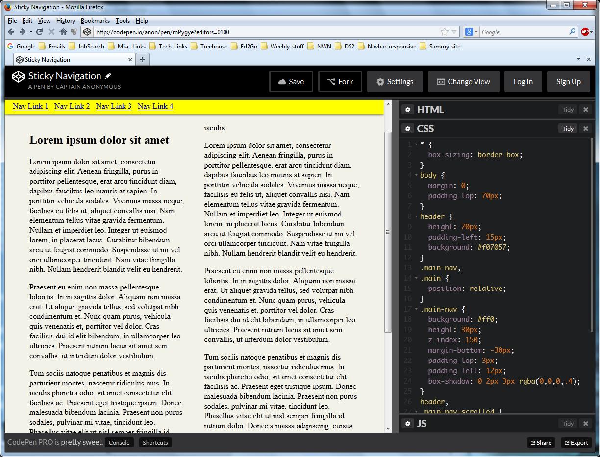
3.) Then select all the css code in the code pen's CSS pane and delete it
4.) Paste this css code in the CSS codepen pane (as a replacement):
* {
  box-sizing: border-box;
}
body {
  margin: 0;
  padding-top: 70px;
}
header {
  height: 70px;
  padding-left: 15px;
  background: #f07057;
}
.main-nav,
.main {
  position: relative;
}
.main-nav {
  background: #ff0;
  height: 30px;
  z-index: 150;
  margin-bottom: -30px;
  padding-top: 3px;
  padding-left: 12px;
  box-shadow: 0 2px 3px rgba(0,0,0,.4);
}
header,
.main-nav-scrolled {
  position: fixed;
  width: 100%;
  top: 0;
}
.main {
  background: #f2f2e8;
  padding: 50px 50px 50px;
  column-count: 2;
  column-gap: 40px;
}
What does these changes/revisions do?
.
This shrinks the pink header (including "downsizing" the obnoxious H1 text),
shrinks the navbar down to so it barely fits the the navbar text entries,
(with a little extra spacing) and then colors the navbar yellow
(using "background: #ff0;") to set it apart nicely.
Special note:
In the bottom right corner of every code pen
there is an "Export" button
that will allow you to download a zipped copy of the code
so you can see it "live" (via a folder on your hard drive).
Please remember, though, to use the "Save" button in your Forked codepen copy
before using the export button (so zip has the changes)
A few Imgur screenshots...first in an "unscrolled" (just loaded) state:
Then scrolled into it's "stuck" state at the top of the browser window:
http://jmwhite999.altervista.org/stickynav/index.html
Enjoy!
Now if we could only get a sticky navbar that also changes to a hamburger icon
at small screen sizes (via html5 media queries)
..and when clicking on the hamburger icon (on the left side of the navbar)
would scroll out from the left a side panel (that pushes aside the main body of the page)
and shows the menu items vertical stacked,
all with a little css3 animation.
---That's all I'm really looking for...nothing much (Ha! Ha!)..but if it could work
also work in IE6 thru 8 that would be the icing on the cake.
=======>Neither the codepen code on this page,
nor the jquery course code note below, works in IE6...
By the way of an update...there is a section on
"Add a Sticky Navigation Bar " in this "Using JQuery Plugins" course
(that has come out since this thread/tip was posted two years ago):
Sebastian Schäfer
420 PointsIs there a way to center the nav-Elements ? I tried it for hours, but it didn't work...
Santiago Gomez
2,496 PointsSantiago Gomez
2,496 PointsGreat Tip Guil! thanks for the help.