Welcome to the Treehouse Community
Want to collaborate on code errors? Have bugs you need feedback on? Looking for an extra set of eyes on your latest project? Get support with fellow developers, designers, and programmers of all backgrounds and skill levels here with the Treehouse Community! While you're at it, check out some resources Treehouse students have shared here.
Looking to learn something new?
Treehouse offers a seven day free trial for new students. Get access to thousands of hours of content and join thousands of Treehouse students and alumni in the community today.
Start your free trial
Daniel Lewis
1,437 PointsVisual Language Overhaul
Hello students! We've been working hard on implementing a new visual language for the Treehouse web app, and today we are releasing the first iteration of this overhaul to you all!
A tremendous amount of work goes into a project like this, and involves some work you will all see on the front end, and even more work that you won't necessarily see behind the scenes of the app. We have some massive improvements planned in the coming months, and this iteration gives us the foundation we need to make these improvements better, quicker, and ultimately more plentiful. Stay tuned!
Huge thanks to Kyle Meyer, Ryan Wilke, Lora Abe, Tyson Rosage and Jason Seifer for contributing to this project!
Below is something more resembling a changelog, which I thought would be helpful for you all to get an idea of how we catalog and document changes.
Major changes in this branch:
- New card styles in the Library
- New tag styles
- New button styles
- Gotham Rounded typeface is now app-wide and replaces Helvetica Neue
Cards
- Add/Remove to Home button is now persistent and doubles as an indicator of which cards are currently added or not.
- Add/Remove to Home functionality has also been altered. Studies have shown that users prefer an Undo action to that of a confirmation dialog, and we’ve implemented this flow accordingly.
- Cards no longer use specific content artwork, and rather use iconography that depicts what type of content the card represents.
- Courses, Workshops, Conferences, and Bonus Content all have unique icons.
- Course stages are now represented by bubbles in the header of the Course cards.
- Conferences, bonus content, etc. can now be assigned topics! If there is a single topic associated with the card, it will receive the same theming as other single-topic cards. If there are no topics or multiple topics assigned to a card, it will get the new neutral gray color and either no topic tag or a multiple topic tag which will be displayed as “'x' topics”.
- We’ve added a few more pleasant, minimal animations to the new cards that reinforce certain card actions.
Tags
- Removal of the dot indicating color. Now the text is colored by topic instead, and on hover, the border also changes into the matching topic color.
- Difficulty tags! Before, these were kind of tacked onto cards under the card title, but these are getting the tag treatment going forward. They’re not yet filterable, but will be in the next iteration.
- Restyled “New” and “Pro” tags.
Buttons
- Buttons have also been reworked a bit, with default primary and secondary buttons now being stroked, with a primary alternative button that is solid. This allows us a little more flexibility with primary action emphasis without needing the use of a third-color secondary/tertiary button.
- Rebuilt and restyled Prerequisite buttons
Other changes/improvements
- Topic tags restyled and difficulty tags added inline on activity pages
- Various tweaks and improvements have been made to line-height, font scale, colors (including topic colors) and a tremendous amount of front-end code consolidation and cleanup, bug fixes have been worked through.
16 Answers
Chris Shaw
26,676 PointsNice job guys, looks great apart from the font which on Windows looks stretched and blurred, also the related content cards appear to be somewhat smaller than they used to be, was that on purpose?

Tristan Gaebler
6,204 PointsSome courses are in the wrong spots/missing
Daniel Lewis
1,437 PointsTristan, we're on it, thanks!
Tristan Gaebler
6,204 PointsNo, thank you :)
Kyle Meyer
5,459 PointsHey Tristan, thanks for the heads up. I'm on it now!
Douglas Miles
2,193 PointsI like how the new layout tells me how long each course is. This will allow us students to schedule an approximation of how much time we need to spend on each course to complete it just by looking at it. Maybe that was always there and i never noticed? but now it is more noticeable none the less.
Daniel Lewis
1,437 PointsGlad you like it! And yes, it's new. Before we would just show you a stage count.
Nathan Williams
Python Web Development Techdegree Student 6,851 PointsWhoo! Congrats, everyone! This is awesome!
Tobiasz Gala
Full Stack JavaScript Techdegree Student 23,529 PointsFont is a little bit blurry. Buttons look ugly because there is background color, old one were more noticeable. I like that you added time of each course. I also like that you added "viewed" for workshops and other videos. Completed courses should have darker background or at least "Completed" should be more noticeable. By "Resume" button I don't see progress bar which looked great before. I see some circles on headers that probably indicate how many stages is there and how many of them are completed. I think that older progress bar was better. Library is more organized (except like Tristan said some courses are in wrong spots and missing). Layout looks good but I think those more important things like completed, progress bar, buttons should be more noticeable. This is only my opinion but as I said it looks good and I like those new features.
Douglas Miles
2,193 PointsYeah I agree with you on the font, I think it also should be darker to add more contrast between the letters and the background. It makes it very difficult to read.
Daniel Lewis
1,437 PointsAre you guys by chance on Windows machines?
Tristan Gaebler
6,204 PointsIm on os x
Douglas Miles
2,193 PointsI am on windows 7.. using chrome. my mac broke the other day. =( but it looks like it is fixed now! yay!
David Tonge
Courses Plus Student 45,640 PointsI noticed that when someone posts a question on the forum the button(in the related content section) that leads you directly to the challenge they were having problems with is no longer there.
Alan Johnson
7,625 PointsThanks for letting us know, David. Can you share a link for a page where you're seeing that issue?
Jason Anello
Courses Plus Student 94,610 PointsHi David,
Thanks for bringing this up.
I'm seeing it on every question I've looked at tonight. The "Related content" section used to link to either a code challenge, video, or quiz. Now it links to the course.
This can be seen also in Chris Upjohn 's screenshot. I don't know what secondary tags existed in that screenshot but you can see that it's linking to the course and not the actual piece of content the question came from.
Daniel Lewis
1,437 PointsThis will be fixed in a deploy later this morning. Thanks for reporting!
Dustin Matlock
33,856 PointsAlan Johnson, I sent a message about the related content issue a few days ago. Use Color in CSS tags should either be related to the actual video or the Customizing Colors and Fonts stage. Right now, the tag is shown related to HTML First, which is a little earlier in the course.
Lora L. Abe
1,504 PointsDustin Matlock Jason Anello The "Related Content" cards have been fixed to link to the relevant video / quiz / code challenge. Thanks for the feedback!
Dustin Matlock
33,856 PointsOh, of course. The new design looks sharp I love it.
Christopher Warren
17,640 PointsJust a few items.
- Many courses I have completed are no longer marked as completed on the library page even though all steps within the course are marked completed.
This is incredibly frustrating.
Example course: http://teamtreehouse.com/library/soft-skills (All steps marked as completed)
- Odd spacing between the skip quiz and review video buttons on quizzes.
http://teamtreehouse.com/library/across-the-world-and-in-your-workplace
- The width inside the quiz answers break down is dodgy. Class = disclaimer
Browser: Chrome version 37 OS: Windows 7
Kyle Meyer
5,459 PointsHey Chris Warren,
Thanks for the post! We fixed an edge case that showed some Courses as incomplete. You should see your progress properly reflected now. We fixed the button spacing, and will update the .disclaimer spacing in a future deploy.
Thanks so much!
Luke Buśk
21,598 PointsMeh...i dont really like it.
- Font looks ugly and is less readable.
- When i go to Library i have a lot of bigger, more detailed icons that work SLOW, scrolling down through all the courses is killing my Firefox now and i can see it slowing down heavily. CPU usage is rising to 80% like crazy.
- Its not showing which courses You have completed and which not
- Overall the site is working very slowly and loading too long
Maybe (outside of font) it has nicer visuals in Library and icons are more detailed, but its a disaster regarding UX and Usability. Im a long time loyal customer and subscriber (1 year+) but the actual performance is discouraging me from even launching any course today.
Firefox, Windows 7
Daniel Lewis
1,437 PointsWe are working on a few performance improvements. Sorry that you're experiencing so many issues!
Liam Brennan
17,182 PointsThere are a couple of buttons that need fixing in the quizzes. The submit answer and next question buttons.
https://dl.dropboxusercontent.com/u/27345407/Treehouse_submit.png https://dl.dropboxusercontent.com/u/27345407/Treehouse_nextq.png
Chrome, Mac OSX 10.8
Daniel Lewis
1,437 PointsI believe these were fixed in the most recent deploy. Thanks!
Liam Brennan
17,182 PointsThanks Daniel,
It looks as though the next question button has been fixed, but the submit button is still appearing as in the screenshot above. Thought i'd let you know.
Cheers,
Liam
Daniel Lewis
1,437 PointsThanks Liam, on it!
Harry James
14,780 PointsAwesome! It looks great!
The font does seem a bit stretched on Chrome, Windows, however but, maybe it's just that I'm not used to it.
Daniel Lewis
1,437 PointsThanks Harry! Can you post a screenshot by chance?
Harry James
14,780 PointsHere you go!
David Tonge
Courses Plus Student 45,640 PointsThe tiles are all horribly aligned now

https://www.dropbox.com/s/qqjda2pvbw33ld2/Screenshot%202014-10-01%2012.50.26.png?dl=0
Daniel Lewis
1,437 PointsDavid, we're on it, thanks!
Lora L. Abe
1,504 PointsThis has been fixed. Again, thanks for letting us know!
Harry James
14,780 PointsHello!
Just wanted to point out that this:
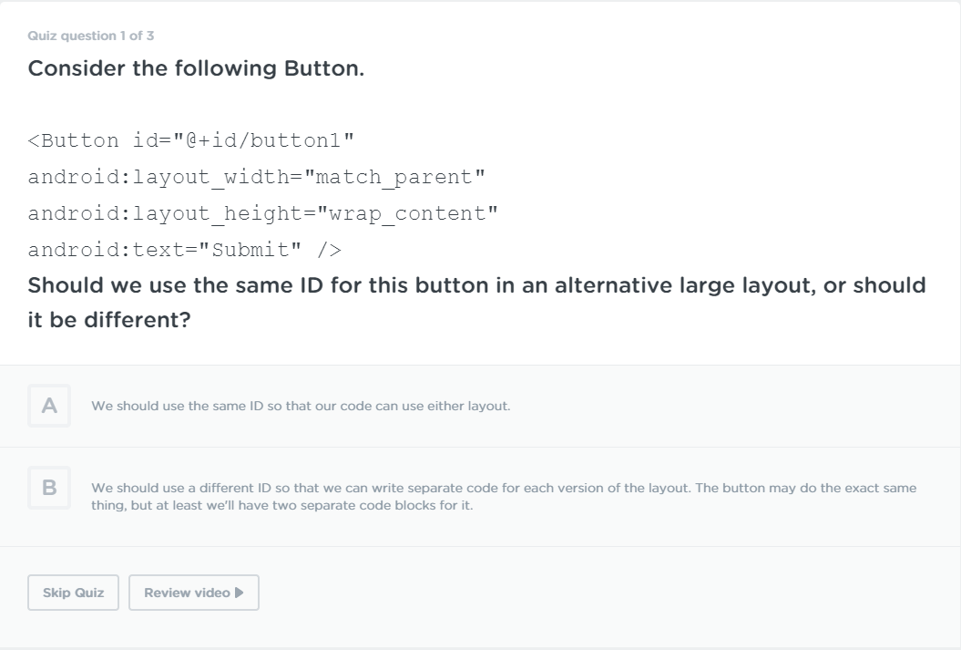
doesn't look too great when doing the quizzes. I believe that the code takes up a huge amount of the screen and that it could do with a bit of de-sizing... (and perhaps split the continuation of the question onto another line but, that's not as big of a deal).
Dustin Matlock
33,856 PointsLooks like there's a broken image on the Local Wordpress Development course.
Dustin Matlock
33,856 PointsDaniel Lewis, is the design on code challenges working correctly? It seems a little off visually.
No Button Border

Faint Button

Ryan Wilke
1,959 PointsThanks for reporting all this Dustin. Daniel and I will have a look at this shortly and see if we can make some quick improvements.
Gonzalo Castro
23,449 PointsHi. I'm experiencing some issues in some courses that I have complete and it doesn't appears as complete. The course box in the library show me negative time and when i click on resume it appear all done.
I contact the support team few months ago and they said that they will report this as a bug. But the problem still there.
Hope you can fix it, so I can know for real what course is complete.
Ryan Wilke
1,959 PointsThanks for letting us know, Gonzalo Castro. This issue is on our list, and I just let some of our developers know about it again so we can get it fixed up soon!
Christopher Warren
17,640 PointsPlease do. I always seem to have courses that rotate between appearing complete and in-complete.
Daniel Lewis
1,437 PointsDaniel Lewis
1,437 PointsDefinitely a bug, on it! :)
Ryan Wilke
1,959 PointsRyan Wilke
1,959 PointsIt's fixed and will be deployed soon. Thanks Chris.
Chris Shaw
26,676 PointsChris Shaw
26,676 PointsRyan Wilke nice, I'll keep my eye out for anything else