Accessibility For UX Designers
Accessibility For UX Designers
Accessible design means designing products for use by everyone, regardless of ability.
Types of Disabilities
Think about the variety of reasons a user might only be able to operate their mobile device with one hand.
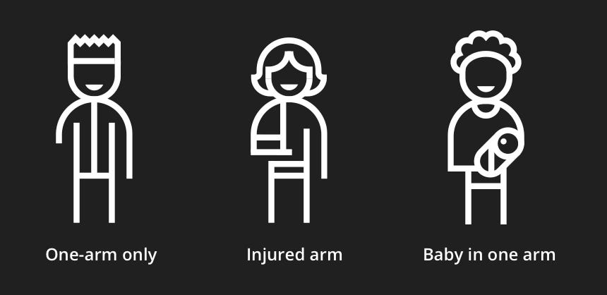
Some of your audience might have a permanent disability, such as having only one arm. However, there are also temporary disabilities, such as a broken arm that will eventually heal, and situational disabilities, like using a smartphone one-handed while holding a baby.
Example of permanent, temporary and situational disability (Source: Microsoft’s inclusive design toolkit)
These temporary and situational disabilities can impact your entire audience, not just those with permanent conditions impacting their ability to see, hear, move, think, or communicate.
Eliminating barriers between your audience and your product results in better overall usability.
Web Content Accessibility Guidelines
Making your content accessible to all users isn’t just the right thing to do, it’s required by law. Notable names that have been subject to lawsuits due to online content that wasn’t accessible to all users, regardless of ability, include the following:
- Domino's Pizza
- Beyoncé.com
- Amazon
- Target
- Netflix
- Hulu
- Harvard University
- Fox News
- Burger King
- Rolex
The legal specifics of web accessibility might vary depending on what country you live in, but the internationally recognized standard is the Web Content Accessibility Guidelines.
WCAG is broken up into four principles–you can use the acronym POUR to remember them. Accessible web content must be Perceivable, Operable, Understandable, and Robust.
The four principles are used as umbrellas for thirteen accessibility guidelines. These guidelines are, in turn, broken up into testable success criteria, that span three levels, A, AA, and AAA.
Level A compliance involves tasks that should be easily within reach, whether having developers provide alternate descriptions for non-text media like images, or ensuring color isn’t the only visual means of conveying information.
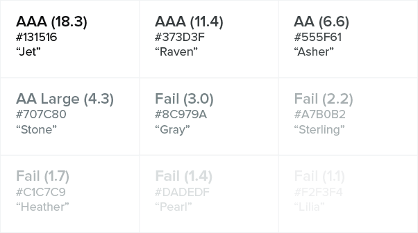
Level AA requires more effort, but this should be the minimum accessibility standard for online content. Level AA color contrast compliance, for example, means a contrast ratio of at least 4.5:1 for body copy and 3:1 for large text, as opposed to a 7:1 contrast ratio for body copy and 4.5:1 for large text to meet the AAA standard for users with more severe vision loss.
Testing a neutral color palette as text on a white background (Source: Color Contrast for Better Readability)
Level AAA is described as the gold standard level of accessibility. Meeting these guidelines will create the best possible experience for all users. However, some AAA criteria like providing sign language interpretation for all prerecorded audio content require specialized and sometimes expensive resources. The WCAG documentation actually doesn’t require Level AAA compliance because it is not always possible to satisfy all Level AAA Success Criteria.
In general, treat Level AA WCAG compliance as an absolute must-have. If your product doesn’t meet this level of accessibility, your work is unfinished.
As for Level AAA, apply these standards wherever it’s within your means and abilities to do so.
Perceivable
All users, regardless of ability, must be able to Perceive your web content. In other words, all content must be presented in a form that people with disabilities can use.
This principle is broken into four guidelines:
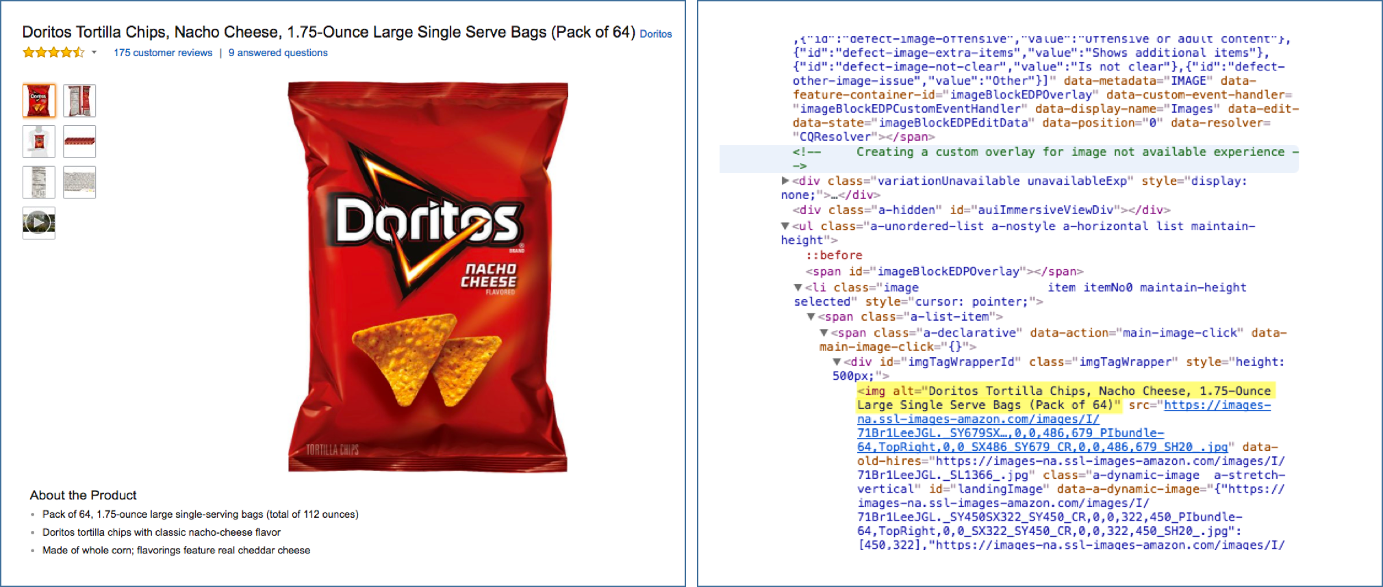
- Text alternatives: the development team should ensure all non-text content has a text alternative.
The highlighted text shows the alt text (alt attribute) of the image at left. (Source: Alt Text at Moz.com)
- Time-based media: Provide captions and transcripts to make audio and video content accessible to hearing-impaired users.
Captions as seen in a web media player. (Source: WebAIM)
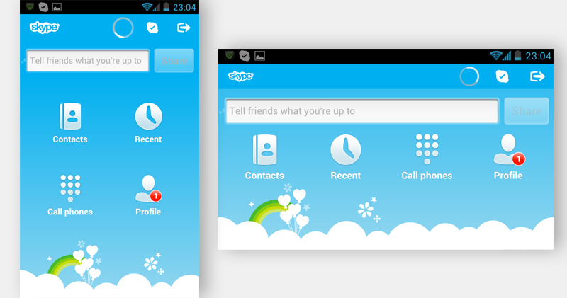
- Adaptable: Content can be presented in different ways without losing information or structure. While this guideline mostly pertains to developers using semantic HTML meaningfully, mobile designers need to make sure content can be understood in both portrait and landscape orientation.
In Skype’s mobile interface, the icons change position when the screen moves from portrait to landscape. (Source: Smashing Magazine)
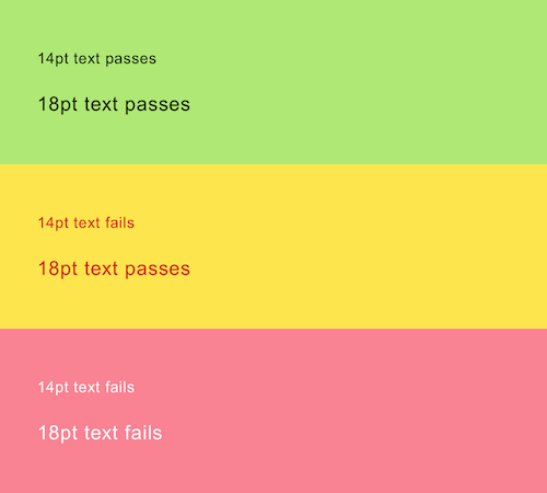
- Distinguishable: Foreground content should be distinguishable against its background. This includes using a resource such as the WebAIM Color Contrast Checker to ensure your body copy maintains a sufficient color contrast ratio.
This illustrates how contrast is based on the combination of color and size. (Source: Smashing Magazine)
Operable
All users, regardless of ability, must be able to Operate your web content.
This principle is broken into five guidelines:
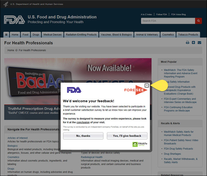
- Keyboard accessible: Many users with disabilities related to vision or motor skills rely on a keyboard. Developers should test that all interactive elements are accessible using the Tab key. Designers should ensure focus states, which indicate the currently selected element, are visually obvious.
FDA.gov follows through with keyboard accessibility by making it possible to navigate to and out of pop-ups. It is extremely important for users to be able to close pop-ups or they will be stuck inside them. (Source: Nielsen Norman Group)
-
Enough time: The timing guideline of the Operable principle states that when completing a task (such as booking a flight) has a time limit, users should be able to adjust or disable the time limit if they need extra time.
Users should also have the option to disable distracting content. For example, Slack allows users to disable animated gifs and emojis.
Opening the Accessibility tab in the Slack iOS app (Source: slack.engineering)
Seizures and physical reactions: Animations should never flash more than three times in any one-second period.
Navigable: Users should always be able to navigate your content and figure out where they are. While using semantic HTML meaningfully will once again be the developer’s responsibility, designers should understand the importance of using descriptive, easily identifiable headings to organize content.
The BBC’s homepage is a good example of how headings should be structured. (Source: Nomensa)
This guideline also specifies that the purpose of a link should be clear from the link text alone.
Examples of ineffective and effective link text. (Source: Nomensa)
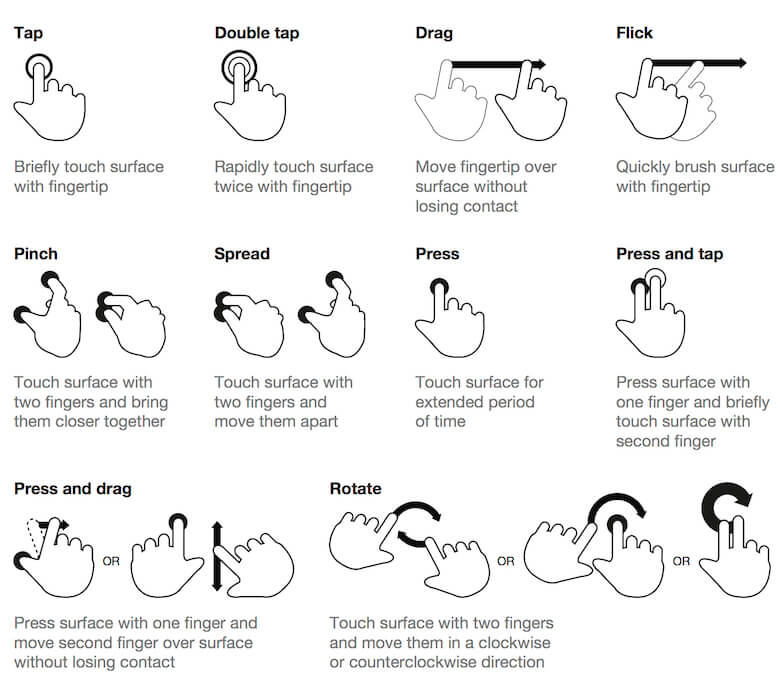
- Input Modalities: Many touch screen apps require complex gestures to activate navigation features.
Chart of touch gestures. (Source: Touch Gesture Guide)
Because users of assistive technologies might not be capable of complex interactions, alternative navigation should be available that can be activated by a simple tap, click, or physical gesture.
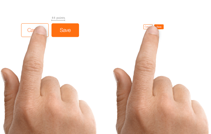
In addition, the guideline states that tappable interface elements be a minimum of 44 square pixels in size.
Create controls that can be accurately tapped with a finger. (Source: Apple UI Design Dos and Don’ts)
Understandable
All users, regardless of ability, must be able to Understand your web content.
This principle is broken into three guidelines:
-
Readable: Plain language makes your content easier to understand. Some of the recommendations on plainlanguage.gov, a resource for keeping body copy clear and straightforward on federal government websites, include using
- Strong, simple words
- Short paragraphs
- Clearly organized information
- A conversational tone
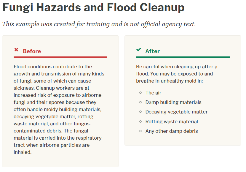
Examples of complex and plain language. (Source: plainlanguage.gov)
-
Predictable: Predictable app and website experiences and consistent navigation schemes benefit all users, regardless of physical ability.
In addition, this WCAG guideline warns against unexpected changes in context. To avoid disorienting users, the following should happen only when the user initiates a change by interacting with an interface element:
- opening a new window
- loading a new page
- significantly rearranging page content
- moving focus to a new component
For more, see Guideline 3.2 — Predictable: Make Web pages appear and operate in predictable ways
-
Input assistance: Users make mistakes sometimes, no matter how well designed the web form or interface. Prevent frustration by making errors easy to spot and correct.
A Nielsen Norman Group article called “How to Report Errors in Forms: 10 Design Guidelines” offers three principles for error reporting:
- The error message should be easy to notice and understand.
- The field(s) in error should be easy to locate.
- Users shouldn’t have to memorize the instructions for fixing the error.
Adobe.com: The red color and the icon next to the error message drew users’ attention. (Source: Nielsen Norman Group)
Robust
Robust content is content that can be understood by a variety of assistive technologies. Since this guideline requires writing valid, descriptive HTML, it’s aimed at developers.
Accessibility Checklist for UX Designers
Now that you’re familiar with the basics of accessible design, we’ve provided a downloadable, interactive PDF checklist you can use to measure the accessibility of your design projects.
Click to download the Accessibility Checklist for UX Designers (PDF, 595 KB)
