Welcome to the Treehouse Community
Want to collaborate on code errors? Have bugs you need feedback on? Looking for an extra set of eyes on your latest project? Get support with fellow developers, designers, and programmers of all backgrounds and skill levels here with the Treehouse Community! While you're at it, check out some resources Treehouse students have shared here.
Looking to learn something new?
Treehouse offers a seven day free trial for new students. Get access to thousands of hours of content and join thousands of Treehouse students and alumni in the community today.
Start your free trial
Asia Chan
11,007 Points2 Qs: (1) How to remove white space between floated objects; (2) How to make images flexible depending on viewport size?
Here's the link to my workspace: https://teamtreehouse.com/workspaces/24367532
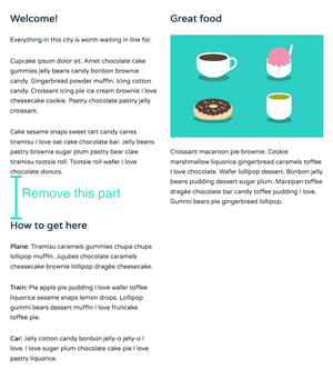
Q1: For the Tablet media query, I was able to have a 2 column layout by using floats:
    .col {
        vertical-align: top;
        float: left;
        margin: 0;
    }

    .primary,
    .secondary,
    .tertiary {
        width: 50%;
    }

    .primary {
        padding-right: 0;
        padding-left: 0.5em;
    }

    .secondary,
    .tertiary {
        padding-left: 0;
        padding-right: 1.5em;
    }
However, there's this unsightly white space between .secondary & .tertiary. I'd like for the .tertiary column to go up nearer .secondary column.
OR do I need not worry about that part anymore?
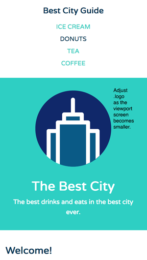
Q2: For the .logo, I noticed that when I scaled the viewport to the narrowest width, it becomes unsightly vis-a-vis other elements. How do you code that .logo (as well as .headline & .tagline) will adjust?
Thanks in advance!
1 Answer
Amrit Pandey
17,595 PointsOk I finally got the answers, that white spaces you see is because you create three columns. If you want, to display your content in two column side-by-side, use two columns and include the content you want in respective sides. In this way you are going to get all your content inside the columns without those white spaces, below each other perfectly stacked.
here is the CSS you apply to both column without any unnecessary white spaces.
.col {
    width:50%;
    display:inline-block;
    vertical-align:top;
    margin-left:-4px;
    padding: 1em;
  }
for reference checkout my workspace https://teamtreehouse.com/workspaces/24427452#