Welcome to the Treehouse Community
Want to collaborate on code errors? Have bugs you need feedback on? Looking for an extra set of eyes on your latest project? Get support with fellow developers, designers, and programmers of all backgrounds and skill levels here with the Treehouse Community! While you're at it, check out some resources Treehouse students have shared here.
Looking to learn something new?
Treehouse offers a seven day free trial for new students. Get access to thousands of hours of content and join thousands of Treehouse students and alumni in the community today.
Start your free trial
Ryan Meyer
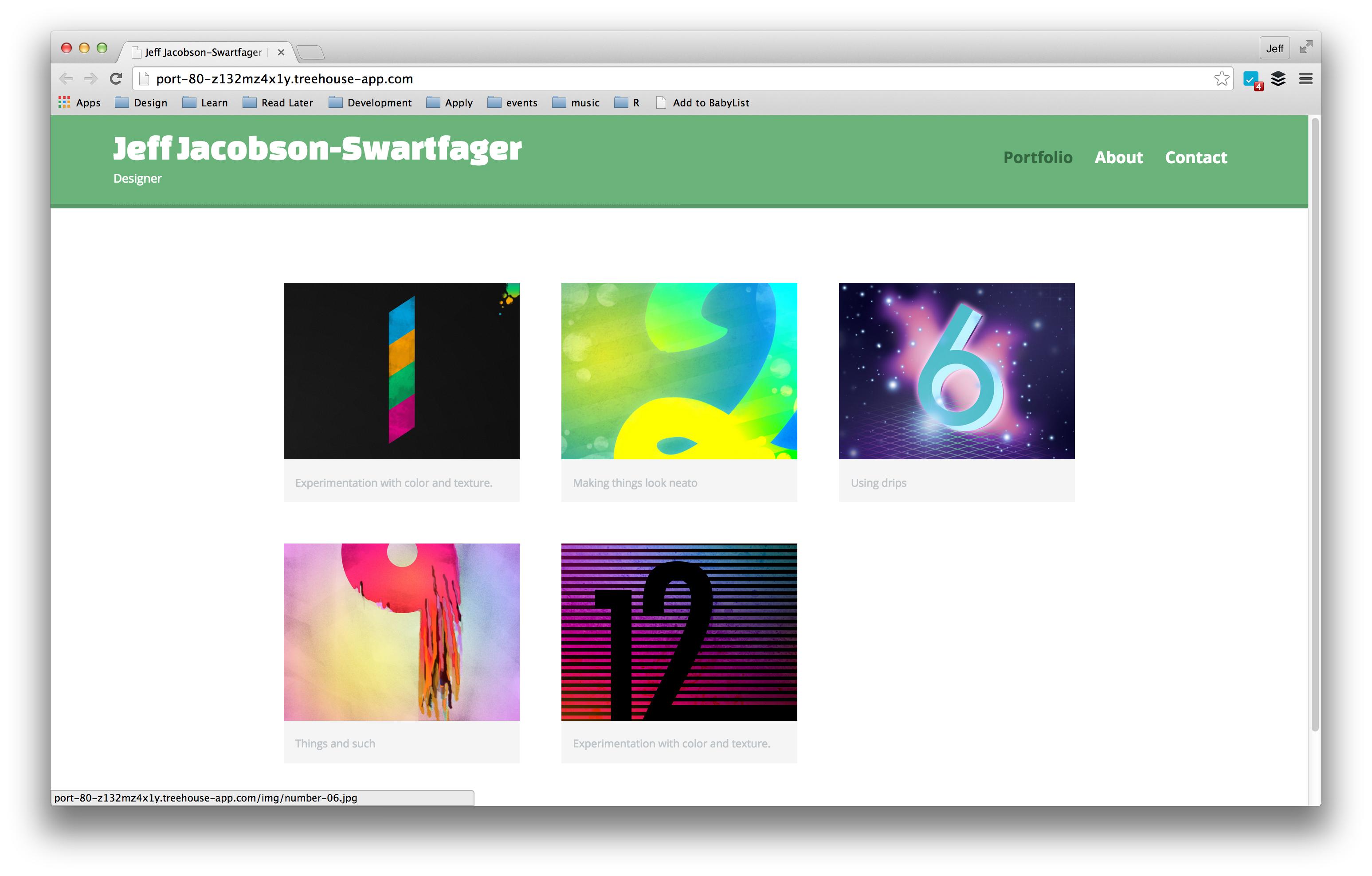
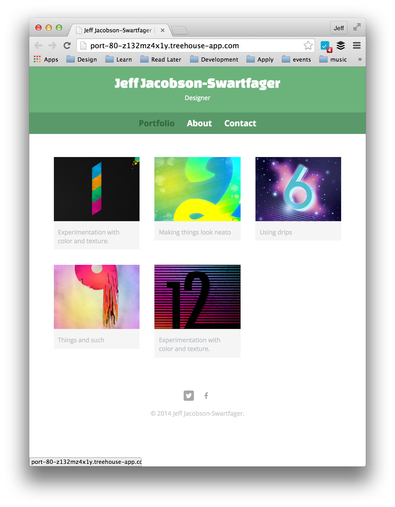
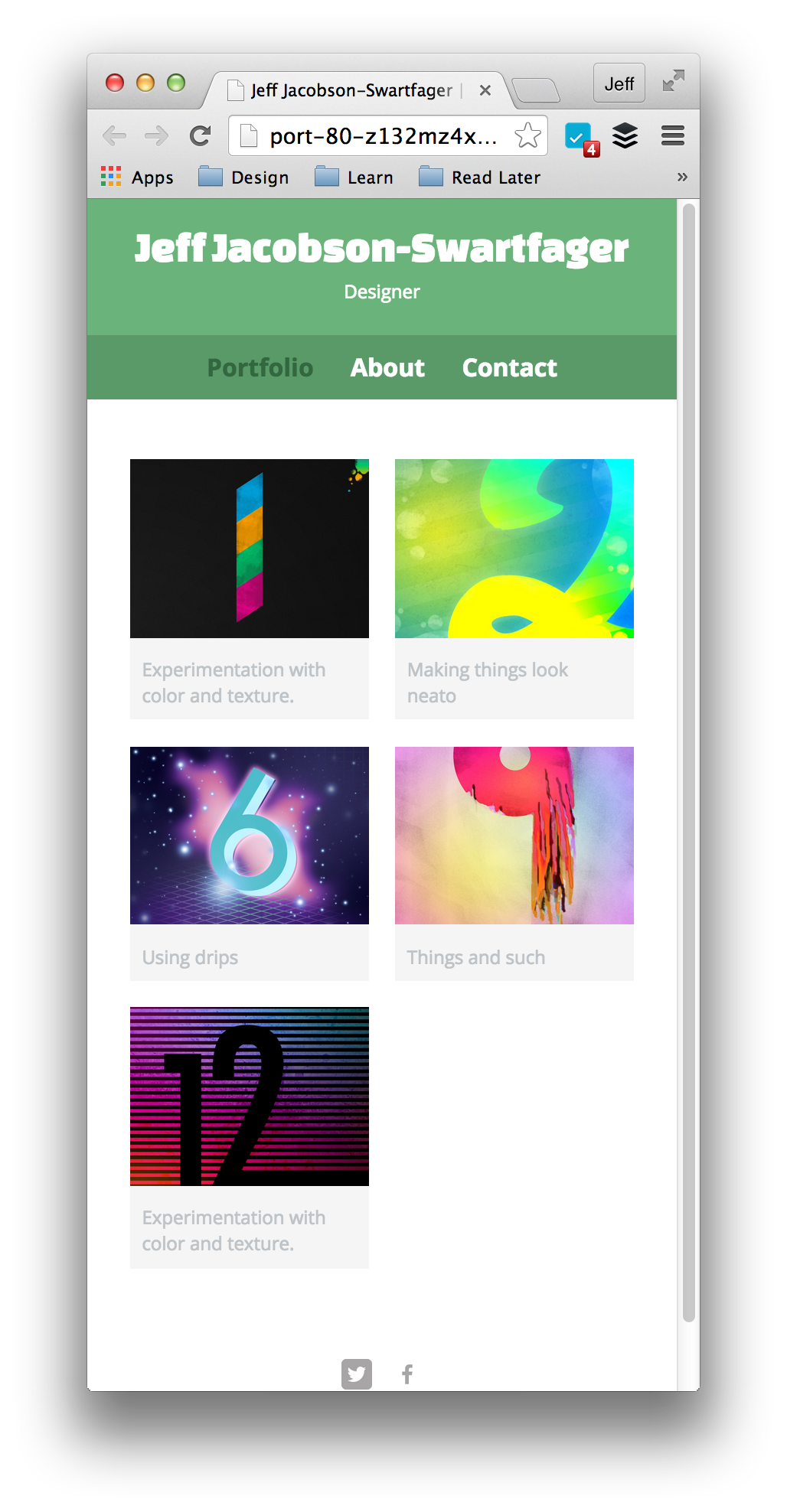
6,927 Points3rd image gets pushed to second column when window is resized
I searched the forum, and found some terribly worded and answered questions for what I believe is my same question. i will try better here.
In the video, nick's caption paragraphs under the gallery images word wrap as he resizes the screen, and the images stay in the correct order. When i resize my screen and the paragraph wraps, by third image is pushed to the 2nd column push the other images along with it.
#gallery {
  margin: 0;
  padding: 0;
  list-style: none;
}

#gallery li {
  float: left;
  width: 45%;
  margin: 2.5%;
  background-color: #f5f5f5;
  color: #bdc3c7;
}

#gallery li a p {
  margin: 0;
  padding: 5%;
  font-size: 0.75em;
  color: #bdc3c7;
}
      <section>
        <ul id="gallery">
          <li>
            <a href="img/numbers-01.jpg">
              <img src="img/numbers-01.jpg" alt="">
              <p>Experimentation with color and texture.</p>
            </a>
          </li>
          <li>
            <a href="img/numbers-02.jpg">
              <img src="img/numbers-02.jpg" alt="">
              <p>Making things look neato</p>
            </a>
          </li>
          <li>
            <a href="img/numbers-06.jpg">
              <img src="img/numbers-06.jpg" alt="">
              <p>Using drips</p>
            </a>
          </li>
          <li>
            <a href="img/numbers-09.jpg">
              <img src="img/numbers-09.jpg" alt="">
              <p>Things and such</p>
            </a>
          </li>
          <li>
            <a href="img/numbers-12.jpg">
              <img src="img/numbers-12.jpg" alt="">
              <p>Experimentation with color and texture.</p>
            </a>
          </li>
        </ul>
      </section>
Ryan Meyer
6,927 PointsSorry I thought i was posting my question in that videos section. The only thing I can come up with is setting the min height of the paragraph object.
Jeff Jacobson-Swartfager
15,419 PointsI've opened a fresh workspaces and I'm getting the expected behavior in Chrome 40.0.2214.91: reflowing text and images as demonstrated in the video. I haven't been able to reproduce the behavior you're experiencing (the code you posted seems to be the same as the relevant snippets from the index.html and main.css files).
Which browser are you using?
Ryan Meyer
6,927 PointsIm using Chrome Version 40.0.2214.93 (64-bit) on a mac. Must be some other code that is affecting it. It seems that I have all the same code as nick on the video. I will try it stripped down in a new workspace and see what happens.
Ryan Meyer
6,927 PointsStill the same issue with a fresh workspace. I sent the preview link to a friend and he saw the same issue.
2 Answers
Jeff Jacobson-Swartfager
15,419 PointsAlright! I'm finally seeing what you're seeing! Yes, you're right: it is an issue with that break point (between about 401px wide and 479px wide).
quick method
You can add a short media query to clear it:
@media (max-width: 479px) { /* for all device sizes up to 479px wide*/
  li:nth-child(3n) { /* every third list item */
    clear: left; /* clear everything to the left (bump down to the next line) */
  }
}
better method
Or, you could do it with better form by adding this to your main styles:
li:nth-child(3n) { clear: left; }
... and this to your first breakpoint:
@media screen and (min-width: 480px) { /* this is the first breakpoint, just add the code within this @media query */

  /* there's some code I'm not going to repeat that goes in here */

  li:nth-child(3n) { clear: none; } /* removes the clearing we're doing for mobile devices */
}
Ryan Meyer
6,927 PointsIt appears that the code at this point is written for an ideal world, where each caption is at least 2 lines of text for the min-width of the image. This is why Nicks columns aren't doing the same thing as mine are. If he had a shorter caption on any of his gallery images, he would see this happen to his site. At least I know now and more code will be needed to handle this.
Jeff Jacobson-Swartfager
15,419 PointsI tried using the same captions you've got, and I'm still getting the appropriate columns. Could you post some images of what you're getting or share the link?
Ryan Meyer
6,927 PointsNot sure if this link will work for you. http://port-80-4khpu590do.treehouse-app.com/
With no word wrap and wider screen https://www.dropbox.com/s/16z1mtmtjcp4uic/Screenshot%202015-01-29%2017.28.39.png?dl=0
With word wrap and a slightly narrower screen https://www.dropbox.com/s/8tx6l54o6vnsasz/Screenshot%202015-01-29%2017.29.09.png?dl=0
Sorry Couldn't seem to get dropbox to work with the markdown.
Jeff Jacobson-Swartfager
15,419 PointsJeff Jacobson-Swartfager
15,419 PointsCould you post a link to the video you're following?