Welcome to the Treehouse Community
Want to collaborate on code errors? Have bugs you need feedback on? Looking for an extra set of eyes on your latest project? Get support with fellow developers, designers, and programmers of all backgrounds and skill levels here with the Treehouse Community! While you're at it, check out some resources Treehouse students have shared here.
Looking to learn something new?
Treehouse offers a seven day free trial for new students. Get access to thousands of hours of content and join thousands of Treehouse students and alumni in the community today.
Start your free trial
Sonya Trachsel
13,674 PointsAccordion / dropdown menu in the nav needs to change content position on mobile
Hi guys,
Decided to ask this question here, maybe someone else has seen the solution somewhere or has an example to show.
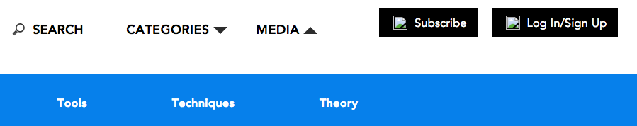
I'm struggling with the task of making the accordion/ dropdown menu responsive. In the image below you can see that when I click on categories it should display the contents below the navigation bar. (example below).
And when I do it on mobile, it does the same. However what I need it to do is to move below the categories section on mobile. Is there anything I can do to change the position of contents on mobile? (example below).
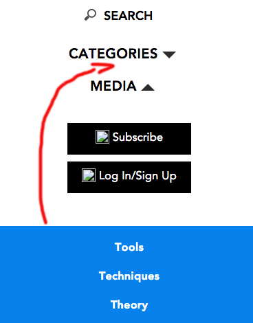
Currently the blue bar is hidden and then onclick it's shown.
Thank you for your help!
2 Answers
Russell Sawyer
Front End Web Development Techdegree Student 15,705 PointsHi Sonya,
Without seeing your code it's tough to make a determination on what you need to change to make the Responsive navbar work.
What I can offer is some resources that I use when I want to add a responsive navbar to my webpage. You can make a responsive navbar using Bootstrap. Or, it looks like you are trying to code your navbar in CSS.
Hope this helps.
If you want to post your code I can take a look if you want.
Good luck. :)
Steven Parker
244,136 Points
 Two possible approaches come to mind:
One would be to use absolute positioning in a media query to place the menu where you want. If you do this, you'll probably also need a placeholder element to appear at the same time to shift the other elements and make space for the menu (which will be immune to normal flow because of the positioning).
The other idea, which I favor myself, would be to have two identical menus, one at each potential position, and have the media query enable one or the other at a time.