Welcome to the Treehouse Community
Want to collaborate on code errors? Have bugs you need feedback on? Looking for an extra set of eyes on your latest project? Get support with fellow developers, designers, and programmers of all backgrounds and skill levels here with the Treehouse Community! While you're at it, check out some resources Treehouse students have shared here.
Looking to learn something new?
Treehouse offers a seven day free trial for new students. Get access to thousands of hours of content and join thousands of Treehouse students and alumni in the community today.
Start your free trial
YIHU JIN
1,972 Pointsaligning boxes
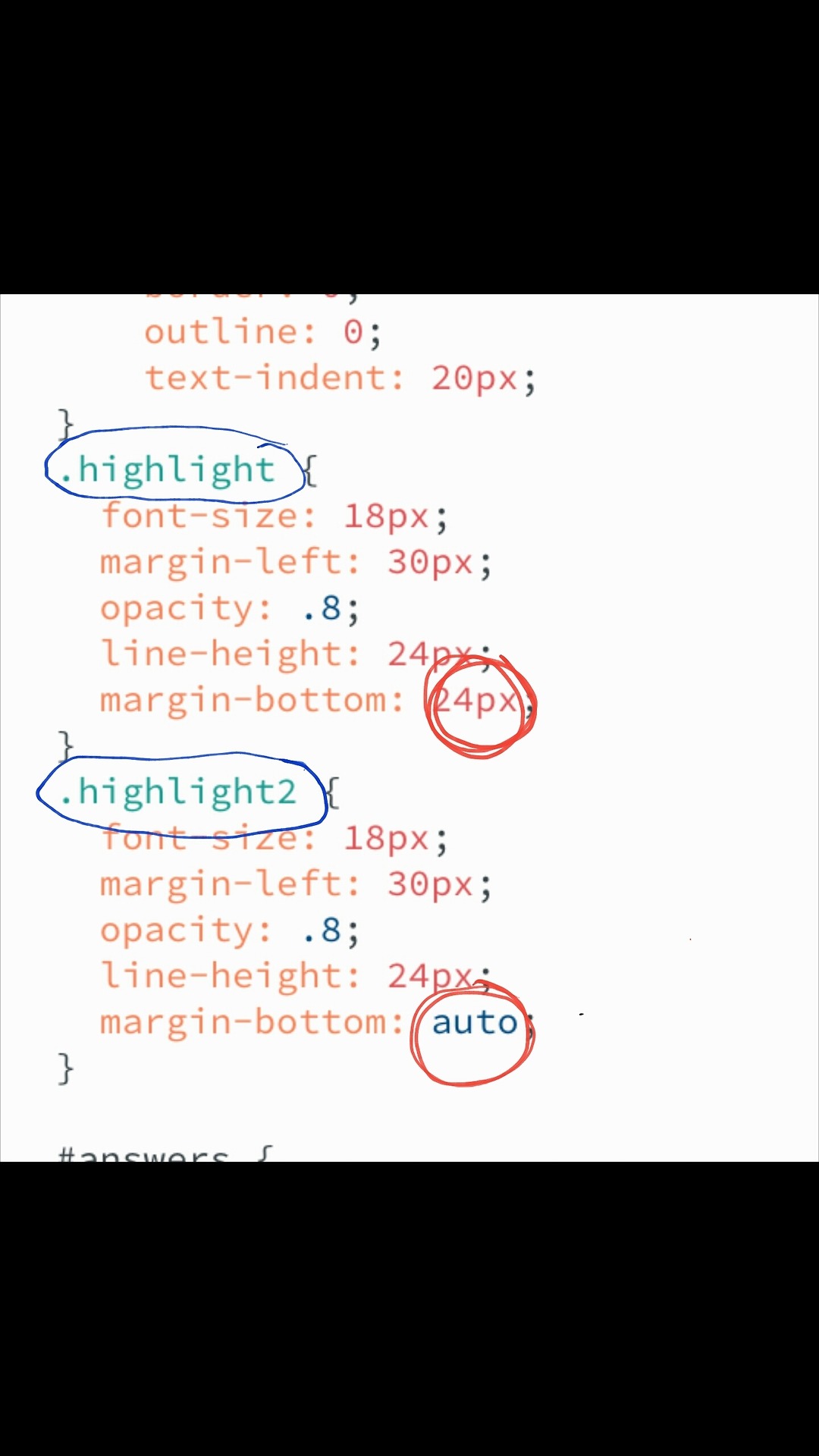
so i added another question and row of boxes one of the questions i had was a little long so it got split up into 2 lines of text. this pushed the one row of boxes down slightly. the way i fixed it was to take that "highlight" and name it "highlight2" then i added....... .highlight { font-size: 18px; margin-left: 30px; opacity: .8; line-height: 24px; margin-bottom: 24px; } .highlight2 { font-size: 18px; margin-left: 30px; opacity: .8; line-height: 24px; margin-bottom: auto; so basically now the "highlight2" is on auto and the other 3 questions named "highlight" i had to tweek so they would aline is their a more simple way to do this so that all 4 "highlight" sections are functioning together?
4 Answers
YIHU JIN
1,972 Pointsoh sorry, deceived but the question box format. I've taken some screen shots but i haven't really learned where to post things so you can see them so i put them on my Tumblr and i'm posting links to there. ok so 1.... https://68.media.tumblr.com/2852ff77a2b4233ab0e30bf1ff2af7ee/tumblr_onow528jNG1w9xi6so1_1280.png 2.... https://68.media.tumblr.com/85a0227a800680fbae4356b6110c6203/tumblr_onow5jESr81w9xi6so1_1280.png 3... https://68.media.tumblr.com/f54a595eccfa47f2dea372e257baa2c1/tumblr_onovu3Aw1P1w9xi6so1_1280.jpg 4... https://68.media.tumblr.com/73adcdca5a2f3ade3a32a984c15ccca3/tumblr_onovtmgEL41w9xi6so1_1280.jpg
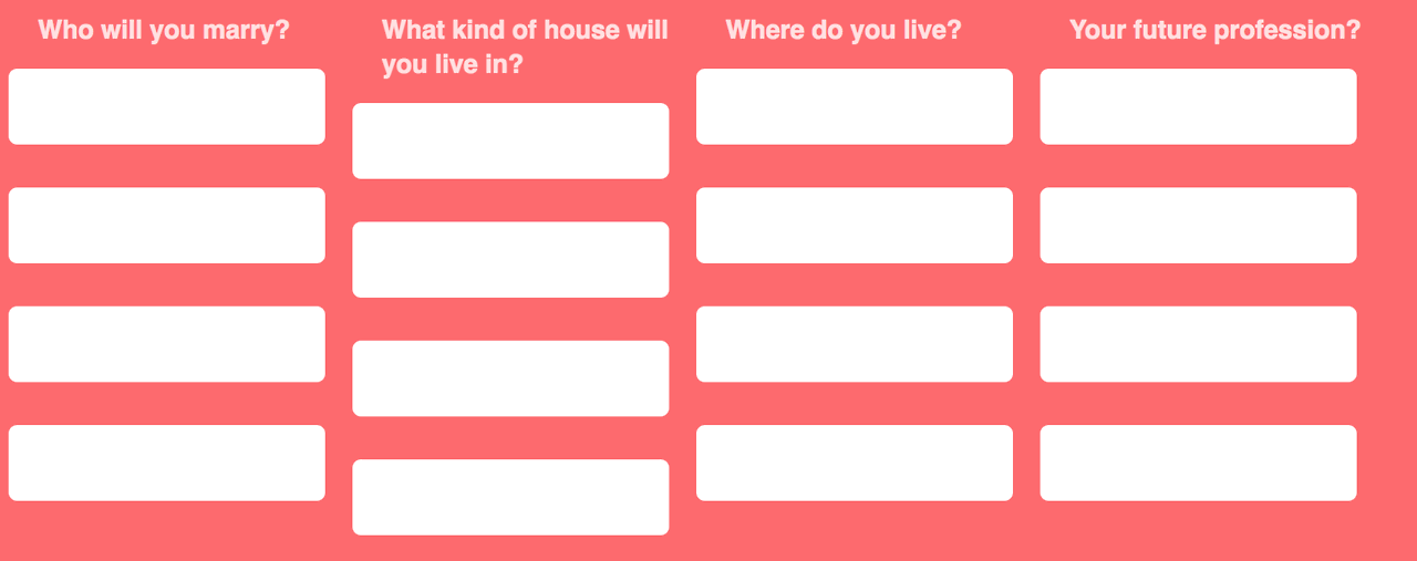
so in pic 1 this is what the trouble was. as you see the 2nd column has a long sentence that shifts the boxes down
in pic 2 this is how i want it to look
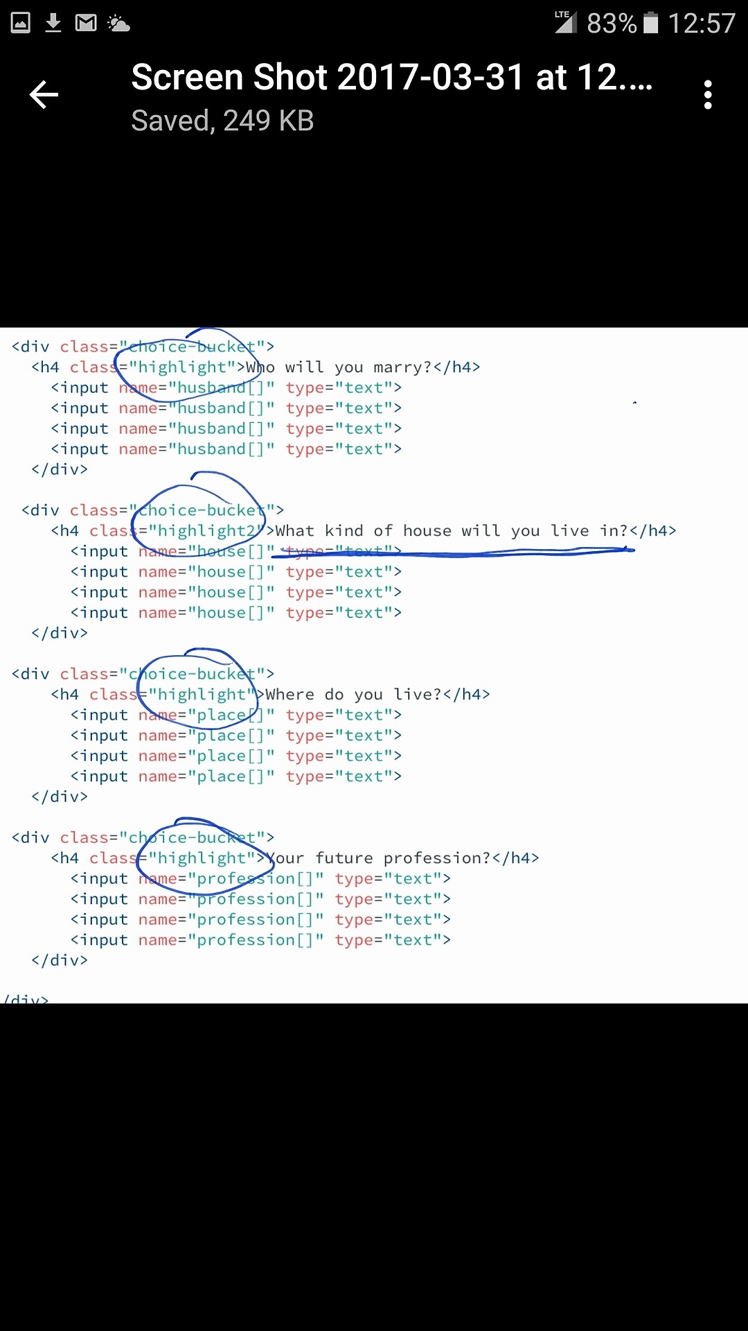
in pic 3 is the html bit where i split the 4 sections into 2 separate categories. "highlight" and Highlight2"
in pic 4 is the style sheet where i split the sections. category 1,3,4 (highlight) with shorter lines i set the bottom-margin to auto and in category "highlight2" i had to tweek it to 24px
i just seems like there is an easier way then splitting it into 2. i feel like later it could cause more work and more problems down the line.
thank you. sorry this is probably a very stupid question. but im just a beginner.
thank you for the time
Armand van Alphen
16,969 PointsWhat you can do is nest those 4 <h4> elements in a separate parent above your input elements. to illustrate it would look something like this.
HTML
<div>
<h4 class="highlight">title1</h4>

<h4 class="highlight">title2</h4>

<h4 class="highlight">title3</h4>

<h4 class="highlight">title4</h4>
</div>
css . .highlight{ float: left; }
Explanation.
- Float left ensures the elements will stick next to each other instead of below each other.
- The containing div will be the height of the largest element inside it and the div will actually push the elements that come after it down because of this everything will be be pushed down equally and be on the same line.
Steven Parker
244,136 PointsYou'd need a different styling strategy for this.
You could put the titles in a separate container as armaniimus suggested, floated or not. But then you might have to constrain their widths to keep them vertically aligned with the boxes below. And if you use floats, you'd need to clear before the rows of boxes.
Another approach might be to put everything in a table, which would make the HTML more complicated but it would keep both dimensions aligned.
Yet another possibility would be to use flexbox, one of the most modern developments in CSS. Both tables and flexbox are discussed in some of the CSS courses here.
Armand van Alphen
16,969 PointsI wouldn't use tables for positioning
Although easily to use in my opinion they make your code more complicated to read just as Steven Parker said .
But the biggest downsize of them is that they are not responsive and are therefore very bad to use for positioning if you want to optimize for mobiles and tablets. Which allot of people use to browse the web these days and you kinda ruining there user experience if you neglect that.
Last I am not familair with flexbox so I can't advise you for or against it in this particular case.
Steven Parker
244,136 PointsYou might really enjoy taking one of the courses here that covers flexbox. It was developed specifically to overcome pitfalls of floats and give many features similar to tables but still be responsive.
Steven Parker
244,136 PointsSteven Parker
244,136 PointsWhen posting code, be sure to format it using the instructions from the Markdown Cheatsheet found below the "Add an Answer" area
Or even better, make a snapshot of your workspace and post the link to it. This allows others to try out your example and provide a more complete and accurate answer.