Welcome to the Treehouse Community
Want to collaborate on code errors? Have bugs you need feedback on? Looking for an extra set of eyes on your latest project? Get support with fellow developers, designers, and programmers of all backgrounds and skill levels here with the Treehouse Community! While you're at it, check out some resources Treehouse students have shared here.
Looking to learn something new?
Treehouse offers a seven day free trial for new students. Get access to thousands of hours of content and join thousands of Treehouse students and alumni in the community today.
Start your free trial
Bartlomiej Zabielski
Courses Plus Student 10,363 Pointsbackground not scaling.
Hey all,
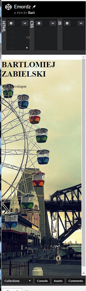
I have been trying create a basic front page for hours and i'm totally lost. I created a codepen to see the problem. https://codepen.io/digitalrambo/pen/Emordz
The background image is not resizing with the browser window when i move browser window from sides. However, when i diagonally drag browser smaller from the corners it DOES resize. I feel shattered that I cant figure it out =/
any advice appreciated
8 Answers
stjarnan
Front End Web Development Techdegree Graduate 56,488 PointsIf you set max width that gives you a max width the img can take within the parent element (parent div or whatever you have the image in).
Then background cover is a setting that decides how the background image will be focused within that space. Contain for an example makes the image take as much place as possible within the allocated space but stops when the image reach max-height or max-width.
I hope that helps.
stjarnan
Front End Web Development Techdegree Graduate 56,488 PointsIt scales just perfectly for me, using Chrome. I can't find a reason as to why it wouldn't work either. So I suppose you managed to fix it?
Bartlomiej Zabielski
Courses Plus Student 10,363 PointsEDIT:
it wont resize I tried using min-width max-width on all the elements but just clicking buttons S:
Bartlomiej Zabielski
Courses Plus Student 10,363 Points)*:
EDIT:
mini progress I think.
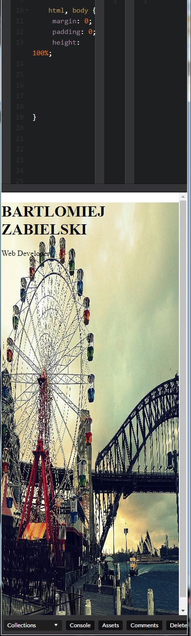
So by adding background-size: 100% 100%;
it now does what I wanted but now I realise why cover is better because it looks contorted.
Question Would it be better to keep background as cover and just add media queries for content and possibly re-position the background on x and y axis so looks nice on different viewports?
Bartlomiej Zabielski
Courses Plus Student 10,363 Pointswould appreciate some advice. Where is the CSS army? I will rewatch some videos on backgrounds but would be nice to get some feed back.
stjarnan
Front End Web Development Techdegree Graduate 56,488 PointsAs I said before, the background-image scales perfectly for me. Doesn't matter what browser I look in, it still works.
Bartlomiej Zabielski
Courses Plus Student 10,363 PointsHey stjarnan
thanks for reply (:
I am just bit confused. I remember having to add max-width: 100% to imgs. So i guess cover value takes care of that for me right? I should read it on mdn docs my bad but a reply would be nice to ease my mind
Bartlomiej Zabielski
Courses Plus Student 10,363 Pointsthanks It makes sense.
I also read mdn docs background-size
to confirm I have right logic. Since the background is set to body { then I dont need to specify max-width since body is the biggest container already.
stjarnan
Front End Web Development Techdegree Graduate 56,488 PointsWhen it comes to background-images you will rarely have to bother with max-widths as the idea is that a background should often be 100% of the container.
If you have an img within your container you might want to use max-width though, a great example is if you only want the image to be able to take up 50% of the container and leave the other 50% to some other element like a paragraph.
You're on the right track Bartlomiej :)
Bartlomiej Zabielski
Courses Plus Student 10,363 Points@stjarnan thank you. My post might of seemed bit lazy but I re worked through the vids and read mdn docs. Thanks for reassurance it makes perfect sense now. I will get back to work >: )
stjarnan
Front End Web Development Techdegree Graduate 56,488 PointsDon't worry, asking questions is great for you!
Asking questions improves your learning potential, so keep it up :)