Welcome to the Treehouse Community
Want to collaborate on code errors? Have bugs you need feedback on? Looking for an extra set of eyes on your latest project? Get support with fellow developers, designers, and programmers of all backgrounds and skill levels here with the Treehouse Community! While you're at it, check out some resources Treehouse students have shared here.
Looking to learn something new?
Treehouse offers a seven day free trial for new students. Get access to thousands of hours of content and join thousands of Treehouse students and alumni in the community today.
Start your free trial
Tommy Gebru
30,164 PointsBuilding a website for HBO's Silicon Valley
I could really use some feedback for my website... are the image captions ok? does it work well on mobile devices? is it slow to load? Does it look nice? How can it be better... all advice/opinions welcome!
4 Answers
jason chan
31,009 PointsIt's cool. It would be cooler with the parallax effect on each image. My only suggestion.
Sunny Bradford
431 PointsOverall the color scheme makes it hard to read text. I.e., Light text in light background
Also Reach for the sky is a pic of people standing in line waiting for their seats. Doesn't scream out social connection. Lastly, the On Time photo is a pic of a plane in the Tarmac. That could have arrived 3 hours late. Images should tell the user the content before they even read any script.
Tommy Gebru
30,164 PointsThanks for your feedback I had so little to go on I practically made it all up!
I tried using some of the original color palette like the green text, and the yellow backgrounds....
I also had on good image of a logo but it was black ... it would have been easier to use a white logo I believe
Sunny Bradford
431 PointsMake an image of the departures board at the airport with a bunch of airlines listed as delayed and cancelled. Then all your airline's flights are listed as ON TIME. That speaks to what I'd rather choose. Takes some photoshop work.
Tommy Gebru
30,164 PointsI didn't exactly catch that but I can change my background image to this...
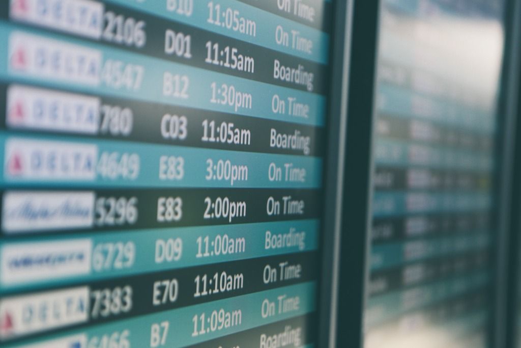
Tommy Gebru
30,164 PointsI guess I can leave it as i have now
Ben Shockley
6,094 PointsI like it, it's a really cool idea. It's one of my favorite shows right now. One thing I would say is you might want to put a drop shadow or something like on the text. It's really hard to read on some of the images.
Tommy Gebru
30,164 PointsYeah I tried that ... but it was still hard to read!... thats why I but the opacity on the divs so it kind of gives some clarity
Tommy Gebru
30,164 PointsTommy Gebru
30,164 Pointsthanks.. I didnt think about doing parallax... I will probably do that if i can get my hands on more information about the company