Welcome to the Treehouse Community
Want to collaborate on code errors? Have bugs you need feedback on? Looking for an extra set of eyes on your latest project? Get support with fellow developers, designers, and programmers of all backgrounds and skill levels here with the Treehouse Community! While you're at it, check out some resources Treehouse students have shared here.
Looking to learn something new?
Treehouse offers a seven day free trial for new students. Get access to thousands of hours of content and join thousands of Treehouse students and alumni in the community today.
Start your free trial
Max Hallinan
7,614 PointsCode review: CSS Instagram icon
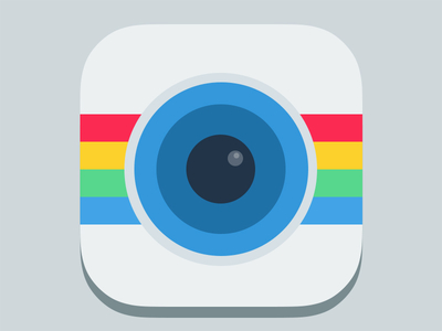
For my first CSS project, I coded an Instagram icon designed by Ludovic Fauchet. Fauchet shared the PSD which I used to reference the colors and measurements.
I'm uncertain about my code, especially the nested divs and positioning values. I also tried to use percentage widths and heights so that the icon would expand or contract as the viewport was resized. I couldn't find a way to keep the width and height of an element or class linked so that the icon would scale proportionally. Does anyone have a solution for this?
I welcome any feedback on the code. Thanks in advance.
My code: CSS Instagram icon
Original design:
3 Answers
James Barnett
39,199 PointsIt's really well done, about as close to pixel perfect as my eye can detect. I wouldn't worry about the nested divs, the code is pretty good on the semantic/organization front.
However it could use some work on, DRY-ing up your CSS, you can drop 20% of your CSS that way.
I'd round up your rems at 3 decimal places, the way the math works out you end up with the same size and more readable code. There's no need to use hundreds for your z-index 2-9 will work fine.
I couldn't find a way to keep the width and height of an element or class linked so that the icon would scale proportionally.
Set a fixed width (in pixels) for your body, using media queries to scale it. Then convert all of your rems to %, as your viewport size changes the percentages should change as well.
To make the lines DRY-er and use percentages ...
  <div class = "stripe">
    <div class="red"></div>
    <div class="yellow"></div>
    <div class="green"></div>
    <div class="blue"></div>
  </div>
.stripe {
  position: absolute;
  top: 32%;
  height: 39%;
}

.stripe > div {
  z-index: 2;
  height: 25%;
}
Max Hallinan
7,614 PointsThanks for your excellent suggestions. I DRY-ed out the stripes, rounded up the rems, revised the z-indexes, and will make a second version with percentage units.
Philipp Antar
7,216 Pointspretty slick!!