Welcome to the Treehouse Community
Want to collaborate on code errors? Have bugs you need feedback on? Looking for an extra set of eyes on your latest project? Get support with fellow developers, designers, and programmers of all backgrounds and skill levels here with the Treehouse Community! While you're at it, check out some resources Treehouse students have shared here.
Looking to learn something new?
Treehouse offers a seven day free trial for new students. Get access to thousands of hours of content and join thousands of Treehouse students and alumni in the community today.
Start your free trial
James Forbes
1,521 PointsContact Icons Pushed To Left In Two Column Display
Hi, I was debugging an HTML list syntax error when suddenly the contact icons started to push from their secondary column section over the top of the primary column section, when displaying in ~660px.
I suspect it is a problem with my responsive.css, or main.css.
So here they are! Thank you to anyone who can help :)
@media screen and (min-width: 480px) {

  /**********************************
  TWO COLUM LAYOUT
  ***********************************/

  #primary  {
    width: 50%;
    float: left;
   }

  #secondary: {
    width: 40%;
    float: right;
   }

  /**********************************
  PAGE: PORTFOLIO
  ***********************************/

  #gallery li {
    width: 28.3333%;
  }

  #gallery li:nth-child(4n) {
    clear: left;
  }

  /**********************************
  HEADER
  ***********************************/

  .profile-photo  {
  float: left;
  margin: 0 5% 80px 0;
  }
}


@media screen and (min-width: 660px) {

  /**********************************
  HEADER
  ***********************************/

  nav {
    background: none;
    float: right;
    font-size: 1.125em;
    margin-right: 5%;
    text-align: right;
    width: 45%;
  }

  #logo {
    float: left;
    margin-left: 5%;
    text-align: left;
    width: 45%;
  }

  h1 {
    font-size: 2.5
  }

  h2  {
    font-size: 0.825em;
    margin-bottom: 20px;
    }

  header  {
    border-bottom: 5px solid #599a68;
    margin-bottom: 60px;
  }
}
/************
General
************/

body  {
  font-family: 'open sans', sans-serif;
}

#wrapper {
  max-width: 940px;
  margin: 0 auto;
  padding: 0 5%;
}

a {
  text-decoration: none;
}

img {
  max-width: 100%;
}

h3  {
  margin: 0 0 1em 0;
}


/************
Heading
************/

header  {
  float: left;
  margin: 0 0 30px 0;
  padding: 5% 0 0 0;
  width: 100%;
}

#logo {
  text-align: center;
  margin: 0;
}

h1  {
  font-family: 'changa one', sans-serif;
  margin: 15px 0;
  font-size: 1.75em;
  font-weight: normal;
  line-height: 0.8em;
}

h2  {
  font-size: 0.75em;
  margin: -5px 0 0;
  font-weight: normal;
}


/************
Navigation
************/

nav {
  text-align: center;
  padding: 10px 0 0;
  margin: 20px 0 0;
}

nav ul {
  list-style: none;
  margin: 0 10px;
  padding: 0;
}

nav li  {
  display: inline-block
}

nav a {
  font-weight: 800;
  padding: 15px 10px;
}


/************
Footer
************/

footer  {
  font-size: 0.75em;
  text-align: center;
  clear: both;
  padding-top: 50px;
  color: #ccc;
}

.social-icons {
  width: 20px;
  height: 20px;
  margin: 5px 0;
}


/************
Page: Portfolio
************/

#gallery  {
  margin: 0;
  padding: 0;
  list-style: none;
}

#gallery li {
  float:  left;
  width:  45%;
  margin: 2.5%;
  background-color: #f5f5f5;
  color:  #bdc3c7;
}

#gallery li a p {
  margin: 0;
  padding: 5%;
  font-size:0.75em;
  color: #bdc3c7;
}


/************
Page: About
************/

.profile-photo  {
  display:  block;
  max-width:  150px;
  margin: 0 auto 30px;
  border-radius: 100%;
}

/************
Page: Contact
************/

.contact-info {
  list-style: none;
  padding: 0;
  margin: 0;
  font-size: 0.9em;
}

.contact-info a {
  display: block;
  min-height: 20px;
  background-repeat: no-repeat;
  background-size:  20px  20px;
  padding: 0 0 0 30px;
  margin: 0 0 10px;
}

.contact-info li.phone  a {
  background-image: url('../img/phone.png');
}

.contact-info li.mail  a {
  background-image: url('../img/mail.png');
}

.contact-info li.twitter  a {
  background-image: url('../img/twitter.png');
}


/******
Colors
******/

/* site body */
body  {
  background-color: #fff;
  color:  #999;
}

/* green header */
header {
  background-color: #6ab47b;
  border-color: #599a68;
}

/* nav background on mobile */
nav {
  background-color: #599a68;
}

/* logo text */
h1, h2  {
  color: #fff;
}

/* links */
a {
  color: #6ab47b;
}

/* nav links */
nav a, nav a:visited {
  color: #fff
}

/* selected nav links */
nav a.selected, nav a:hover {
  color: #32673f
}
James Forbes
1,521 PointsThanks Robert, you are a legend! I will use this in future.
Robert Richey
Courses Plus Student 16,352 PointsI downloaded the project files from Adding Breakpoints for Devices and substituted your code for main.css and responsive.css and didn't see anything out of place.
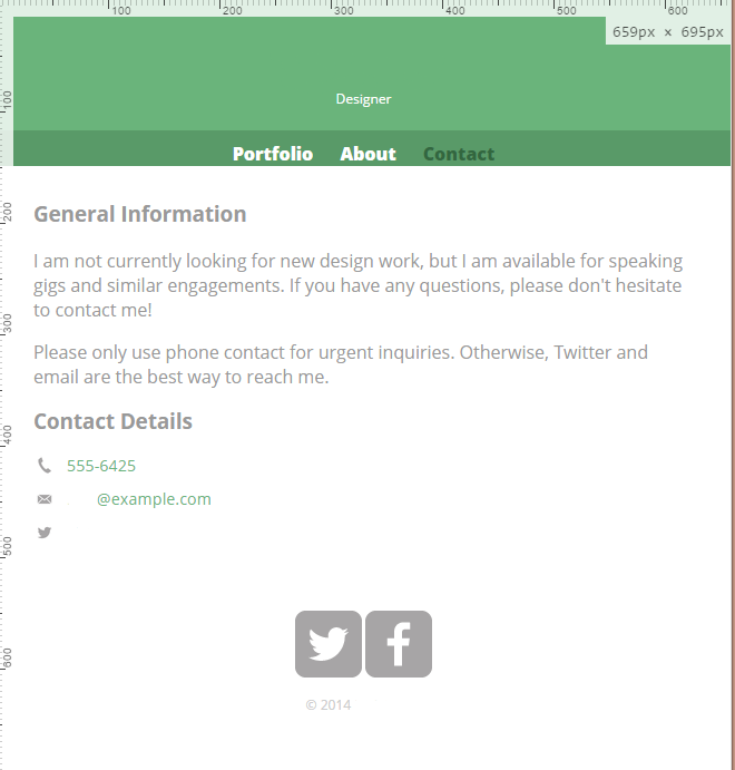
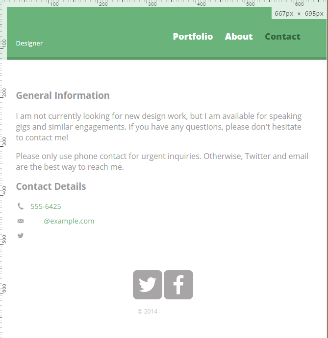
Here are screenshots of the page loading at less than and greater than 660px. I scrubbed Nick's name from the images. Are you seeing something different? Perhaps the problem may be in the HTML?
Less than 660px
Greater than 660px
1 Answer
Jason Anders
Treehouse Moderator 145,863 PointsThe only syntax (possible) problem I can see is under your /********************************** HEADER ***********************************/ the h1 font-size has no 'type'... it just says 2.5 with no unit type declared. I'm not sure if this would affect your columns, but it's the only abnormal entry I can see. (But I have been staring at a screen all day... lol)
Good luck. Jason :)


Robert Richey
Courses Plus Student 16,352 PointsRobert Richey
Courses Plus Student 16,352 PointsHi James,
I'll try to figure out what's going on.
Also, I added markdown to help make the code more readable. If you're curious about how to add markdown like this on your own, checkout this thread on posting code to the forum . Also, there is a link at the bottom called Markdown Cheatsheet that gives a brief overview of how to add markdown to your posts.
Cheers!