Welcome to the Treehouse Community
Want to collaborate on code errors? Have bugs you need feedback on? Looking for an extra set of eyes on your latest project? Get support with fellow developers, designers, and programmers of all backgrounds and skill levels here with the Treehouse Community! While you're at it, check out some resources Treehouse students have shared here.
Looking to learn something new?
Treehouse offers a seven day free trial for new students. Get access to thousands of hours of content and join thousands of Treehouse students and alumni in the community today.
Start your free trial
Nick Pettit
Treehouse TeacherForum Contest: Design a Contact Form
EDIT: This contest has ended! Congratulations to Geert-Jan Hendriks for his winning entry! Our next contest is all about creating a toggle switch.
Hi everybody,
It's time for a new Treehouse Forum contest! First, watch this video to learn more:
After you've watched the video, please read the details below carefully. I'm looking forward to your entries!
How to Enter: Create your contact form entry as a "pen" on Codepen.io and then post the link to your pen as an answer to this post. Your contact form should include the following:
- Name field
- Email field
- Message field
- Submit button
Due Date: All entries must be submitted by April 20th at 11:45pm ET. Here's a timezone chart so you can see what time that is for your locale.
Prize: The entries will be judged by Treehouse teachers based on both design and originality. One winner will receive a free month of Treehouse Pro on us! :) We'll announce the winner on April 21st and reveal the next contest.
Makayi Lendo
9,033 PointsI am going to add my two cents and post my form. I am impressed with others have done and will use their design as a guide. http://codepen.io/makguy/pen/oCjrf
Adama Sy
7,076 PointsI never received that much notifications before from treehouse this is a highly rated competition
Tommy Gebru
30,164 PointsReally psyched! This is the first time doing anything on a text editor and codepen! Thanks for the opportunity to showcase what I have learned so far! http://codepen.io/gebruteame/pen/elqIf
Chwan Lii Ng
7,502 PointsHere the final product, goes through from research, reference, modifying and design. No matter win or lose, I have learned a lot of things through this forum contest. & appreciate all other participant's design, once you had paid so much effort on your project, you're already is a winner =)! This is the Fullscreen and the code
113 Answers
rayorke
27,709 PointsWhich browsers should participants support (or is that being too specific)?
Nick Pettit
Treehouse TeacherWhichever browsers you think you should support for making websites. :)
When we narrow down the entries to a few finalists, we generally will check in several browsers, so be ready.
Adama Sy
7,076 Pointswhy someone with 8 millions points like you Rhys Yorke should compete with us beginners . Not fair Nick Pettit . this is a beginner competition we should have restrictions otherwise we won't win ever .
Adam Sackfield
Courses Plus Student 19,663 PointsPoints doesn't mean you are the best. Also your only as good as your competition so you should feel inspired by some of the better designs. Take my entry way down this list, no where near the best but I have a lot of points. Also it does not say this is a beginners contest, it is a contest for Treehouse members. I think the best practise here is to focus on your entry and treat these contests as a learning experience. Rhys can't be awesome at everything so maybe a contest will come up that favours your skill set. We are all hear to learn from Treehouse and equally each other :)
rayorke
27,709 PointsActually Adam, I AM awesome at everything.
No one should be discouraged at all from entering the contest based on its participants. I won't be participating in this competition - I just wanted to ask Nick for some clarification on behalf of the participants.
But as Adam Sackfield mentioned, points are earned by successfully completing the Treehouse courses, and helping out on the forums, etc - so in no way is it an indication of someone's level of ability.
I'm looking forward to seeing what members come up with!
Adama Sy
7,076 PointsLol I won't either...
I will practice more I'm learning fro what people are posting anyway
Adam Sackfield
Courses Plus Student 19,663 PointsHahaha :) My bad Rhys Yorke. You are the chosen one ;)
Michael Ntambazi
Courses Plus Student 201 PointsI am gonna win this. Hahaha
Sekhar Reddy
1,141 PointsJohny Zolo Sten
3,564 Pointsclassic :)
Charlie Hield
4,767 PointsHere's my entry: Fullscreen & Code.
Joe Hirst
Courses Plus Student 6,489 PointsThis is really nice! I like how you’ve used jQuery to validate the from and display the senders name in a success message. This is a really nice subtle touch. Great job!
Mintautas Kiulkys
4,368 PointsI realy like your entry. Good job, Charlie! :)
Marina G
11,320 PointsCool! Looks like we have a winner :) Congrats Charlie! :)
Francesco Miceli
5,134 PointsWow Charlie. My compliments!
Adama Sy
7,076 PointsWow Charlie that is some nice work
Mintautas Kiulkys
4,368 PointsMy entry: http://codepen.io/mintautas/pen/pcivA
Tom Lawrence
8,685 PointsThis is froggin cool :D
Lyle Denman
10,625 PointsVery cool. Looks awesome in Firefox. However, in Chrome and Chromium I'm getting some bizarre input layouts. Solid design.
Mintautas Kiulkys
4,368 PointsThanks, Lyle :)
I use chrome myself (the newest version), but everything looks just fine :)
Peter Hearne
6,803 PointsNice design, but i find it very harsh on the eyes to look at, maybe you should make the text black instead of green and darken the other colors
John Coffin
10,359 PointsI LOVE the inspiration. The text is monster difficult to read. A bit more contrast, and we may have a winner.
Luke Buśk
21,598 PointsThis is my entry. First Contact Form ever, took me a lot of hours but i also learned a lot while doing this!. Full Screen and Code
Lyle Denman
10,625 PointsLooks really good, Luke. Only critique is that I'd like to send the android a longer message. ;)
Luke Buśk
21,598 PointsHe doesn't like too long messages ;)
Carman A
7,672 PointsLOL... I almost don't wanna enter this is so good.
Luke Buśk
21,598 PointsThank You guys, it means a lot to me :)
Peter Hearne
6,803 Pointsthis is brilliant!!
John Coffin
10,359 PointsAwesome all around: It is easy to read (i.e. lot's of contrast), it is original, it is consistent, and it uses humor.
Adrian Scott
8,284 PointsHello, this is my first post :)
Here's my entry Full Screen & Code
federicococheofiletti
5,289 PointsI just love your form! Great design!
Adrian Scott
8,284 PointsThank you, sir. :)
Matthew McLennan
10,315 PointsVery Nice Sliding effect. Sets a calming mood paired with that background.
Adrian Scott
8,284 PointsThat was the main idea behind the design :)
Alejandro Cavazos
4,250 PointsHello, never had so much fun making a web form. Inspired from TeamTreehouse's colors, here it is. Full: http://cdpn.io/gqKiL Pen: http://codepen.io/AlexKvazos/pen/gqKiL/
Calvin Maighan
12,061 PointsAdd more bottom margins to the labels please <3 Besides that its BEAutiful! :)
John Coffin
10,359 PointsGreat "Mobile First" type design.
syalih
16,468 PointsHello, Can I Create A Contact Form Just In Html And CSS.?
Mintautas Kiulkys
4,368 PointsHey :)
I created mine only using HTML and CSS :)
syalih
16,468 PointsThanks :)
Karen de Graaf
14,350 PointsThis is my entry Fullscreen and Code.
It's my first entry to a forum contest!
Peter Banka
4,150 PointsThat's really creative!
Richard Duncan
5,568 PointsNice idea of putting on a postcard! Like it a lot!
Saad Aleem
6,089 PointsI love it. Just set outline: none to get rid of that pesky outline which interferes with the feel of the form. Just a suggestion.
Emma Willmann
Treehouse Project ReviewerGreat idea...love this.
John Coffin
10,359 PointsCreative, simple, and consistent. How does it look on a phone?
Sekhar Reddy
1,141 PointsI really like the post card design
Peter Banka
4,150 PointsHere's a the pen and the Fullscreen : )
Thanks for the fun challenge!
Daniel Cristea
Courses Plus Student 4,310 PointsAlex Devero
24,526 PointsNice challenge, thanks Treehouse. Here is my entry, it's working (colors are changing) co try it out :) Code: http://cdpn.io/kmgBF Fullscreen: http://codepen.io/d3v3r0/full/kmgBF/
Saad Aleem
6,089 PointsPretty cool!
Giulia Malaroda
11,030 PointsThis is my first contest ever! So excited! Here are my Fullscreen and Code :)
Brayden Kness
12,492 PointsVery nice
Saad Aleem
6,089 PointsI opted for a simple contact form. Here is my entry fullscreen and code
federicococheofiletti
5,289 PointsClassy look!
Joe Hirst
Courses Plus Student 6,489 PointsThis is nice and clean. Great job!
Saad Aleem
6,089 PointsThanks. This is first time I've coded something meaningful.
Alejandro Cavazos
4,250 PointsSet a max-width: 100%; for the textarea because you can resize it endlessly. Or just disable it.
Saad Aleem
6,089 PointsThanks for pointing that out Alexandro. I've fixed it now :)
David Sampong
4,473 PointsThis is my first contest also, media queries included http://codepen.io/dsashun/pen/tEmaK/
federicococheofiletti
5,289 PointsFinally my first project! Here's the fullscreen. Tried some media queries also!
Joe Hirst
Courses Plus Student 6,489 PointsThis was a fun little project. Here’s my entry: full screen and the code
Saad Aleem
6,089 PointsAwesome!!
Peter Hearne
6,803 Pointslove it!
Peter Hearne
6,803 Pointsohh just to point it out you've made a little mistake you wrote " from " instead of " form " at the bottom in copyright
Joe Hirst
Courses Plus Student 6,489 PointsPeter Hearne Thanks for pointing that out! Don’t know how I missed it, but it’s been corrected. :)
Crystal Nguyen
4,146 PointsThis one is great! Like it a lot.
Wenzel Massag
3,663 PointsThis was fun, I was just coding my future website and cut out the contact section. Am I glad I decided to do this site in interchangeable, responsive code-blocks:
Peter Banka
4,150 PointsThat's beautiful!
Karan Barsiwal
4,861 Points
alexandershibonje
7,207 PointsMy first ever forum contest..Here is my Fullscreen and Code
Peter Hearne
6,803 Pointsnot bad, but id lose the comic sans, its a big no no
Calvin Maighan
12,061 PointsVery nice sir! But he's right, if you saw Treehouse's jokes on facebook about comic sans you would know better ;)
Peter Hearne
6,803 Pointserror
Yan Paiha
3,289 Pointshere is mine :) http://cdpn.io/uzKwJ
Adam Sackfield
Courses Plus Student 19,663 PointsUpdated entry added a little more styling but I am not design, just floating the concept of the hints at the top. Not even uses full validations here
Adama Sy
7,076 PointsCharlie your is not good , compared to others, but I believe you made it in purpose
Peter Hearne
6,803 Pointsok so after fixing my heading here is my fullsize page contact form :) http://codepen.io/justpete/full/JzcdF
Jean Paiva
7,128 PointsMy first form: Fullscreen Pen
For some reason, my input fonts aren't right. (Pen newbie here)
Steve N. Peralta R.
31,097 Pointsok....hands at work!!
Carman A
7,672 PointsMy PEN. I'm going to clean up the code. I know I'm not gonna win I just want criticism lol.
Shiraj Ganguly
12,608 PointsAwesome!
Samara Soucy
6,733 PointsPeople say I have an odd sense of humor. Oh, well, maybe someone else will get a giggle.
Josh Allen
663 PointsHope you enjoy the Full Screen & PEN! "She's got them blue jeans!" (Country song going through my head when I saw this contest).....decided to just go with it.
Peter Banka
4,150 PointsAmazing
Ashlynn Pai
11,679 PointsI just signed up for CodePen and wasn't sure how to use it so I just put all my CSS files on top of each other.
Fullscreen: http://codepen.io/ashlynnpai/full/hiLBK
Code: http://codepen.io/ashlynnpai/pen/hiLBK
IP attributions are on the CodePen Details & Comments.
Edited: image seems to be showing properly now
Peter Banka
4,150 PointsThat's great! Earthlings do like forms!
Andrew Chappell
12,782 PointsHere's mine! I used Chalker's email validation plugin and Font Awesome to spice it up. Full screen and code
Michał Jarosz
2,037 PointsThis is mine, hope you like it :) full screen and pen
Robert Russell
8,958 Pointsfavorite so far.
Michał Jarosz
2,037 Pointsthank you Robert Russell
Alexander Batalov
21,887 PointsYet another entry. Simple one: full screen and some lines
Becky Castle
15,294 PointsHere's my first-ever contest entry!
My design in full screen. And my work.
I hope my design isn't too "blingy" for this contest. I wanted to make a contact form anyways for the kayaking company that I work for, so this contest is perfect motivation to get a start on it. Healthy criticism wanted-- thanks :)
Samuel Lopez
Front End Web Development Techdegree Student 13,960 PointsMy entry: Fullscreen & Code
Joe Hirst
Courses Plus Student 6,489 PointsYour links are broken Sir.
You'll need to fix the "]" part in your markdown for them to work.
Samuel Lopez
Front End Web Development Techdegree Student 13,960 PointsThey work for me :)
Jean Paiva
7,128 PointsVery nice work Samuel Lopez ...if you want you can add the email field as required!
Samuel Lopez
Front End Web Development Techdegree Student 13,960 PointsThanks Jean Paiva! I believe I have the email field.
Shiraj Ganguly
12,608 PointsHeres my entry: Code Fullscreen
I had some trouble getting the icons to show before the placeholders. It worked in chrome with the
::-webkit-input-placeholder{padding:20px}
and it succesfully moved the placeholder text over 20px for the icons to fit nicely. The corresponding
::-moz-placeholder{padding: 20px}
did nothing and I went crazy trying to fix it. Ended up settling for just moving the icons to the end of the placeholders.
Any insights on that would be appreciated.
oisin
5,286 PointsI couldn't figure it out... You could however add a few spaces before your placeholder
placeholder=" Name"
That's all I could come up with
Edit: Was meant to be a reply to Shiraj Ganguly
Shiraj Ganguly
12,608 PointsThats a pretty good workaround, It just gets to me when stuff that should work doesn't and I cant figure out why. Thanks!
James Panter
8,290 PointsMy entry :D Fullscreen: http://cdpn.io/IlEFr Code: http://codepen.io/jpanter/pen/IlEFr
Samuel Lopez
Front End Web Development Techdegree Student 13,960 PointsI like the coding theme!
Becky Castle
15,294 Pointsnice!
Shiraj Ganguly
12,608 Pointswhoops, delete this
Jose Ortiz
Courses Plus Student 6,161 PointsUpdated my entry hope you guys like it http://dreamcpu.com/ContactForm.html
Becky Castle
15,294 PointsI like the expandable message field. (I haven't learned that stuff yet, but it looks exciting.)
Brayden Kness
12,492 PointsI just use jquery to change the class of the text area when the user is focused in on it and use the css transition property for the animation
daniel csillag
2,840 Pointsnice
Crystal Nguyen
4,146 PointsMy go at it. Hope ya'll like.
http://codepen.io/NoodlePuter/full/yKiEx
Love how when you watch the videos it seems relatively easy, and when you have a go at it, you wanna split your hairs. None the less great practice. Thanks Treehouse for doing these contest!
Hello Jonny
8,001 PointsVery creative and inspirational.
Crystal Nguyen
4,146 PointsThank you Michael Ferreras ! means a lot
Andrew Chappell
12,782 PointsYou have a really nice eye for design!
Luke Buśk
21,598 PointsIt looks good, but You need to work on functionality.
Mintautas Kiulkys
4,368 PointsThis one is very nice! I like it.
Peter Hearne
6,803 Pointswow this is beautiful
Adam Sackfield
Courses Plus Student 19,663 PointsNice desgin, but the input text seems to be set to white and therefore a user cannot see what they are typing :)
Richard Duncan
5,568 PointsBeautiful.
Crystal Nguyen
4,146 PointsThanks guys for the wonderful comments. I really do appreciate them!
Adam Sackfield ah thank you for catching up! Went ahead and changed that haha
Stephen Omoarukhe
15,307 PointsSuper, loving it.
Luke Buśk
21,598 Pointsnvm
Geert-Jan Hendriks
23,126 PointsNice work! This is my first contest to. I created an under-the-ocean form, made some fish in Adobe illustrator and did the validation with jQuery...
fullscreen and the pen
Adam Sackfield
Courses Plus Student 19,663 PointsNice work :)
John Coffin
10,359 PointsOOooooooooh!!! I want to just watch the fish swim by all day. It is typically impossible to incorporate "techie" stuff without it being garish or a distraction. This fits in perfectly.
Geert-Jan Hendriks
23,126 PointsThanks John :)
Karan Barsiwal
4,861 Points
Eric Flowers
9,472 PointsExcellent.
Steve N. Peralta R.
31,097 PointsAnd this is mine ;) C'mon people!!! Enlist!!!! :P Fullscreen and by the way the Pen
John Coffin
10,359 PointsI love everything about the contact form itself. The text is perfect. The usage of space is perfect. The font is perfect. Everything is genuine.
I hate the fact that I had to discover clicking on "NOW!!!" before finding the form (and yes, I know that it is the only obvious thing that one can do ... I still hate it). Is there any way that this could be changed to "contact us" or "CONTACT!!!" or something of that ilk?
Steve N. Peralta R.
31,097 PointsYeah I thought that could be an UX issue. So, I'd solved it, thx for suggestion John
Tomas Pustelnik
15,571 PointsHi, here is my contest entry: Codepen
John Coffin
10,359 PointsGreat entry. Very Minecraft. I love how this is simple in form without being simplistic or boring. The rounded inputs with shadowing is a good example.Good use of contrast on the letters too.
Tomas Pustelnik
15,571 PointsThank you. I'm glad you like it.
Peter G.
Courses Plus Student 5,806 PointsHey everybody. So I really wanted to have some fun with this contest since there's already a ton of great developers doing cool contact forms, so probably not much of a chance of me winning. So I created a contact form for my favorite Marvel Superhero's; The X-MEN!!! FYI: Days of Future Past looks soo sick! Definitly did learn a bunch while doing this. Enjoy it. And here's the link to Days of Future Past: https://www.youtube.com/watch?v=gsjtg7m1MMM
Richard Duncan
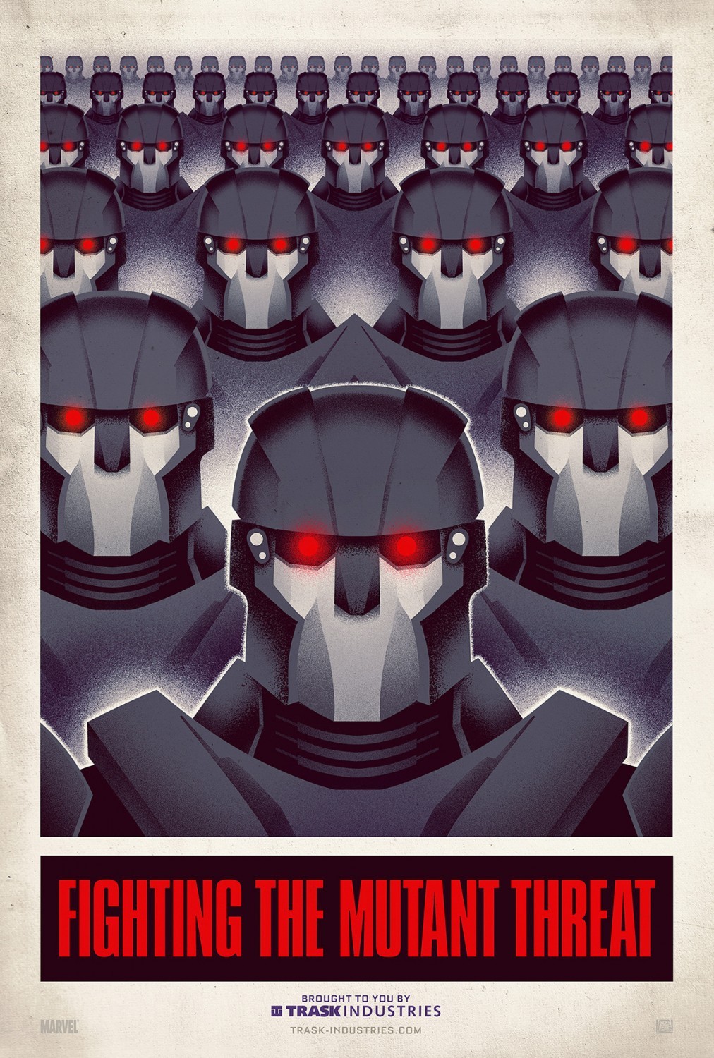
5,568 PointsI'm excited for Days of future past too. Shameless plug here but I did an illustration for DOFP a few months back, kind of a tribute to the 70's style posters that are going around. If you're interested...
Here's mine http://www.kryptonite-dove.com/wordpress/wp-content/uploads/2014/01/sentinel-screen.png
You can see the original here http://www.aceshowbiz.com/images/still/days-of-future-past-poster02.jpg
Peter G.
Courses Plus Student 5,806 PointsDude that's soo cool. Now I'm thinking I should done a contact form the Sentenials. :)
Emil Wallgren
11,737 PointsHere's my contribution :-) Wanted to get some kind of Tim Burton vibe to it! Enjoy! And have an awesome day! :-)
Full: http://codepen.io/EmilWallgren/full/hoqbC Code: http://codepen.io/EmilWallgren/pen/hoqbC
Adrian Carballo
6,311 PointsI decided to go with the classic form look. Few nice features though: mobile-ready, minimalistic design, and validation. Try submitting it! Full screen and Code.
John Coffin
10,359 PointsWell executed, and the little icons for the name and email save it from being too generic. They are also functional in that they remind the user what the information is after the user has typed something in.
The highlighting of the submit button is a bit too subtle for me. This can be a preference thing, or it may be specific to your design, so I'd say that if it works for you, leave it as it is.
Adrian Carballo
6,311 PointsThanks John Coffin, I will be making a couple of changes over the next days though, seeing that a lot of people are posting really good designs. Looking forward to see who wins!
Ilma Andayana
12,146 PointsHi everybody, Here is my contact form. Hope you love it!
John Coffin
10,359 PointsReally nicely done. Simple (which is good) but not without some nice touches. In particular, I like the rounded corners and the information bubbles (probably not the correct technical term) that pop up around the contact form as someone hovers over the different sections. I also like the fact that the submit button glows when you hover over it.
Becky Castle
15,294 PointsI agree w/ John! Nice work.
Ilma Andayana
12,146 PointsThank you, John and Becky!
Saad Aleem
6,089 PointsA few minor changes. This isn(n't even) my final form: fullscreen
Brandon Frederickson
2,325 PointsThis form is... nice, nice, baby...
Pen: http://codepen.io/BFrederickson11/pen/mDvGI Fullscreen: http://codepen.io/BFrederickson11/full/mDvGI
Richard Duncan
5,568 PointsSweet rotate on submit, like your style Brandon Frederickson
Brandon Frederickson
2,325 PointsThanks Richard Duncan
Becky Castle
15,294 PointsAhahahaha! I love it!
Priyajot Syan
Courses Plus Student 2,643 PointsHi Friends, Here is my entry for my first ever contest.Tried to keep it simple.Hope its a good one :-) Full Screen: http://codepen.io/syanshammi/full/uKIye and Code: http://codepen.io/syanshammi/pen/uKIye
Jose Ortiz
Courses Plus Student 6,161 PointsUpdated my entry hope you guys like it http://dreamcpu.com/ContactForm.html
oisin
5,286 PointsAfter a lot of blood sweat and tears ... mostly tears, here's the Fullscreen and Code ... It's a little bit messy but at least its responsive :) *The fonts only work in Chrome for some reason
Jose Ortiz
Courses Plus Student 6,161 PointsVery nice
Richard Duncan
5,568 PointsLike it a lot good work!
oisin
5,286 PointsThanks a lot :)
Eric Flowers
9,472 PointsLots of fun, learned a lot. Fullscreen and Code
Ilma Andayana
12,146 PointsYou really make this fun!
Eric Flowers
9,472 PointsThanks Ilma! I was admiring your hovering effects. I really like it.
Maurits Pallesen
9,770 PointsFirst thing i ever coded all by myself. I know it doesn't stand a chance to all the other fancy designs i've seen, but here it is. :) http://codepen.io/anon/pen/Hjcdf/?editors=110
Elle David
3,144 PointsIts a really simple form.
Full page: http://cdpn.io/uFCzI code: http://codepen.io/elledavid/pen/uFCzI/
Brayden Kness
12,492 PointsThis is amazing!
Robert Russell
8,958 Pointstry fixing font-family: on <textarea>. looks awesome!
Eric Flowers
9,472 PointsPops! love the colors
Elle David
3,144 Pointsthanks you guys! Robert Russell I added the style for the font so if the font was changing in different states, it should be fixed now.
Justin Whedon
21,009 PointsI've been busy and don't have time to do this, but one of the cooler site contact form's I've done lately is this one... http://previewhq.com/jeanie/#section-four
Carman A
7,672 PointsRedid mine. Well after long hour's, and many cups of iced tea, I got it to work(with pure css). Fullscreen and the pen. courtesy of the :valid pseudo element. This is my first contest. I realize it would probably be better to make it a visible one but this... this got mo' swag.
Richard Duncan
5,568 PointsI'm a little late to the party but here is my submission Fullscreen and Pen.
I've always seen forms as a bit of a chore and not much of a design challenge so wanted to give something different a try. I've attempted to pull together everything I have learned here, hope you guys enjoy it!
Don't forget to submit a valid form if you need to use the district line ;) please mind the gap!
Carman A
7,672 PointsThat's very creative.
Richard Duncan
5,568 PointsThanks carman arrington and Oisin McVeigh :)
oisin
5,286 Pointslove it, the background is great!
Thomas K
11,565 PointsHere's mine.
Stephen Omoarukhe
15,307 PointsMy entry http://codepen.io/kyngsteev/full/abyek. Thanks for the opportunity.
Becky Castle
15,294 PointsBahaha! I KNEW there was more bureaucracy to getting those beacons lit! Nice.
Michael Fraser
19,084 PointsHa! whoever put that font ('elvish ring') together has too much time on their hands.
Michael Ntambazi
Courses Plus Student 201 PointsRobert Russell
8,958 PointsSuch contact. So form. Very design WOWWW
Here's my go, I like pop-up stuff, so press the button.
full: http://codepen.io/robdoesweb/full/xbueq code: http://codepen.io/robdoesweb/pen/xbueq
Adam Sackfield
Courses Plus Student 19,663 PointsMateusz Szymanski I edited your post to add correct Markdown as your link was not showing. If you now click edit you can see how to add links to the forum :)
Adam Sackfield
Courses Plus Student 19,663 PointsAnother entry this time with a little design here
Justin Hunter
Courses Plus Student 11,484 PointsSimple and responsive with a couple subtle homages to Treehouse. Code | Fullscreen
Charlie Jaime
17,351 PointsThis will be my first forum contest entry ever Fullscreen- http://codepen.io/beowulf/full/nACKo Hope you guys like it any constructive feedback will be appreciated thank you.
Colin Barrett
11,446 PointsMy fist forum contest. Went with a minimalist flat UI. Lmk what yall think. http://codepen.io/colinbarrettdesign/full/ElpdB/
Denny Schuldt
4,623 PointsHi guys!
This is my first forum contest! :D Here's my entry: Full: http://codepen.io/DenkSchuldt/full/vasDq Code: http://codepen.io/DenkSchuldt/pen/vasDq
Regards! D.
Tom Lawrence
8,685 PointsHere is mine,
It is not responsive because I am not up to that bit of the track yet.
http://codepen.io/tomlawrenceuk/full/fpBIy
Hope you like.
Jacob Miller
12,466 PointsHere's mine: Fullscreen - Code
Justin Golownia
5,818 PointsMy first entry to a forum contest! There are a lot of things I want to do with it still, but I wanted to prove to myself that I can actually code something and start using what I've learned on treehouse so far :-) fullscreen and code
Any feedback is more than welcomed!
Hello Jonny
8,001 PointsHey you guys, I joined Treehouse last week and been enjoying it so far.
Here's my Fullscreen and Code
Chad Donohue
5,657 PointsHere is my entry. Fullscreen and pen.
Karan Barsiwal
4,861 Pointsnice
Richard Duncan
5,568 PointsLike it, good stuff.
Rémi BRUGUIER
4,970 PointsHello everyone ! Thanks TreeHouse for that neat little contest, very enjoyable. It's not perfect yet, but I spent way more time than I expected aleady, so here it is: FullScreen / Code
It should be compatible with most modern browsers and screen sizes.
Luis Felipe Lino
Full Stack JavaScript Techdegree Student 15,708 PointsI liked. It's beautiful and clean.
Tim Quincey
6,273 PointsHere is my entry! FullScreen / Code
Danielle Hill
26,062 PointsMy entry: Fullscreen and Code
John Coffin
10,359 PointsThis was a lot of fun. Here are links to the Fullscreen and the Code.
It was also frustratingly challenging for such a "simple" task. If anyone want an education in what they know and what they don't, you still have a few hours.
Chwan Lii Ng
7,502 PointsHere the final product, goes through from research, reference, modifying and design. No matter win or lose, I have learned a lot of things through this forum contest. & appreciate all other participant's design, once you had paid so much effort on your project, you're already is a winner =)! This is the Fullscreen and the code
Kyle Johnson
5,896 PointsKenny G = instant win. Awesome.
Chwan Lii Ng
7,502 Pointshaha, i m a fans of him. =)
Chwan Lii Ng
7,502 PointsGood job Friz, its awesome! :)
Frizman Zuri
iOS Development Techdegree Student 8,116 PointsThanks! :)
Frizman Zuri
iOS Development Techdegree Student 8,116 PointsThanks Chwan :)
Frizman Zuri
iOS Development Techdegree Student 8,116 Pointsooppss sorry
Jamie Tuffen
8,042 Pointsalthough now i've noticed I'm quite possibly late in getting my entry in :S got lost in the moment :S
Denny Schuldt
4,623 PointsCool! :D
Luis Felipe Lino
Full Stack JavaScript Techdegree Student 15,708 PointsNice one!
Luis Felipe Lino
Full Stack JavaScript Techdegree Student 15,708 PointsHey guys. That was a nice project, I'm happy with results. Good luck to everyone.
Here is my entry Code
Rémi BRUGUIER
4,970 PointsNice animations and transitions!
ES M
8,655 PointsHello!
This is the first Forum Contest I've taken part in. What a fun challenge - there are some really incredible entries!
I decided to test out my brand-new adobe illustrator/media query skills on this one too. Here's the code and the fullscreen version.
Kyle Johnson
5,896 PointsHere's mine. Spent a few days writing out the php before I realized it was purely a design challenge -__-. Lot's of fun, regardless!
Michael Fraser
19,084 PointsReally crisply styled, but the textarea has collapsed in my browser (safari 7) - just shows up as a horizontal line... Looks great in Chrome though. No idea whats up with that :)
Medua Okonta
8,808 PointsMy submission
Amr Tag
5,429 PointsI really have huge doubts about what I built here, there is definitely a room for a lot of improvements...but, how will I improve without participating in such contests, right? here is my participation: http://codepen.io/anon/pen/vHIuc/
leannakayla
6,817 PointsHere you go: fullscreen and code
This is actually my first time coding anything original since starting Treehouse. I had a late start on this and it was a bit difficult at first since my original idea required me to know Javascript (which I haven't gone through yet) but I have to say I'm happy with the way it turned out :)
Justin Hunter
Courses Plus Student 11,484 PointsSeriously good job!
leannakayla
6,817 PointsThanks! :D
David St.Germain
1,677 PointsHere's mine. And here's the full page preview. Hope y'all like it. ^^
Zinamarie Zeno
Front End Web Development Techdegree Student 8,590 PointsHere's my go at it. Hope ya like (:
Luis Felipe Lino
Full Stack JavaScript Techdegree Student 15,708 PointsI would like to see it, but actually my internet isn't working very well. =/
Michael Fraser
19,084 PointsNice - the overlapping circles are a nice touch. Good way of highlighting the focus on the form too; I tried by changing the background colour, but that seems to break in old ie. This would be a lot more durable in bad browsers!
Nick Pettit
Treehouse TeacherWow! I cannot believe how many entries this contest received. You all did an amazing job putting together these great entries. :)
This week's winner is Geert-Jan Hendriks! His contact form is very easy to scan and understand, makes good use of contrast and complementary colors, and has some great illustrations. The animations are also really nice.
This is mostly meant to be a design contest, but I also appreciate that Geert-Jan used the label element for each form field. This is a pretty important feature for accessibility and a lot of forms on the web these days are neglecting to use label elements in favor of the placeholder attribute. The W3C explicitly says "The placeholder attribute should not be used as a replacement for a label."
Congrats to Geert-Jan! Great stuff.
Charlie Hield
4,767 PointsCongrats Geert-Jan, love those error octopus!

Rémi BRUGUIER
4,970 PointsCongratulations !
Eric Flowers
9,472 PointsVery well done
Zinamarie Zeno
Front End Web Development Techdegree Student 8,590 PointsCongratulations! Your form was amazing!
Amr Tag
5,429 PointsCongratulations, well designed and executed :)
John Coffin
10,359 PointsThat was my favorite too!
Geert-Jan Hendriks
23,126 PointsThanks everybody! I never expected to win, there where so many great creative contact forms! This is awesome :)
leannakayla
6,817 PointsCongrats! ^.^/ Loved your animation and illustrations!
Ilma Andayana
12,146 PointsCongratulations!
Becky Castle
15,294 PointsNice job, Geert-Jan!
Emil Wallgren
11,737 PointsCongratulations! Great form! :-)
Jose Ortiz
Courses Plus Student 6,161 PointsCongrates :)
Adama Sy
7,076 PointsAdama Sy
7,076 PointsI looked at some entry and I decided that I should learn more before coming into this kind of challenge lol.
Tears in my eyes...realizing I'm still a beginner. Snif