Welcome to the Treehouse Community
Want to collaborate on code errors? Have bugs you need feedback on? Looking for an extra set of eyes on your latest project? Get support with fellow developers, designers, and programmers of all backgrounds and skill levels here with the Treehouse Community! While you're at it, check out some resources Treehouse students have shared here.
Looking to learn something new?
Treehouse offers a seven day free trial for new students. Get access to thousands of hours of content and join thousands of Treehouse students and alumni in the community today.
Start your free trial
ds20
Courses Plus Student 8,125 PointsGetting captions in an image gallery to move with images
So I recently finished the intro HTML & CSS courses and now I'm testing my skills by building a sample website. However, I'm having some trouble getting image captions to behave the way I'd like.
For my page, I'm trying to make a simple staff page, with pictures of staff members and their name and job title to the right of the pictures. This example I found on Google Images gives the basic idea: (http://nonprofithub.org/wp-content/uploads/2011/12/acumen_fund.png)
I have the staff list under a <ul> element. The staff members are each contained within a <li> element, with 3 parts: an <img> of the staff member, an <h2> with their name, and a <p> with a job title. However, right now the images and captions are just arranged in vertical columns, which makes the result that the 3 captions finish up by the second image. They just run right after one another instead of going to the right of the image.
I think I could get them to look right by really fiddling with the margins/padding, but I think that would get messed up if I tried to change the layout of the page, say by resizing the images.
So the thrust of my question is this: How can I try to "tie"/"anchor" my image captions to my images? My initial reaction is that it's an answer of floats/clears or margins, but I'm at a bit of a loss. I'll include my code as a comment below
3 Answers
Joseph Zimmerman
6,402 PointsGreat,
sounds like you just need to make a max width declaration for the container class. Also, you will need to remove the fixed margin and padding from the img element you applied in your original CSS markup.
Try using chrome dev tools to inspect the element that is forcing your descriptions to far to the right. You may not be far enough along yet in treehouse but if you open your page in chrome. go to view/developer/developer tools you will be able to inspect the markup for each element and can even add and remove properties to get to root of the problem.
Joseph Zimmerman
6,402 PointsO, I see you had already floated the image to the left. I believe if you float description to the left you'll have the results your looking for.
Or remove the image float and set a max width for you container you should be good.
Joseph Zimmerman
6,402 PointsIf I'm understanding you question properly you should be able to accomplish this with some easy code adjustments.
The quickest solution, while maybe not best practice would be...
wrap each list item with a div container so you can adjust margin and padding for each staff member profile. Within those container divs simply wrap the h2 and p elements in another div container and float these description containers to the right.
ds20
Courses Plus Student 8,125 PointsThanks for the reply. So I wrapped all the list items in their own divs, and did the same with the h2 and p, as you suggested. So my list items now look like this:
    <div class="container">
       <li>
          <img src="img/chaskin.jpg">
          <div class="description">
              <h2>Greedo</h2>
              <p>Supervising Attorney</p>
          </div>
       </li>
     </div>
and then I applied a right float in CSS:
.description {
  float: right;
}
With this, the descriptions now seem to line up correctly with their respective pictures, but on the far right side of the window, with just blank space in between the pictures on the left and the descriptions on the right. So is something still amiss, or do I now try to push them back together using negative margins or something?
For reference, here's a picture of what it looked like originally, and now with the floats:
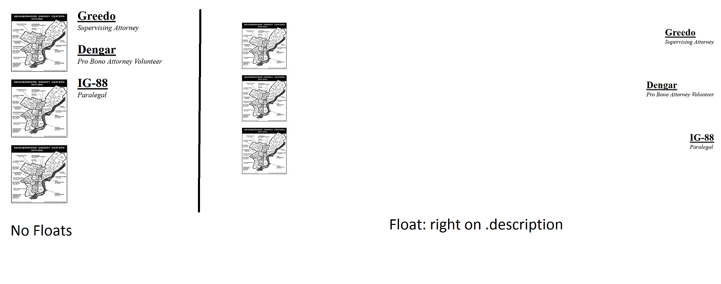
Also you mentioned this wouldn't be best practice- do you or others have a suggestion for what would be a better way to go about this? Since this is just a test, I'm happy to go for something that would take longer/involve writing more code, if it would be the better thing to do in the future.
ds20
Courses Plus Student 8,125 PointsYes! Setting the descriptions to float: left had the desired effect. I had tried looking in the dev tools, but I wasn't seeing anything in the box model that would force such a large shift. I'll try adjusting a max-width too, just for the practice, but thanks a lot for your help. I'd still be curious if you have an idea of "best practice" in a problem like this, but this has been very helpful and informative about the interaction of floats.
ds20
Courses Plus Student 8,125 Pointsds20
Courses Plus Student 8,125 PointsAnd my CSS for the page:
I have some other code at this point, a header and a link to the stylesheet and all that, but I believe the problem is isolated to these sections. When I put up a sample workspace with this code, the problem presents. (p.s. in the future i'll resize images before uploading but since this was just a trial I did it in the CSS)