Welcome to the Treehouse Community
Want to collaborate on code errors? Have bugs you need feedback on? Looking for an extra set of eyes on your latest project? Get support with fellow developers, designers, and programmers of all backgrounds and skill levels here with the Treehouse Community! While you're at it, check out some resources Treehouse students have shared here.
Looking to learn something new?
Treehouse offers a seven day free trial for new students. Get access to thousands of hours of content and join thousands of Treehouse students and alumni in the community today.
Start your free trial
Jordan Vermillion
586 PointsHaving a Nav/Header issue on the "How to Make a Website" track
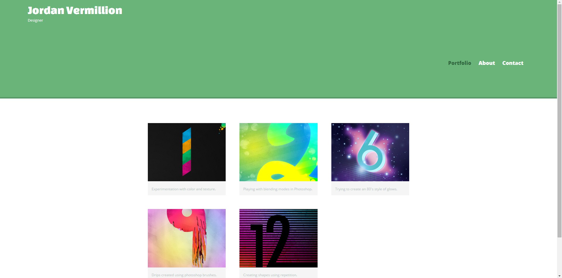
I'm making my way through the "How to Make a Website" portion of the Web Design track, and as far as I can tell, I have followed Nick's code exactly. Yet my page's Nav/Header is pretty messed up. It's a little frustrating trying to troubleshoot this issue because I can't for the life of me figure out what's wrong. Any help would be greatly appreciated!
Here are pictures of the difference:

Here's my code:
<header>
      <a href="index.html" id="logo">
        <h1>Jordan Vermillion</h1>
        <h2>Designer</h2>
      </a>
      <nav>
        <ul>
          <li><a href="index.html" class="selected">Portfolio</a></li>
          <li><a href="about.html">About</a></li>
          <li><a href="contact.html">Contact</a></li>
        </ul>
      </nav>
    </header>
/***********
HEADING
***********/

header {
  float: left;
  margin: 0 0 30px 0;
  padding: 5px 0 0 0;
  width: 100%;
}


#logo {
  text-align: center;
  margin: 0;
}

h1 {
  font-family: 'Changa One', sans-serif;
  margin: 15px 0;
  font-size: 1.75em;
  font-weight: normal;
  line-height: 0.8em;
}

h2 {
font-size: 0.75em;
margin: -5px 0 0;
font-weight: normal;
}


/***********
NAVIGATION
***********/

nav {
  text-align: center;
  padding: 10px 0;
  margin: 20px 0 0;
}

nav ul {
  list-style: none;
  margin: 0 10px;
  padding: 0;
}

nav li {
  display:inline-block;
}

nav a {
  font-weight: 800;
  padding: 15px 10px;
}
And here is Nick's code from the source files:
 <header>
      <a href="index.html" id="logo">
        <h1>Nick Pettit</h1>
        <h2>Designer</h2>
      </a>
      <nav>
        <ul>
          <li><a href="index.html" class="selected">Portfolio</a></li>
          <li><a href="about.html">About</a></li>
          <li><a href="contact.html">Contact</a></li>
        </ul>
      </nav>
    </header>
/**********************************
HEADING
***********************************/

header {
  float: left;
  margin: 0 0 30px 0;
  padding: 5px 0 0 0;
  width: 100%;
}

#logo {
  text-align: center;
  margin: 0;
}

h1 {
  font-family: 'Changa One', sans-serif;
  margin: 15px 0;
  font-size: 1.75em;
  font-weight: normal;
  line-height: 0.8em;
}

h2 {
  font-size: 0.75em;
  margin: -5px 0 0;
  font-weight: normal;
}


/**********************************
NAVIGATION
***********************************/

nav {
  text-align: center;
  padding: 10px 0;
  margin: 20px 0 0;
}

nav ul {
  list-style: none;
  margin: 0 10px;
  padding: 0;
}

nav li {
  display: inline-block;
}

nav a {
  font-weight: 800;
  padding: 15px 10px;
}
Jordan Vermillion
586 PointsMy Page: http://i.imgur.com/2AERsJt.jpg Nick's Page: http://i.imgur.com/g9zMJgP.jpg
Sorry about the delay!
5 Answers
Jacob Miller
12,466 PointsHmm.. I replaced his code in the source files with your code and all looks good. Can you post all your code so far, or put it in a codepen and link to it? Thanks.
Jordan Vermillion
586 Pointshttp://codepen.io/anon/pen/dsEot/
Here ya go!
Jacob Miller
12,466 PointsIt looks good in the codepen - what browser are you using?
Jordan Vermillion
586 PointsUsing chrome, tried it on Firefox, but not IE.
Edit: Tried in IE, same issue.
Jacob Miller
12,466 PointsWell, if you're still having a problem, I don't know what to tell you - the code you posted in codepen works perfectly over here.
Jordan Vermillion
586 PointsIt's so strange, because it looks the same on my home and work computers. However, in CodePen, it looks totally fine. Could it be an issue with Workspaces?
Jacob Miller
12,466 PointsI just figured out why it's doing that. It's the responsive.css file. It has a media query that's changing the header around when the page is 660px or larger. If you delete that media query it will keep the everything centered in the header.
Jordan Vermillion
586 PointsThat is part of the lesson though. In interest of following the lesson as closely as possible, I'd like to keep it. I don't know if I'll need it later.
Also weird since the project's source files have the same media query. I actually just went and copied the one from the source file and replaced mine just to be 100% sure that everything is correct. Nick's still works, mine still doesn't.
Either way I appreciate your help man, just trying to do everything the right way haha
Jordan Vermillion
586 Points*

Jacob Miller
12,466 PointsJacob Miller
12,466 PointsCan you repost or link to your screenshots? I'm not seeing them.