Welcome to the Treehouse Community
Want to collaborate on code errors? Have bugs you need feedback on? Looking for an extra set of eyes on your latest project? Get support with fellow developers, designers, and programmers of all backgrounds and skill levels here with the Treehouse Community! While you're at it, check out some resources Treehouse students have shared here.
Looking to learn something new?
Treehouse offers a seven day free trial for new students. Get access to thousands of hours of content and join thousands of Treehouse students and alumni in the community today.
Start your free trial
Randy Rubin
1,757 Pointshelp: Responsive Design issue in "How to Make A Website"
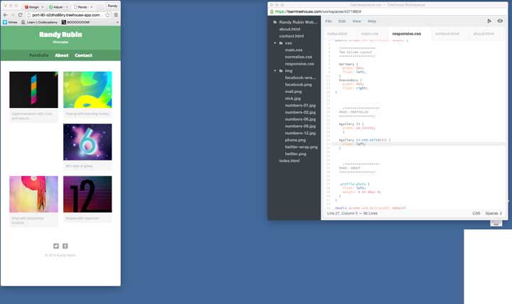
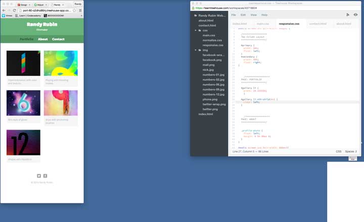
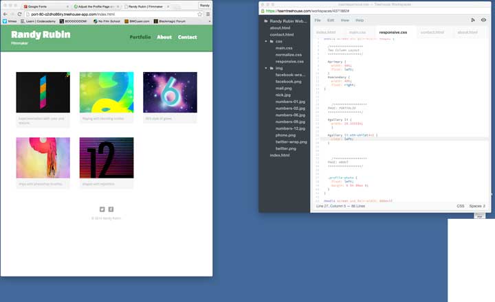
In the responsive design part of "How to Make a Website", specifically "Build Three Column Layout", Nick shows us how to use the li:nth-child (4n) so that the 4th image block clear:left. However during the transition, or breakpoint, from <480 to >480 the 3rd image block seems to not be clearing left and a space is left and the 4th block is forced onto the third row. I took some photos but I don't see a way to upload on the forum. My code is below:
@media screen and (min-width: 480px) {
#gallery li { width: 28.33333%; }
#gallery li:nth-child(4n) { clear: left; }
}
hum4n01d
25,493 PointsWould you please upload your code to http://codepen.io or http://jsfiddle.net so that Robert and I can look at it and get you an answer?
Randy Rubin
1,757 Points

@media screen and (min-width: 480px) {

  /******************
  Two Column Layout
  ******************/

  #primary {
    width: 50%;
    float: left;
  }
  #secondary {
    width: 40%;
    float: right;
}


    /******************
  PAGE: PORTFOLIO
  ******************/

  #gallery li {
    width: 28.33333%;
    }

  #gallery li:nth-child(4n) {
    clear: left;
  }


    /******************
  PAGE: ABOUT
  ******************/


  .profile-photo {
    float: left;
    margin: 0 5% 80px 0;
  }
}

@media screen and (min-width: 660px){

    /******************
  HEADER
  ******************/


  nav {
    background: none;
    float: right;
    font-size: 1.125em;
    margin-right: 5%;
    text-align: right;
    width: 45%;
  }

  #logo {
    float: left;
    margin-left: 5%;
    text-align: left;
    width:45%;
  }

  h1 {
    font-size: 2.5em;
  }

  h2 {
    font-size: 0.825em;
    margin-bottom: 20px;
  }

  header {
    border-bottom: 5px solid #599a68;
    margin-bottom: 60px;
  }
}
<!DOCTYPE html>
<html>
<head>
<meta charset="utf-8">
<title>Randy Rubin | Filmmaker</title>
<link rel="stylesheet" href="css/normalize.css">
<link href='http://fonts.googleapis.com/css?family=Changa+One|Open+Sans:400italic,700italic,400,700,800' rel='stylesheet' type='text/css'>
<link rel="stylesheet" href="css/main.css">
<link rel="stylesheet" href="css/responsive.css">
<meta name="viewport" content="width=device-width, initial-scale=1.0">
</head>
<body>
<header>
<a href="index.html" id="logo">
<h1>Randy Rubin</h1>
<h2>Filmmaker</h2>
</a>
<nav>
<ul>
<li><a href="index.html" class="selected">Portfolio</a></li>
<li><a href="about.html" >About</a></li>
<li><a href="contact.html" >Contact</a></li>
</ul>
</nav>
</header>
<div id="wrapper">
<section>
<ul id="gallery">
<li>
<a href="img/numbers-01.jpg">
<img src="img/numbers-01.jpg" alt="">
<p>Experimentation with color and texture.</p>
</a>
</li>
<li>
<a href="img/numbers-02.jpg">
<img src="img/numbers-02.jpg" alt="">
<p>Playing with blending modes.</p>
</a>
</li>
<li>
<a href="img/numbers-06.jpg">
<img src="img/numbers-06.jpg" alt="">
<p>80's style of glows</p>
</a>
</li>
<li>
<a href="img/numbers-09.jpg">
<img src="img/numbers-09.jpg" alt="">
<p>drips with photoshop brushes</p>
</a>
</li>
<li>
<a href="img/numbers-12.jpg">
<img src="img/numbers-12.jpg" alt="">
<p>shapes with repetition</p>
</a>
</li>
</ul>
</section>
<footer>
<a href="http://www.twitter.com"><img src="img/twitter-wrap.png" alt="Twitter Logo" class="social-icon"></a>
<a href="http://www.facebook.com"><img src="img/facebook-wrap.png" alt="Facebook Logo" class="social-icon"></a>
<p>© 2014 Randy Rubin.</p>
</footer>
</div>
</body>
</html>
hum4n01d
25,493 Pointshum4n01d
25,493 PointsPlease paste all of your css into a comment so that I can add it to the pen
Randy Rubin
1,757 PointsYep, the css I posted above was the responsive.css.
main.css:
/******************
General
******************/

body {
 font-family: 'Open Sans', sans-serif;
}

#wrapper {
  max-width: 940px;
  margin: 0 auto;
  padding: 0 5%;
}

a {
  text-decoration: none;
}

img {
 max-width: 100%;
}

h3 {
  margin: 0 0 1em 0;
}


/******************
Heading
******************/

header {
  float: left;
  margin: 0 0 30px 0;
  padding: 5px 0 0 0;
  width: 100%;
}

#logo {
  text-align: center;
  margin: 0;
}

h1 {
  font-family: 'Changa One', sans-serif;
  margin: 15px 0;
  font-size: 1.75em;
  font-weight: normal;
  line-height: 0.8em;
}

h2 {
  font-size: 0.75em;
  margin: -5px 0 0;
  font-weight: normal;
}


/******************
Navigation
******************/


nav {
  text-align: center;
  padding: 10px 0;
  margin: 20px 0 0;
}

nav ul {
  list-style: none;
  margin: 0 10px;
  padding: 0;
}

nav li {
  display: inline-block;
}

nav a {
font-weight: 800;
  padding: 15px 10px;
}


/******************
Footer
******************/


footer {
  font-size: 0.75em;
  text-align: center;
  clear: both;
  padding-top: 50px;
  color: #ccc;
}

.social-icon {
  width: 20px;
  height: 20px;
  margin: 0 5px;
}


/******************
Page: Portfolio
******************/


#gallery {
  margin: 0;
  padding: 0;
  list-style: none;
}

#gallery li {
  float:left;
  width: 45%;
  margin: 2.5%;
  background-color: #f5f5f5;
  color: #bdc3c7;
}

#gallery li a p {
  margin: 0;
  padding: 5%;
  font-size: 0.75em;
  color: #bdc3c7;
}


/******************
Page: About
******************/


.profile-photo {
  display: block;
  max-width: 150px;
  margin: 0 auto 30px;
  border-radius: 100%;
}


/******************
Page: Contact
******************/


.contact-info {
  list-style: none;
  padding: 0;
  margin: 0;
  font-size: 0.9em;
}

.contact-info a {
  display: block;
  min-height: 20px;
  background-repeat: no-repeat;
  background-size: 20px 20px;
  padding: 0 0 0 30px;
  margin: 0 0 10px;
}

.contact-info li.phone a {
  background-image: url('../img/phone.png');
}

.contact-info li.mail a {
  background-image: url('../img/mail.png');
}

.contact-info li.twitter a {
  background-image: url('../img/twitter.png');
}


/******************
Colors
******************/

/* site body */

body {
  background-color: #fff;
  color: #999;
}

/* green header */
header {
  background: #6ab47b;
  border-color: #599a68;
}

/* nav background on mobile */

nav {
  background: #599a68;
}

/* logo text */

h1, h2 {
  color: #fff;
}

/* links */

a {
  color: #6ab47b
}

/* nav link */

nav a, nav a:visited {
  color: #fff;
}

/* selected nav link */

nav a.selected, nav a:hover {
  color: #32673f;
}
2 Answers
Damien Watson
27,419 PointsHi Randy,
I had this same issue and fixed it by changing it to the third child, oops, I mean adding a definition for the third child:
#gallery li:nth-child(3n) { clear:left; }
Randy Rubin
1,757 PointsCool, I'll give that a try.
Damien Watson
27,419 PointsSorry, I jumped the gun on my explanation of where to put this.
In the media query (min-width:480px) above the 'nth-child(4n)' you need to add:
#gallery li:nth-child(3n) { clear:none; }
and you add the 'clear:left' in your main css.
Robert Richey
Courses Plus Student 16,352 PointsIn the downloadable project files, this page does the same thing. Right around 344 - 347px screen width, the images shift. This is because the caption text in the first image is slightly too big at that screen width.
There's nothing wrong with your code, it's just a bug from the course.
Randy Rubin
1,757 PointsI see, thanks!

Robert Richey
Courses Plus Student 16,352 PointsRobert Richey
Courses Plus Student 16,352 PointsHi Randy,
There's a link on this page called Markdown Cheatsheet that shows how to link to a hosted image.
Consider posting your entire HTML and CSS files - letting us see all the code will increase the chance of someone knowing how to solve the problem.
Cheers