Welcome to the Treehouse Community
Want to collaborate on code errors? Have bugs you need feedback on? Looking for an extra set of eyes on your latest project? Get support with fellow developers, designers, and programmers of all backgrounds and skill levels here with the Treehouse Community! While you're at it, check out some resources Treehouse students have shared here.
Looking to learn something new?
Treehouse offers a seven day free trial for new students. Get access to thousands of hours of content and join thousands of Treehouse students and alumni in the community today.
Start your free trial
Ibrahim Rodríguez
Courses Plus Student 2,495 PointsHow to achieve this?
Hey guys,
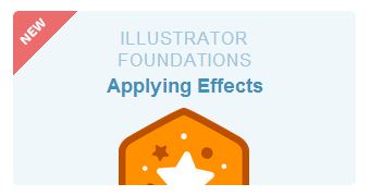
How to achieve this using css? http://cl.ly/image/0v1E1O0o191S
That little 'New' tag with rounded border over a rounded box.
Thanks!
5 Answers
John Locke
15,479 PointsHi Ibrahim:
The larger rounded box is achieved with the border-radius property in CSS.
The corner is a separate div, with a red background-color, and a background-image of a PNG with the top triangle transparent, and the bottom diagonal triangle is the same color as the larger background div.
Inside of that smaller corner div, there is an icon image of the "NEW" text.
You can also right-click > View Source or right-click > Inspect Element in Google Chrome to see how any webpage is built.
Ryan Matsudaira
Courses Plus Student 885 PointsThis can be achieved by placing a div inside of another block level element that has an overflow:hidden. On the div, use CSS to create a triangle, then rotate that div -45 degrees. Inside of that div, have an absolutely positioned span that contains the text "NEW". Use negative margins to position the triangle and absolute positioning for the "NEW" text. It's kind of hacky and impractical I feel, but it gives you the desired effect. Attached is the CSS and associated markup...
<style type="text/css">

article{
border:1px solid #ccc;
border-radius:10px 0 0 0;
float:left;
padding:10px;
overflow:hidden;
width:300px;}

.triangle{
border-bottom: 60px solid #f16a6c;
border-left: 60px solid transparent;
border-right: 60px solid transparent;
float:left;
margin-left:-62px;
position:relative;
top:-22px;
-webkit-transform: rotate(-45deg);}

.triangle > span{
color:#fff;
font-size:1em;
font-weight:bold;
position:absolute;
right:-26px;
top:40px;}

</style>

<article>
    <div class="triangle">
    <span>NEW</span>
    </div>
    <p>lorem ipsum</p>
</article>
James Barnett
39,199 PointsIbrahim Rodríguez - The method John Locke mentioned is how Treehouse did it.
However you can do it in pure CSS in roughly 3 parts:
- use the CSS triangle trick
- use border-radius w/ overflow hidden on the box
- position & rotate the "new" text.
Here's a codepen demo to do that.
James Barnett
39,199 PointsI got bored, so I decided to duplicate the look & feel of this in pure CSS3 as a challenge to myself.
Here's a working demo: http://codepen.io/jamesbarnett/pen/sDEom
Ibrahim Rodríguez
Courses Plus Student 2,495 PointsJohn Locke Thanks so much! I just checked the Inspect Element in Google Chrome and it's pretty helpful.
Ryan Matsudaira Thanks Ryan! I wish I could do these things that fast! I added your code to my favorites.
James Barnett Awesome! I just wanted to know about the corner but now you duplicated the whole thing I can just check more stuff in it.
Thanks a lot for your help, have a great week!