Welcome to the Treehouse Community
Want to collaborate on code errors? Have bugs you need feedback on? Looking for an extra set of eyes on your latest project? Get support with fellow developers, designers, and programmers of all backgrounds and skill levels here with the Treehouse Community! While you're at it, check out some resources Treehouse students have shared here.
Looking to learn something new?
Treehouse offers a seven day free trial for new students. Get access to thousands of hours of content and join thousands of Treehouse students and alumni in the community today.
Start your free trial
Jim Carrot
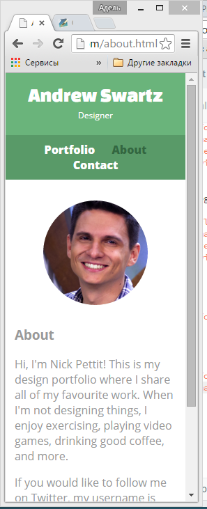
888 PointsI found that there is moment when the last nav element (link to Contact page) goes little lower than other nav elements
Here is what I mean. https://i.gyazo.com/cb0bb8d038e0f6812ed5deeee4e25f85.png https://i.gyazo.com/e16f88ac016f9259b085a4a22e318e46.png My code is absolutely exact with Nick's one.
9 Answers
Amir Saar
4,690 PointsHi Jim, I've found another solution... On the css selector: nav ul - set the margin to 0 5px. that should solve it.
Dustin McCaffree
14,310 PointsCan you post your current code here? That's the only way we can really help :)
Jim Carrot
888 PointsWill it be ehough to add code for main.css and index.html?
Dustin McCaffree
14,310 PointsYes that should be fine :)
Jim Carrot
888 PointsI am repeating that it is absolutely the same as Nick's one:) <!DOCTYPE html> <html> <head> <meta charset="utf-8"> <title>Andrew Swartz | Designer</title> <link rel="stylesheet" href="css/normalize.css"> <link href='https://fonts.googleapis.com/css?family=Changa+One|Open+Sans:400,400italic,700,700italic,800' rel='stylesheet' type='text/css'> <link rel="stylesheet" href="css/main.css"> <link rel="stylesheet" href="css/responsive.css"> <meta name="viewport" content="width=device-width, initial-scale=1.0"> </head> <body> <header> <a href="index.html" id="logo"> <h1>Andrew Swartz</h1> <h2>Designer</h2> </a> <nav> <ul> <li><a href="index.html" class="selected">Portfolio</a></li> <li><a href="about.html">About</a></li> <li><a href="contact.html">Contact</a></li> </ul> </nav> </header> <div id="wrapper"> <section> <ul id="gallery"> <li> <a href="img/numbers-01.jpg"> <img src="img/numbers-01.jpg" alt=""> <p>Experimentation with color and texture.</p> </a> </li>
<li>
<a href="img/numbers-02.jpg">
<img src="img/numbers-02.jpg" alt="">
<p>Playing with blending modes in Photoshop.</p>
</a>
</li>
<li>
<a href="img/numbers-06.jpg">
<img src="img/numbers-06.jpg" alt="">
<p>Trying to create an 80's style of glows.</p>
</a>
</li>
<li>
<a href="img/numbers-09.jpg">
<img src="img/numbers-09.jpg" alt="">
<p>Drips created using Photoshop brushes.</p>
</a>
</li>
<li>
<a href="img/numbers-12.jpg">
<img src="img/numbers-12.jpg" alt="">
<p>Creating shapes using repetition.</p>
</a>
</li>
</ul>
</section>
<footer>
<a href="http://twitter.com/nickrp"><img src="img/twitter-wrap.png" alt="Twitter Logo" class="social-icon"></a>
<a href="http://facebook.com/nickpettit"><img src="img/facebook-wrap.png" alt="Facebook Logo" class="social-icon"></a>
<p>© 2015 Andrew Swartz.</p>
</footer>
</div>
</body> </html>
Jim Carrot
888 Points/******************** GENERAL *********************/
body { font-family: 'Open Sans', sans-serif; }
wrapper
{ max-width: 940px; padding: 0 5%; margin: 0 auto; }
a { text-decoration: none; }
img { max-width: 100%; }
h3 { margin: 0 0 1em 0; }
/******************** HEADING *********************/
header { float: left; margin: 0 0 30px 0; padding: 5px 0 0 0; width: 100%; }
logo
{ text-align: center; margin: 0; }
h1 { font-family: 'Changa One', sans-serif; margin: 15px 0; font-size: 1.75em; font-weight: normal; line-height: 0.8em; }
h2 { font-size: 0.75em; margin: -5px 0 0; font-weight: normal; }
/******************** NAVIGATION *********************/
nav { text-align: center; padding: 10px 0; margin: 20px 0 0;
}
nav ul { list-style: none; margin: 0 10px; padding: 0; }
nav li { display: inline-block; }
nav a { font-weight: 800; padding: 15px 10px; }
/******************** FOOTER *********************/
footer { font-size: 0.75em; text-align: center; clear: both; padding-top: 50px; color: #ccc; }
.social-icon { width: 20px; height: 20px; margin: 0 5px; }
/******************** PAGE: PORTFOLIO *********************/
gallery
{ margin: 0; padding: 0; list-style: none; }
gallery li
{ float: left; width: 45%; margin: 2.5%; background-color: #f5f5f5; color: #bdc3c7; }
gallery li a p
{ margin: 0; padding: 5%; font-size: 0.75em; color: #bdc3c7; }
/******************** PAGE: ABOUT *********************/
.profile-photo { clear: both; display: block; max-width: 150px; margin: 0 auto 30px; border-radius: 100%; }
/******************** PAGE: CONTACT *********************/
.contact-info { list-style: none; margin: 0; padding: 0; font-size: 0.9em; }
.contact-info a { display: block; min-height: 20px; background-size: 20px 20px; background-repeat: no-repeat; padding: 0 0 0 30px; margin: 0 0 10px; }
.contact-info li.phone a { background-image: url(../img/phone.png); }
.contact-info li.mail a { background-image: url(../img/mail.png); }
.contact-info li.twitter a { background-image: url(../img/twitter.png); }
/******************** COLORS *********************/
/* site body */ body { background-color: #fff; color: #999; }
/* green header */ header { background: #6ab47b; border-color: #599a68; }
/* nav background on mobile */ nav { background: #599a68; }
/* logo text */ h1, h2 { color: #fff; }
/* links */ a { color: #6ab47b; }
/* nav link */ nav a, nav a:visited { color: #fff; }
/* selected nav link */ nav a.selected, nav a:hover { color: #32673f; }
Diwesh Saxena
15,512 PointsJim Carrot : I have the same problem as yours . Did you find a solution ?
Jim Carrot
888 PointsNo. I think that the code is supposed to work like this.
Michal Janek
Front End Web Development Techdegree Graduate 30,654 PointsI am having the same issue, I am interested if that is how it is supposed to be or not....in the video Nick is not having this Issue.
Michal Janek
Front End Web Development Techdegree Graduate 30,654 PointsI managed to fix this by changing the width % ratio between the header {35%} and logo {55%}
Abdullahi Ali
472 Pointsi have this same problem if any one know the solution please let me know thanks!!!
Abdullahi Ali
472 Pointshi Jim Carrot, i have tryied this way and it works please try it
nav a { font-weight: 800; padding: 5px 5 px; }