Welcome to the Treehouse Community
Want to collaborate on code errors? Have bugs you need feedback on? Looking for an extra set of eyes on your latest project? Get support with fellow developers, designers, and programmers of all backgrounds and skill levels here with the Treehouse Community! While you're at it, check out some resources Treehouse students have shared here.
Looking to learn something new?
Treehouse offers a seven day free trial for new students. Get access to thousands of hours of content and join thousands of Treehouse students and alumni in the community today.
Start your free trial
alborz
Full Stack JavaScript Techdegree Graduate 30,885 PointsI think I've found an issue with Chrome rendering the UI
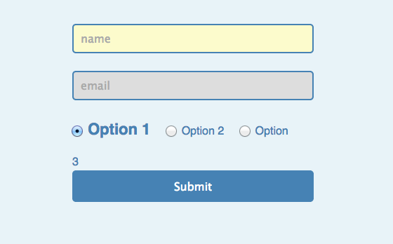
So after completing the end of this video's coding -- styling the adjacent labels once the user selects the radio button -- for some reason the "3" in "Option 3" floats below the Option 1 label in the UI. However when using Firefox, this issue doesn't exist and the "3" remains within the width of the div element.
Hope this isn't an actual issue - thanks.
alborz
Full Stack JavaScript Techdegree Graduate 30,885 PointsHi Chris,
Here's my code below:
<!DOCTYPE html>
<html>
<head>
    <title>UI Element States Pseudo-Classes</title>
    <link rel="stylesheet" href="css/style.css">
</head>
<body>
    <form>
        <input type="text" name="name" placeholder="name">
        <input type="text" name="email" placeholder="email" disabled>
        <div>
            <input name="radio" id="radio1" type="radio"><label for="radio1">Option 1</label>
            <input name="radio" id="radio2" type="radio"><label for="radio2">Option 2</label>
            <input name="radio" id="radio3" type="radio"><label for="radio3">Option 3</label>
        </div>
        <input type="submit" name="submit">
    </form>
</body>
</html>
body {
    background-color: #e8f3f8;
    font: 1em/1.5 sans-serif;
}
form {
    margin: 50px auto;
    width: 320px;
    color: steelblue;
}
input {
    padding: 10px;
    border-radius: 5px;
    font-size: inherit;
}
input[type="text"] {
    display: block;
    margin-bottom: 25px;
    width: 100%;
    border: 2px solid steelblue;
}
input[type="radio"] {
    margin: 0 8px 25px 18px;
}
input[type="radio"]:first-child {
    margin-left: 0;
}
input[type="submit"] {
    width: 344px;
    height: 45px;
    border: none;
    background: steelblue;
    color: white;
    cursor: pointer;
}

/* UI Element States Pseudo-Classes */

input[type="text"]:enabled {
    background-color: #fcfbcc;
}

:disabled {
    background: #ddd;
}

input[type="radio"]:checked + label {
    font-size: 22px;
    font-weight: bold;
}
Chris Shaw
26,676 PointsI just tested your above code and saw a consistent result, the below screenshot is from Chrome 37 on Windows.
4 Answers
Melody Schech
2,977 PointsI am using firefox and had the same issue with dangling "3", I changed the form width to 326px and resolved the issue.
alborz
Full Stack JavaScript Techdegree Graduate 30,885 PointsWell that worked. :)
alborz
Full Stack JavaScript Techdegree Graduate 30,885 PointsI apologize I should have been been specific and included that the issue occurs when the user selects a radio button; in Chrome (I tested on Version 37.0.2062.124 on a Mac) when I select a radio button, the "3" floats below "Option 1". In Firefox this doesn't occur...
Below I included the screenshot. I also tested using the "final" files from the lesson, showing the same result.
Nicholas Christiny
1,826 PointsI see the same behaviour, also on a Mac with Chrome, using Workspaces.
I've noticed a few other peculiarities similar to this elsewhere in these tutorials and chalked it up to browser rendering issues.
Melody Schech
2,977 PointsI also had to change the font-size to 15.
Maria T. Rodriguez
UX Design Techdegree Student 5,914 PointsHello, I have encountered the same problem with the number 3 floating on the next line instead of the same line.
I tried Firefox and Safari and I'm getting the same error.
I'm curious to see why this is happening.
Melody Schech
2,977 PointsI think that what may have happened is that the CSS was corrected for the web browser view in the video, but not the written code. I went back to check the codepen view of the brower and the dangling 3 is there too after the "checked" input is added. So to sum up the changes I made:
form { margin: 80px auto; width: 326px; color: steelblue;
Here I changed the width from 320px to 326px, this corrects the line so all numbers are on one line.
input[type="radio"]:checked + label { font-size: 15px; font-weight: bold; } I changed the font-size from 20px to 15px, this corrects the dangling 3 when this part is added.
Christine Bergeron
2,533 PointsI know this isn't the real solution to this issue, but changing the font-size of the radio labels does prevent that annoying dangling "3" from occurring. Also, changing the width of the form works, too. Not the perfect solution, but it is easier on the eyes at least.


Chris Shaw
26,676 PointsChris Shaw
26,676 PointsHi Alborz,
Could you please post the code you have as without it we can't say for sure what's going on.
https://teamtreehouse.com/forum/howto-guide-markdown-within-posts