Welcome to the Treehouse Community
Want to collaborate on code errors? Have bugs you need feedback on? Looking for an extra set of eyes on your latest project? Get support with fellow developers, designers, and programmers of all backgrounds and skill levels here with the Treehouse Community! While you're at it, check out some resources Treehouse students have shared here.
Looking to learn something new?
Treehouse offers a seven day free trial for new students. Get access to thousands of hours of content and join thousands of Treehouse students and alumni in the community today.
Start your free trial
Aneta Molenda
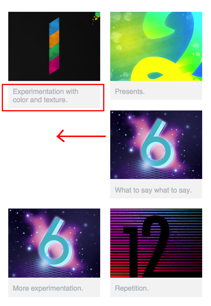
2,004 PointsImage caption preventing third image floating left in two-column design
Having trouble with responsive columns. I did everything from the video, except I wrote my own random image captions. Even with n-th child, I'm noticing that the longer captions take up two rows of text and short captions take up one row of text, which means my 3rd image is not floating left in the mobile size.
1 Answer
Alison Brodribb
24,615 PointsYou could clear the left side for every odd floated image, as per below:
#gallery li:nth-child(2n+1) { clear: left; }
Since this would muck up your formatting for your 3-column layout, you'd also need to either remove the above formatting in your 3-column layout by changing it to clear: none, or you could do what I've done, which is include the code in a media query for screen width of less than 480px:
@media screen and (max-width: 479px) {
#gallery li:nth-child(2n+1) {
clear: left;
}
}
Aneta Molenda
2,004 PointsAneta Molenda
2,004 PointsWorks very well now with the new media query. Thanks a bunch!