Welcome to the Treehouse Community
Want to collaborate on code errors? Have bugs you need feedback on? Looking for an extra set of eyes on your latest project? Get support with fellow developers, designers, and programmers of all backgrounds and skill levels here with the Treehouse Community! While you're at it, check out some resources Treehouse students have shared here.
Looking to learn something new?
Treehouse offers a seven day free trial for new students. Get access to thousands of hours of content and join thousands of Treehouse students and alumni in the community today.
Start your free trial
Brad Lacke
7,438 PointsIs it possible to "specify" that content goes into a certain column, or span of columns?
Apologies if this is fairly obvious but I've looked all over the internet and have only gotten more confused.
It seems that in most discussions on grid layouts, and in Guil's videos, columns are used to be precise about width and proportion, but you're still kind of obligated to fill the parent container in each row.
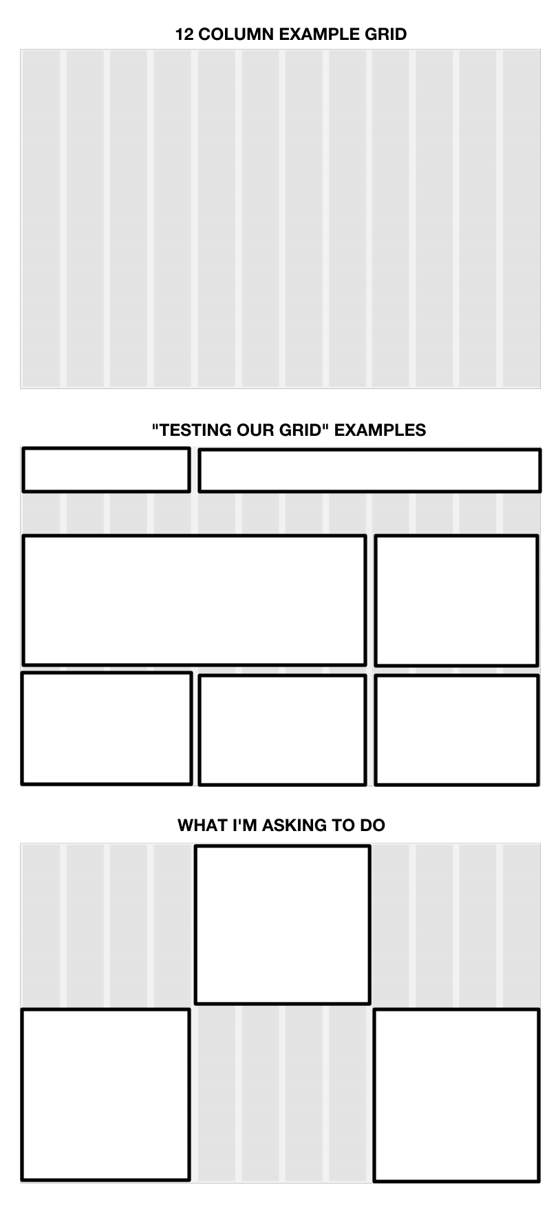
What if I wanted, say, a mostly empty row with just an image taking up the middle columns, "inset" for lack of a better word. Telling it to span four columns would leave it on the left side, while having it go to the eighth column makes it an eight-column element, which also isn't what I'm after. Basically Im wondering if you can specify a "start" column and an "end" column from within a grid structure. Possible?
Edit for clarity:
Brad Lacke
7,438 PointsKonrad, yeah, exactly. Like say, in a 12 column grid, I wanted a block of text locked into the center 4 columns only, and then as another example, further down the page I wanted a 4-column block of text from columns 2 through 5, and another one in the rightmost four columns. Seems like that would be the entire purpose of a grid layout, but I can't find anyone addressing dead space and/or exact positioning.
Konrad Pilch
2,435 PointsI dont fully get you what you mean : ( Could you draw it or something? and example form web ?
4 Answers
Konrad Pilch
2,435 PointsI found out something, you can use offset like offset 2 i think.
Brad Lacke
7,438 PointsAh that's perfect! Thanks again, I knew there was something obvious I just didn't understand.
Konrad Pilch
2,435 PointsIf i remember right:
<div class="row">

       <div class="col-md-4">
                        <!-- Im empty -->
       </div><!-- col-md-4 -->

<div class="col-md-4">
                        <!-- Im in middle -->
<h1>Im in middle </h1>
       </div><!-- col-md-4 -->

<div class="col-md-4">
                        <!-- Im empty -->
       </div><!-- col-md-4 -->

</div><!-- /row -->
Brad Lacke
7,438 PointsI see - so the best way to do that is basically using a framework and making columns to take up the desired empty slots?
Konrad Pilch
2,435 PointsI mean, you can use a framework to do it or not.
Think it as if you have theh power to do anything . So if you want top in the middle , you could either set the margin to 0 auto , and make it e.g 400px wide. While in the bottom , yo ucould put it in some div, set it to 1200px and then put there two box 400px and one to set float left and other to float right or you can justify the space somehow. Look on justify in google in css tricks .
I hope this helps : p
Brad Lacke
7,438 PointsIt does, I guess I got wrapped up in trying to solve the problem with grids when the solution is much easier. Thanks for the response!
Mark VonGyer
21,239 PointsTreehouse bashes on and on about not doing this. Inserting images into a table isn't what tables are designed for.
You could place the image with an absolute positioning so that it sits in the desired position - but this has drawbacks..
Brad Lacke
7,438 PointsBy table do you mean a responsive grid? Are the two terms interchangeable? It was my understanding that tables are another thing entirely.
Mark VonGyer
21,239 PointsAh sorry I made a quick assumption there!
Are you doing this with bootstrap?
Brad Lacke
7,438 PointsNo worries Mark! Definitely some word overlap there.
We're using a grid from scratch that Guil sets up in a previous video. The relevant code (inside a media query) is here:
        /* Columns
    ================================ */

    .grid-container > [class^="grid-"] {
        float: left;
        min-height: 1px;
        padding-left: 10px;
        padding-right: 10px;
        margin-left: 2%;
    }
    .grid-container > [class^="grid-"]:first-child {
        margin-left: 0;
    }
    .grid-container > [class^="grid-"]:last-child {
        float: right;
    }

    /* Columns are 65px wide, with 20px gutters
    =========================================== */

    .grid-1 {
        width: 6.5%;
    }
    .grid-2 {
        width: 15%;
    }
    .grid-3 {
        width: 23.5%;
    }
    .grid-4 {
        width: 32%;
    }
    .grid-5 {
        width: 40.5%;
    }
    .grid-6 {
        width: 49%;
    }
    .grid-7 {
        width: 57.5%;
    }
    .grid-8 {
        width: 66%;
    }
    .grid-9 {
        width: 74.5%;
    }
    .grid-10 {
        width: 83%;
    }
    .grid-11 {
        width: 91.5%;
    }
    .grid-12 {
        width: 100%;
        }

    /* Clearfix
    ================================ */

    .grid-container:after,
    .group:after {
      content: " ";
      display: table;
      clear: both;
    }
...which I've mostly got my head around, but I'm having trouble figuring out how you'd be able to get super meticulous with regarding placement.
Luke Morgan
2,369 PointsBrad have you found any more on this? I'd be keen to know what you've learnt since first looking into it.

Konrad Pilch
2,435 PointsKonrad Pilch
2,435 PointsHI,
YOu mean if you have collums across your screan , e.g 10 and you want to put it in the middle column , 5, your asking if you put it there ? and other content in other colums?