Welcome to the Treehouse Community
Want to collaborate on code errors? Have bugs you need feedback on? Looking for an extra set of eyes on your latest project? Get support with fellow developers, designers, and programmers of all backgrounds and skill levels here with the Treehouse Community! While you're at it, check out some resources Treehouse students have shared here.
Looking to learn something new?
Treehouse offers a seven day free trial for new students. Get access to thousands of hours of content and join thousands of Treehouse students and alumni in the community today.
Start your free trial
Valentin Fezza
18,178 PointsIs there a reason as to why the second and third "f"'s had no ligature joining them?
I couldn't help but notice than Guil's example was not exactly accurate. The second and third "f"'s in the video had no ligature to join them into a single glyph.
2 Answers
James Barnett
39,199 Points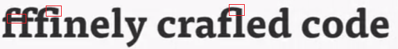
The second and third "f"'s in the video had no ligature to join them into a single glyph.
Nor would I expect it to. I wouldn't expect DroidSerif to have a glyph for a quadruple ligature.
James Barnett
39,199 PointsI thought each typeface had some sort of rule to create ligatures on the fly.
tl;dr Fonts do have rules about contextual alternates, however they are based on letter combinations.
Let's define our terms:
- glyph: A single character in a font
- ligature: When two or more letters are joined together to form one glyph or character
- letter form: How a particular character is drawn in a particular glyph
- contextual alternate An Alternate shape for a letter only used in relation to specific other adjacent or nearby letters
I'm not much of a typography person so that's about how I understand it, you can also check out http://blog.webink.com/opentype-features-css/ for more info.
Valentin Fezza
18,178 PointsValentin Fezza
18,178 PointsThanks James! That makes sense.
I thought each typeface had some sort of rule to create ligatures on the fly.
Maybe when under a certain kerning threshold or something.
Is that even a thing?