Welcome to the Treehouse Community
Want to collaborate on code errors? Have bugs you need feedback on? Looking for an extra set of eyes on your latest project? Get support with fellow developers, designers, and programmers of all backgrounds and skill levels here with the Treehouse Community! While you're at it, check out some resources Treehouse students have shared here.
Looking to learn something new?
Treehouse offers a seven day free trial for new students. Get access to thousands of hours of content and join thousands of Treehouse students and alumni in the community today.
Start your free trial
Erick Kusnadi
21,615 PointsJust finished my personal website. Help and Feedback?
Hey all, over Memorial Day Weekend I took time to use what I learned in the web design track to create my own personal website, so I'd love some feedback and your thoughts on it.
http://handsomecodemonkey.com/
Used: Materialize CSS Framework Github Pages to host it
5 Answers
Marcus Parsons
15,719 PointsHey Erick,
I really like what you did with this site! It's looking awesome! :)
I do have one suggestion that will look good (I tested it out on my end first). Try setting your ".animate-link" class to have "overflow: auto;" instead of "overflow: scroll" so that way the scroll bars only automatically appear when the page needs to be scrolled. You can notice a big difference in the blog page. The nasty horizontal and vertical scroll bars that don't do anything disappear, and it allows the color and vibrancy of the page to take up the maximum height and width it can take up.
How I tested it was just this little piece of code here that I plugged into my console while I visited your site. The console is a powerful tool :)
var styleEl = document.createElement('style');
styleEl.type = 'text/css';
document.getElementsByTagName('head')[0].appendChild(styleEl);
styleEl.appendChild(document.createTextNode('.animate-link { overflow: auto; }'));
I may come back with some more suggestions when it's not so late at night/early in the morning, but seriously, it looks amazing man!
Erick Kusnadi
21,615 PointsThanks Marcus! (I didn't know overflow: auto; worked that way). I'll definitely change it tomorrow morning when it's not so late at night haha. Could I ask what browser and OS you're on when you were testing it on as well?
Marcus Parsons
15,719 PointsNo problem, Erick! I tested this out on Kubuntu Linux 14.04 with both Chrome and Firefox. But, the behavior works the same way across OS's. "overflow: auto" does exactly what it looks like it does; it automatically brings out those scroll bars as needed. So, if the content doesn't overflow beyond the borders of the page, the scroll bars won't show up. but if it does, then they'll show up to lend a helping hand.
I do have one more design idea for you, not really a suggestion per se. What if you were to take each h2 on the "front page" of your website, and expand it such that each h2 element fills up the width of the window and all 3 take up their container space. I would personally get rid of the extra navigation in the bottom right corner because to me it doesn't make sense because there are already huge links right in front of your space.
And then instead of manipulating the box-shadow on each h2, you can change its opacity to be lighter/darker depending on how you want to set the original opacity or even change color when a hover state occurs. You could then have a nice logo area where you can add in a personal logo of some type of monkey and change your background color around. Perhaps the monkey could have shades and have a sort of debonair look to him =]
I'm going to bed, though, because I'm supposed to work in the morning haha!
Marcus Parsons
15,719 PointsOne more thing, if you're interested, I'm open to some different design ideas on my site, as well, especially on my contact page. I love the colors on my other pages, but I just can't seem to find the right color combination I like for my contact page. Here is my site: http://www.marcusparsons.com I obviously have a very creative title to my site! haha =P
Erick Kusnadi
21,615 PointsHey Marcus just checked out your site, just some quick first impressions:
1) I think you're an awesome guy, with a great future, who's starting on his personal brand. You have to use a better photo for your About Me to get that across, get a professional photo (think Linkedin headshot) or if you don't like corporate style, then maybe something a little more fun, but something that helps reveal your awesome, helpful personality and makes people want to explore your site more. If you want to use border-radius: 50%; then make sure the height and width of the image is the same so you get a perfect circle, unless the vertical oval was what you were going for.
2) You can add css transition property for your links on hover, so that it'll give them a slight oohhh feel when you hover over them.
3) As for the color of your contact page. You can try out: http://www.checkman.io/please/
Or you can use a color palette like how I did: http://www.google.com/design/spec/style/color.html#color-color-palette
Finally, if you still can't find a good color combination, it could also be your typography. If you're going full background color, with white text, a thin sans-serif font-weight looks pretty nice.
4) Finally the hamburger menu opening full width is cool, but feels a bit jarring to my UX
Marcus Parsons
15,719 PointsI've taken most of what you said into account. I used that pleasing color generator in combination with a darker blue for a nice gradient effect I really like. I'm probably going to change my photo in the about page as I agree myself. I like the oval shape, though and won't change that lol. Thanks for your feedback!
Ted Sumner
Courses Plus Student 17,967 PointsI found your approach to coding interesting as all the html is on the first page, which means it is really a one page site. The navigation is unique and not in areas that I expected, so it took a minute to figure out.
On the constructive comment side, I would not have checked out your site if I landed on it from a search. There was absolutely nothing on the landing page to catch my interest. My first impression was it was a mobile site that didn't transition. I did like the three pages with content.
Overall, it is an approach I have never seen before and I think it has promise. I just have concerns about its current effectiveness.
Erick Kusnadi
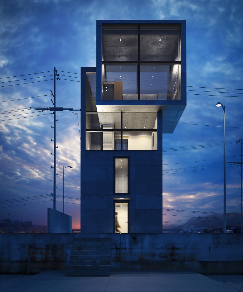
21,615 PointsHey Ted, thanks for the feedback, when I was designing it I wanted to try something new and was actually inspired by some minimalist Japanese Architecture at the time. My favorite architect is Tadao Ando who designs beautiful minimalist buildings. I wanted to take a similar approach to the page that way, but add some material design in as well.
I totally agree with the navigation part it doesn't necessarily follow Nielsen's heuristic of recognition rather than recall, the floating button style convention is pretty new, but is seen in a few of google's applications as they are transitioning to material design.
"My first impression was it was a mobile site that didn't transition." It's funny you said that actually, I designed with mobile-first in mind, and then wanted to transition the layout to a perfect 4 x 4 square, but realized computer screens weren't perfect squares and I only needed 3 categories. I'll keep the engagement when someone first lands on the site in mind, I'm not currently collecting any analytics on it, but I'll make sure to ask around on the effectiveness of the site front.
Ted Sumner
Courses Plus Student 17,967 PointsI like the inspiration. I believe the landing will work for people who know you already or are motivated to explore. For the average person who stumbles on your site, however, you have only a few seconds to convert them from your landing page. It depends on your goals.
I would also add a section on your inspiration for the site. That is interesting and informative about the choices you made. I think I would have it as a fourth nav button.
I agree with Marcus about eliminating the bottom right nav from the landing.
Ted Sumner
Courses Plus Student 17,967 PointsAnother suggestion. Take your email off of your site. Spam bots will find it and you will get on all the spam lists. (This is the voice of experience)
Erick Kusnadi
21,615 PointsHaha, those pesky spam bots! Any way you can think of having contact information without spam bots eating it up? perhaps an image of your email that looks like regular text?
Erick Kusnadi
21,615 PointsThanks for your feedback guys, I really appreciate the critique, I've already updated it to overflow scroll and removed the bottom right nav for now.
Responses Notes for Marcus Parsons "I do have one more design idea for you, not really a suggestion per se. What if you were to take each h2 on the "front page" of your website, and expand it such that each h2 element fills up the width of the window and all 3 take up their container space. I would personally get rid of the extra navigation in the bottom right corner because to me it doesn't make sense because there are already huge links right in front of your space."
Like this?

When I built it out I thought about having it span across the entire width of the page, but opted out because I felt it was too much, I didn't want it bothering people's peripheral vision on desktop (It is full width on mobile, and tablet though).
"And then instead of manipulating the box-shadow on each h2, you can change its opacity to be lighter/darker depending on how you want to set the original opacity or even change color when a hover state occurs. "
I like the idea of changing the opacity slightly, I could also change it into one of color accents that Materialize provides, I'll have to play around and think about this one. For now I like the subtlety of the shadow changing, I'll definitely play around with your suggestions in different play branches I have though.
"You could then have a nice logo area where you can add in a personal logo of some type of monkey and change your background color around. Perhaps the monkey could have shades and have a sort of debonair look to him =]"
I like this a lot, I will for sure add a monkey. I've actually asked my girlfriend to draw out some initial designs for me. I'll take a look at your site and add my comments on our mini comment thread in this forum thread.
Response Notes for Ted Sumner :
"For the average person who stumbles on your site, however, you have only a few seconds to convert them from your landing page. It depends on your goals."
I totally agree with you 100% here, I'm going to think about this quite a bit, take your feedback, and Marcus' and make a couple paper prototypes of the front page, that might help with conversion rates. I need them to want to click on one of the buttons, or stay on the home page long enough to click on one.
I have a few ideas in mind: 1) One combining the logo idea from Marcus, which has an animated monkey hide underneath one of the buttons when you enter. So as to create a game of hide and seek which tours the user around my site. 2) Making the homepage asymmetrical, which is why I originally had the nav in the first place. For example Ando's 4x4 house:
https://41.media.tumblr.com/tumblr_lglqysh5Ul1qf2adko1_1280.jpg
And just one prototype of asymmetry might be something like this. It off puts the user and makes them stop for a second.

I'll do several different prototypes and play around with them.
"I would also add a section on your inspiration for the site. That is interesting and informative about the choices you made. I think I would have it as a fourth nav button."
I'll make a paper prototype of it to see what it would look like and what I'd add to it.
"I agree with Marcus about eliminating the bottom right nav from the landing." Already removed :)
Ted Sumner
Courses Plus Student 17,967 PointsWith respect to email, the PHP course has a contact form that emails the response to any email you define. I think that is a great solution.
As far as landing page, think about what it is you want to achieve with your page. Are you trying to land development business? If so, what is your target customer going to want? If your personal site fails to come close to what they will want, they will likely move on. You can have the coolest JavaScript on the planet, but the average customer will not know how cool it really is. They will either like it or not, and that will govern whether you get to the work.
Erick Kusnadi
21,615 PointsUnderstood, when I have time, hopefully later this weekend, I'll keep the goal of the website and target audience in mind, and do some paper prototyping then. Thanks so much for all your help and feedback.
Marcus Parsons
15,719 PointsI actually did something nifty with my email address. My email is obfuscated in the HTML but is constructed once the page loads into a "mailto:" type email address link. This is what looks like in the HTML (a spam bot cannot interpret):
<script>mail2('marcus','marcusparsons',0,'','shoot me an email');</script>
The last string in that script tag is what shows up as the inner text of the link. The 0 relates to the TLD of the email address. In the case, that is a "com" address.
Check out my Contact Me page, look at the source of the page, and you can grab the script to do this. The relevant js file is called "email.js" and is loaded in the "head" section of the page.
Erick Kusnadi
21,615 PointsErick Kusnadi
21,615 PointsIf you could also comment if the fade in of the content lags on your device that would be appreciated thanks