Welcome to the Treehouse Community
Want to collaborate on code errors? Have bugs you need feedback on? Looking for an extra set of eyes on your latest project? Get support with fellow developers, designers, and programmers of all backgrounds and skill levels here with the Treehouse Community! While you're at it, check out some resources Treehouse students have shared here.
Looking to learn something new?
Treehouse offers a seven day free trial for new students. Get access to thousands of hours of content and join thousands of Treehouse students and alumni in the community today.
Start your free trial
Craig Watson
27,930 PointsLaunching First WordPress Site! All dummy content as yet but would appreciate feedback on whatever you feel needs it :)
Hi everyone :)
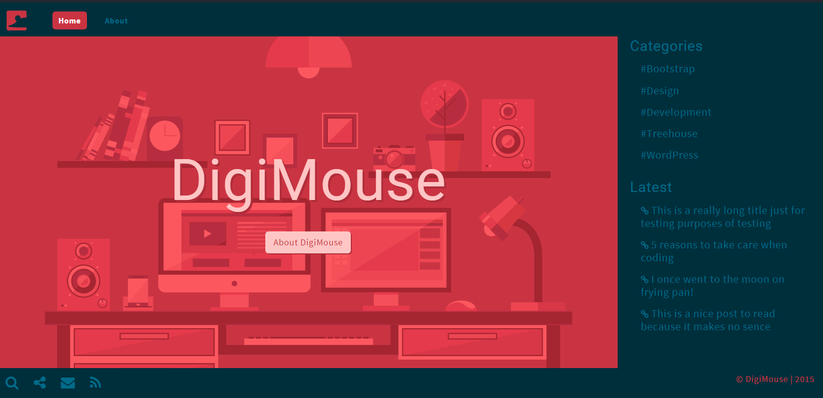
This is the launch of my first WordPress site, the theme is a custom theme based on bootstrap framework.
Please offer any feedback on the theme, layout, typography, colors, anything you feel needs feedback good or bad( be gentle ).
It is all dummy content at the moment and there will be tweaks needed but I thought why not get some feedback now before the site is full of great content :)
By all means test it on mobiles tablets whatever.
Whilst this site was under construction I made a plugin to go with it that has come in hand, It is for bootstrap based wordpress themes.
Thansk for taking a look !
Craig
2 Answers
Ryan Ruscett
23,309 PointsHey,
That is really cool! Good work.
Ted Sumner
Courses Plus Student 17,967 PointsThe bottom of the right frame is cut off on my browser on my laptop. This is a specific problem at around 1240px browser width. It appears to fix itself at other widths. But you do lose content at smaller sizes before you switch to the mobile format.
Otherwise, I really like the concept.
Craig Watson
27,930 PointsHi Ted,
What is it that goes missing ? the copy right notice ? :) also save yourself the shock and dont look at it on iOS mobile lol I used background size cover forgetting it hates it :)
Ted Sumner
Courses Plus Student 17,967 PointsThe breakdown is on the browser height when the width is 1200px or larger. The footer goes over the content panel and there is no way to view the content that I can figure out. There is a way to adjust for browser height with a unit I saw referenced in the forum in the last week. I have not played with it though. It would be interesting to figure out how other people deal with this problem. I don't recall seeing it discussed anywhere before now.
Ted Sumner
Courses Plus Student 17,967 PointsThinking about it some more, your problem would be solved if the frame scrolled with the content, but it doesn't.
Craig Watson
27,930 PointsHi Ted..
This is how it should look over 1200px
?
Ted Sumner
Courses Plus Student 17,967 PointsWhen the browser is short, the right panel cuts off. Try looking at it with the dev panel open or at 1200x500 or so. I noticed it on my laptop, which has a wide aspect monitor.
Craig Watson
27,930 PointsI completely understand now Ted :), I wonder if because it is after all a sidebar where I can add many widgets, I can make a slight adjustment and allow that sidebar to be scrollable on its own.
I will take a look into it.
Thanks again!
Ted Sumner
Courses Plus Student 17,967 PointsYou might look into a media query based on the height of the screen. I don't like the idea of two vertical scroll bars.
Craig Watson
27,930 PointsYou can remove the vertical scroll bars like below Ted :)
.aside {
    overflow-y: scroll;
    -ms-overflow-style: none;
    overflow: -moz-scrollbars-none !important;
}

.aside::-webkit-scrollbar {
    display: none;
}

Craig Watson
27,930 PointsCraig Watson
27,930 PointsHi Guys :)
Made some further refinements based on feedback, and made the layout at the code side far easier to work with. Feel free to let me know what you think....
DigiMouse
Craig