Welcome to the Treehouse Community
Want to collaborate on code errors? Have bugs you need feedback on? Looking for an extra set of eyes on your latest project? Get support with fellow developers, designers, and programmers of all backgrounds and skill levels here with the Treehouse Community! While you're at it, check out some resources Treehouse students have shared here.
Looking to learn something new?
Treehouse offers a seven day free trial for new students. Get access to thousands of hours of content and join thousands of Treehouse students and alumni in the community today.
Start your free trial
Emily Gershbein
654 PointsMyriad Italic
Why would the typographer make the choice for the "a" to change so much from regular to italic? I'm just curious to know why a two-story italic "a" wouldn't have worked well.
1 Answer
Rachel Johnson
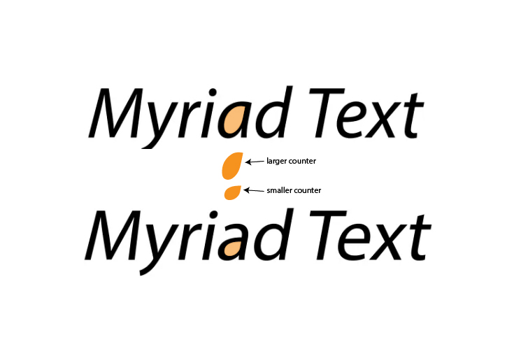
Treehouse TeacherHey Emily Gershbein , that's a great question! It all comes down to history and I could go into the very specifics. But, the short answer is that a single-story 'a' is much easier to read when the 'a' letterform gets distorted to become italic. One aspect typographers have to keep in mind are the counters (mentioned in that video as well). For legibility, we want counters to be as rounded and full as possible. If we compare the counter of a single-story 'a' and a two-story 'a' when italicized, we can see that the counter of the single-story 'a' allows for better readability because it's larger.
I hope this helps!
