Welcome to the Treehouse Community
Want to collaborate on code errors? Have bugs you need feedback on? Looking for an extra set of eyes on your latest project? Get support with fellow developers, designers, and programmers of all backgrounds and skill levels here with the Treehouse Community! While you're at it, check out some resources Treehouse students have shared here.
Looking to learn something new?
Treehouse offers a seven day free trial for new students. Get access to thousands of hours of content and join thousands of Treehouse students and alumni in the community today.
Start your free trial
Michael Broe
670 Pointsnavbar and images not responsive
<!DOCTYPE html> <html> <head> <title>Lexikon alle Buchstaben</title> <meta name="viewport" content="width=device-width, initial-scale=1">
<link rel="stylesheet" type="text/css" href="./css/bootstrap.css"> <link rel="stylesheet" type="text/css" href="./css/bootstrap-theme.css"> <link rel="stylesheet" type="text/css" href="../Investieren/lexikon.css"> <link rel="stylesheet" type="text/css" href="../Investieren/welcome.css"> <link href="https://fonts.googleapis.com/css?family=Lato" rel="stylesheet"> <link href="http://cdnjs.cloudflare.com/ajax/libs/font-awesome/4.3.0/css/font-awesome.css" rel="stylesheet" type="text/css"> </head> <body> <div class="container font-family">
<nav class="navbar navbar-inverse navbar-fixed-top">
<div class="navbar-header">
  <a class="navbar-brand" href="startseite.html">WebSiteName</a>
</div>
<ul class="nav navbar-nav">
  <li><a href="#">Home</a></li>
  <li class="dropdown">
    <a class="dropdown-toggle" data-toggle="dropdown" href="#">Page 1
    <span class="caret"></span></a>
    <ul class="dropdown-menu">
      <li><a href="#">Page 1-1</a></li>
      <li><a href="#">Page 1-2</a></li>
      <li><a href="#">Page 1-3</a></li>
    </ul>
  </li>
 <li class="dropdown">
    <a class="dropdown-toggle" data-toggle="dropdown" href="#">Page 2
    <span class="caret"></span></a>
    <ul class="dropdown-menu">
      <li><a href="#">Page 2-1</a></li>
      <li><a href="#">Page 2-2</a></li>
      <li><a href="#">Page 2-3</a></li>
    </ul>
  </li>
   <li class="dropdown">
    <a class="dropdown-toggle" data-toggle="dropdown" href="#">Page 3
    <span class="caret"></span></a>
    <ul class="dropdown-menu">
      <li><a href="#">Page 3-1</a></li>
      <li><a href="#">Page 3-2</a></li>
      <li><a href="#">Page 3-3</a></li>
    </ul>
  </li>
 <li class="dropdown">
    <a class="dropdown-toggle" data-toggle="dropdown" href="#">Page 4
    <span class="caret"></span></a>
    <ul class="dropdown-menu">
      <li><a href="#">Page 4-1</a></li>
      <li><a href="#">Page 4-2</a></li>
      <li><a href="#">Page 4-3</a></li>
    </ul>
  </li>
  <li class="dropdown">
    <a class="dropdown-toggle" data-toggle="dropdown" href="#">Page 5
    <span class="caret"></span></a>
    <ul class="dropdown-menu">
      <li><a href="#">Page 5-1</a></li>
      <li><a href="#">Page 5-2</a></li>
      <li><a href="#">Page 5-3</a></li>
    </ul>
  </li>
  <li class="dropdown">
    <a class="dropdown-toggle" data-toggle="dropdown" href="#">Page 6
    <span class="caret"></span></a>
    <ul class="dropdown-menu">
      <li><a href="#">Page 6-1</a></li>
      <li><a href="#">Page 6-2</a></li>
      <li><a href="#">Page 6-3</a></li>
    </ul>
  </li>

 </ul>
<ul class="nav navbar-nav navbar-right">
  <li><a href="#"><span class="glyphicon glyphicon-user"></span> Sign Up</a></li>

</ul>
<form class="navbar-form navbar-left"> <div class="form-group"> <input type="text" class="form-control" placeholder="Search"> </div> <button type="submit" class="btn btn-default">Suchen</button> </form>
</nav>
The whole site ist not responsive somehow, tried alot of stuff. Img.responsive makes the imgs move down in desktop mode? Navbar same problem. First Post here hope i done it right
Juan Luna Ramirez
9,041 PointsDid you add the img-responsive class directly to the img tag like this: <img class="img-responsive" src="http://placehold.it/350x250">? This is what I did for the big images and it shrinks them as the parent div shrinks with the screen size.
Check out this codepen and let me know if this is what you needed.
4 Answers
Michael Broe
670 PointsFirst of all Thanks!
The Navbar is doing now what i wanted, sorry for the bad explanation.
Now second Problem ist that the rest of my side is not responsive. I will but the rest of the code below.
I tried putting the img-responsive class in each image which just concluded tto that the images move down to the left in in normal Desktop Mode. Like rest of the website is not reponsive at all . Only the footer and now the navbar is responsive as it should.
``` <div id="myCarousel" class="carousel slide" data-ride="carousel">
<ol class="carousel-indicators">
  <li data-target="#myCarousel" data-slide-to="0" class="active"></li>
  <li data-target="#myCarousel" data-slide-to="1"></li>
  <li data-target="#myCarousel" data-slide-to="2"></li>
</ol>


<div class="carousel-inner">
  <div class="item active ">
    <img class="img-resposnive" src="http://placehold.it/350x150" alt="Los Angeles" style="width:100%;">
  </div>

  <div class="item img-responsive">
    <img src="http://placehold.it/350x150" alt="Chicago" style="width:100%;">
  </div>

  <div class="item img-responsive">
    <img src="http://placehold.it/350x150" alt="New york" style="width:100%;">
  </div>
</div>


<a class="left carousel-control" href="#myCarousel" data-slide="prev">
  <span class="glyphicon glyphicon-chevron-left"></span>
  <span class="sr-only">Previous</span>
</a>
<a class="right carousel-control" href="#myCarousel" data-slide="next">
  <span class="glyphicon glyphicon-chevron-right"></span>
  <span class="sr-only">Next</span>
</a>
</div>
<!--Reihe 1--> <div class="row "> <!--linke Seite--> <div class="col-md-4 col-xs-6 col-sm-12 contentright img-responsive "> <h1 >Meist gelesen</h1> <a href="#" ><img src="http://placehold.it/100x100"><p class="pull-right theleft ">Testest<br>dadad</p></a> </div> <!-- Mitte--> <div class="col-md-4 col-xs-6 col-sm-12 img-responsive"> <h1 class="text-center">Neuster Eintrag</h1> <a href="ä"><img src="http://placehold.it/350x250"></a> </div> <!--Rechte Seite--> <div class="col-md-4 col-xs-6 col-sm-12"> <h1 class="text-right">Neuste Fragen</h1></a> <a href="#"><p class="text-right theright contentright">testestdadaddadw<br>Dawdad<br>mehr..</p></a> </div> </div>
<!--Neue Reihe 2-->
<div class="row">
  <!--linke Seite-->
  <div class="col-md-4 col-xs-6 tothetop contentright">
   <a  href="#" ><img src="http://placehold.it/100x100"><p class="pull-right theleft ">Testest<br>dadad</p></a>
   </div>
  <!--Mitte-->
  <div class="col-md-4">
     </div>
 <!--rechte Seite-->
 <div class="col-md-4 col-xs-6">
  <a href="#"><p class="text-right theright contentright">testest<br>dada<br>mehr..</p></a>
 </div>
</div>

<!--Neue Reihe 3-->
 <div class="row">
  <!--linke Seite-->

  <div class="col-md-4 col-xs-6 tothetop contentright">
  <a  href="#" ><img src="http://placehold.it/100x100" ><p class="pull-right theleft ">Testest<br>dadad</p></a>
  </div>
    <!-- Mitte zwei Bilder-->

    <div class="col-md-4 col-xs-6 left1">
       <a href="ä"><img  src="http://placehold.it/150x150"></a>
        <a href="ä"><img  src="http://placehold.it/150x150" class="pics "></a>
    </div>
   <!--rechte Seite-->

   <div class="col-md-4 col-xs-6 ">
     <a href="#"><p class="text-right theright contentright">testest<br>dada<br>mehr..</p></a>
  </div>
</div>
  <!--Neue Reihe 4-->
 <div class="row">
  <!--linke Seite-->

  <div class="col-md-4 col-xs-6 contentright tothetop">
  <a  href="#" ><img src="http://placehold.it/100x100"><p class="pull-right theleft ">Testest<br>dadad</p></a>
  </div>
    <!-- Mitte ein Bild-->
    <div class="col-md-4 col-xs-6 left1">
      <a href="ä"><img src="http://placehold.it/350x250"></a>
    </div>
   <!--rechte Seite-->
   <div class="col-md-4 col-xs-6 ">
     <a href="#"><p class="text-right theright contentright">testest<br>dada<br>mehr..</p></a>
  </div>
</div>
<!--Reihe 5-->
<div class="row">
  <!--linke Seite-->
  <div class="col-md-4 contentright col-xs-6 tothetop">
  <a  href="#" ><img src="http://placehold.it/100x100"><p class="pull-right theleft ">Testest<br>dadad</p></a>
  </div>
    <!--Mitte und Ad-->
    <div class="col-md-4 col-xs-6 ">
      <a href="ä"><img src="https://www.adspeed.com/placeholder-350x250.gif"></a>
    </div>
  <!-- rechte Seite-->
  <div class="col-md-4 col-xs-6">
     <a href="#"><p class="text-right theright contentright">testest<br>dada<br>mehr..</p></a>
  </div>
</div> <!--Reihe 6--> <div class="row">
<!--linke Seite--> <div class=" col-md-4 contentright tothetop"> <a href="#" ><img src="http://placehold.it/100x100"><p class="pull-right theleft ">Testest<br>dadad</p></a> </div> <!--Mitte--> <div class="col-md-4 plustop"> </div> <!---rechte Seite--> <div class="col-md-4 col-xs-6"> <a href="#"><p class="text-right theright contentright">testest<br>dada<br>mehr..</p></a> </div> </div> <!--Reihe 6--> <div class="row"> <!--linke Seite--> <div class="col-md-4 contentright col-xs-6 tothetop"> <a href="#" ><img src="http://placehold.it/100x100"><p class="pull-right theleft ">Testest<br>dadad</p></a> </div> <!--Mitte 2 Bilder--> <div class="col-md-4 col-xs-6 left1"> <a href="ä"><img src="http://placehold.it/150x150"></a> <a href="ä"><img class="pics" src="http://placehold.it/150x150"></a> </div> <!--rechte Seite--> <div class="col-md-4 col-xs-6"> <a href="#"><p class="text-right theright contentright">testest<br>dada<br>mehr..</p></a> </div> </div> <!--Reihe 7--> <div class="row"> <!--linke seite--> <div class="col-md-4 col-xs-6 contentright tothetop"> <img src="https://www.adspeed.com/placeholder-100x100.gif" /> </div> <!--Mitte--> <div class="col-md-4 col-xs-6 left1"> <a href="ä"><img src="http://placehold.it/350x250"></a> </div> <!--rechte Seite--> <div class="col-md-4 col-xs-6"> <a href="#"><p class="text-right theright contentright">testest<br>dada</p></a> </div> </div>
<!--Ende mehr Kästchen möglich-->
<footer class="footer-distributed">
<div class="footer-right">
<a href="#"><i class="fa fa-facebook" ></i></a>
<a href="#"><i class="fa fa-twitter"></i></a>
</div>
<div class="footer-left">
<p class="footer-links">
<a href="#">Home</a>
.
<a href="#">About</a>
·
<a href="#">FAQ</a>
·
<a href="#">Kontakt</a>
</p>
<p>Company Name © 2017</p>
</div>
</footer>
</div>
<script src="https://ajax.googleapis.com/ajax/libs/jquery/1.12.0/jquery.min.js"></script> <script src="http://maxcdn.bootstrapcdn.com/bootstrap/3.3.6/js/bootstrap.min.js"></script>
</body> </html>
Michael Broe
670 PointsI did try that what happens then is that in normal mode the images on the right go down? And when i go to mobile mode the images are not really ordered like they should be. Like the images on the top overlapp eachother etc.
Juan Luna Ramirez
9,041 PointsIn which "Reihe" in particular do you not like the way the images are stacking?
More importantly, you should look at how your columns inside your rows are stacking. I think you might be having trouble with the way you set up your columns. Let's look at "Reihe 1" as an example.
"Reihe 1"
Each child div has a class of class="col-md-4 col-xs-6 col-sm-12" correct? So, what does this mean?
Lets look at the largest size screen in this markup, md. By stating col-md-4 you are saying that at a medium screen (992px) or bigger, you want your column to take up 4 column spaces out of 12 available in the row. I highlighted "reihe 1" in light blue so you can see a bit more clearly what is happening.
screen size = 992px
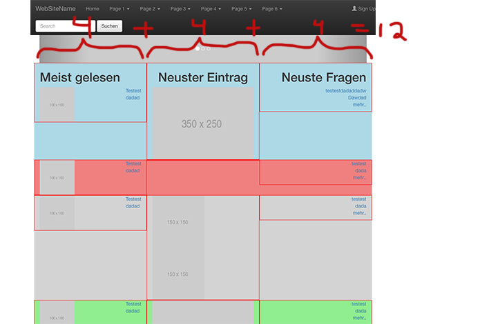
Now let's look at the next screen size, sm. By stating col-sm-12 you are saying that at a small screen (768px) or bigger or until it hits the next media query which in your case is md size, you want your column to take up 12 space out of 12. That means the entire length of the row.
screen size = 768px

Finally, by stating col-xs-6 you are saying that at an extra small screen (<= 480px) or bigger or until it hits the next media query which in your case is sm size, you want your column to take up 6 spaces out of 12. That means half of the space. Now, you have 3 children divs with that class. The problem is that only 2 will fit because 6 + 6 = 12 and 12 is the maximum. Therefore the third div will go to the next line and take up 6 spaces there.
screen size = 480px
An excellent article to really understand this is The Subtle Magic Behind Why the Bootstrap 3 Grid Works.
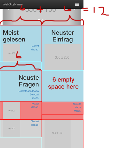
Once you have your columns the way you intend them, you can now worry about how your images are stacking within the columns. Let's look at "Reihe 7" as an example.
Let's focus on the div in the middle, "Mitte 2 Bilder". At a screen size of md (992x) the 2 images stack on top of each other. This is because there is not enough room for both of the in that middle column. If you make the screen bigger then they will fit. But let say always want them to be side by side. One way to accomplish this is by nesting another row within that column. Yes, you can nest another row inside a column. I added a col-xs-6class to each img link so that no matter how small of big the screen, they will always be side by side. You can stack them or prevent them from stacking however you want now that you know how columns work.
The last thing to do is add the img-responsive class to the img tag. This is because when you make the screen very small your images will continue to be side by side, but they will overlap. `img-responsive will make them shrink so that they fit.
      <!--Reihe 7-->
      <div class="row reihe7">

        <!--linke Seite-->
        <div class="column col-md-4 contentright col-xs-6 tothetop">
          <a href="#" >
            <img src="http://placehold.it/100x100">
            <p class="pull-right theleft ">Testest<br>dadad</p>
          </a>
        </div>

        <!--Mitte 2 Bilder-->
        <div class="column col-md-4 col-xs-6 left1">
          <div class="row">
            <a class="col-xs-6" href="#"><img class="img-responsive" src="http://placehold.it/150x150"></a>
            <a class="col-xs-6" href="#"><img class="img-responsive" src="http://placehold.it/150x150"></a>
          </div>
        </div>

        <!--rechte Seite-->
        <div class="column col-md-4 col-xs-6">
          <a href="#">
            <p class="text-right theright contentright">testest<br>dada<br>mehr..</p>
          </a>
        </div>
      </div>
I hope this helps.
Michael Broe
670 PointsThanks alot! Going to read it. I actually want every Row to be working. This site shows how I want it to look like when its in mobile http://www.investopedia.com/ .
Juan Luna Ramirez
9,041 PointsGreat! Once you know how the grid system works you should be able to recreate this layout. Good luck!
Juan Luna Ramirez
9,041 PointsJuan Luna Ramirez
9,041 PointsHi Michael,
I'm not really sure what you are asking. It might be more helpful to ask a more specific question. In any case here are a few notes that I hope will help.
Make sure to include jQuery and Bootstrap's javascript file. I added them at the end of the body in the markup below.
When you say that the navbar is not being responsive do you mean that it doesn't collapse? If so, then you need to add a button that will toggle the collapsing. You can add it in your div:
<div class="navbar-header"></div>. See full markup below. Notice the button's attributes:type="button" class="navbar-toggle collapse" data-toggle="collapse" data-target="#lexikon-navbar-collapse" aria-expanded="false". These attributes are used by the Bootstrap css and jQuery and Bootstrap's script to know how to style the button and which element to collapse.Then wrap your entire ul:
<ul class="nav nav-bar"></ul>in a div:<div class="collapse navbar-collapse" id="lexicon-navbar-collapse"></div>. Notice the id is the id that we targeted in the button'sdata-targetattribute.Here are the modifications I made from the code you provided. Notice I also moved the search form and sign up link into the ul:
<ul class="nav nav-bar"></ul>