Welcome to the Treehouse Community
Want to collaborate on code errors? Have bugs you need feedback on? Looking for an extra set of eyes on your latest project? Get support with fellow developers, designers, and programmers of all backgrounds and skill levels here with the Treehouse Community! While you're at it, check out some resources Treehouse students have shared here.
Looking to learn something new?
Treehouse offers a seven day free trial for new students. Get access to thousands of hours of content and join thousands of Treehouse students and alumni in the community today.
Start your free trial
Tyson Rosage
1,896 PointsNew Treehouse Library
Hey everybody!
Today, we're releasing big changes to Library! This new design features different sections to help you get to the content you're looking for, faster. We're going to be continuing to iterate on this design with different sections to make sure the content displayed is most relevant to you, so please note that this is the first step in making Library that much easier to use.
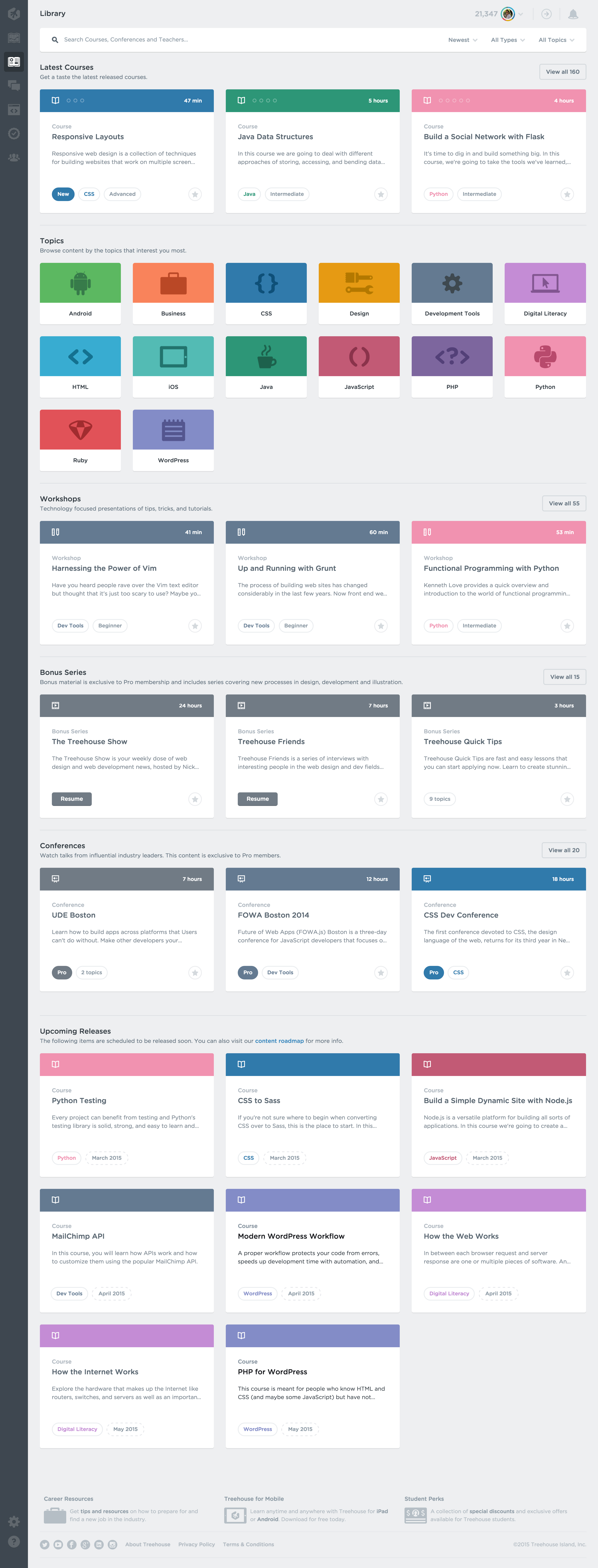
Please post here if you have comments, concerns, or questions. Thanks, as always, for being a Treehouse student.
Harry James
14,780 PointsQuick heads up though, the notification link doesn't work, you're missing a slash:
http://teamtreehouse.comforum/new-treehouse-library
should be:
http://teamtreehouse.com/forum/new-treehouse-library
Hope it helps :)
EDIT: This has been fixed now.
utafwgyyva
901 PointsLooks really neat, Nice update!!
Maxim Popov
8,339 PointsExcellent update! Thank you for your job!
Christopher Vicini
Courses Plus Student 12,191 PointsLooks really great and will come in handy! Nice work Treehouse!
Georgi Dimitrov
Courses Plus Student 7,439 PointsGreat update! Now it's easier to find everything.
Samantha Atkinson
Front End Web Development Techdegree Graduate 42,516 PointsLove it!!
So much easier to find things.
Thank you
Max Weir
14,963 PointsGood stuff, one issue I've had is the slow loading of library items, when loading a category it seems to take longer than it should to load.
27 Answers
Goran Levacic
3,240 PointsGreat update! So organized and easy to find content!
Michael Trilford
7,232 PointsNice, I have found it a little harder to find the content I wanted. Hopefully this update improves the experience :-P
David Tonge
Courses Plus Student 45,640 PointsThis is a great update. I remember sending an email to support about how much memory library used when trying to browse, so this is great.
Rory Gilmore
15,835 PointsLooking great! I especially like how easy it is now to look for upcoming courses. I like to know what I can look forward to and that was a bit of a hassle before :)
Michael Trilford
7,232 PointsI would rather the topics be positioned more near the top. The larger cards do use quite a bit of space.

Disclamer: Have no idea how to add images, this is a test. If this doesn't work, here is the direct link: http://i61.tinypic.com/vdlc1i.png
Kyle Meyer
5,459 PointsThanks for the feedback! We may very well test such an arrangement in the future.
Harry James
14,780 PointsHeh! I've gone ahead and formatted your message correctly so you can go ahead and take a look in the Edit section of your post to see how I've changed it.
The syntax is

Hopefully this should help you out in the future if you want to add any more images :)
Sean Gaffney
Front End Web Development Techdegree Student 2,560 PointsHey Michael, I updated your response to fix the image. You had the right idea, but just needed to include the direct URL in the parentheses. Like so:

Michael Trilford
7,232 PointsCheers guys
Sherrie Gossett
14,924 PointsGood job!
AR Ehsan
7,912 PointsReally cool everyone!
Ayman Abdoun
10,342 PointsOh, that is beautiful. I have a question, how could you take a snapshot to this very long web page? When I ever try to git snapshot , it just gives me an image of my screen width and height.
Michael Trilford
7,232 PointsYou can download a chrome add on which takes the entire page in length.
Tyson Rosage
1,896 PointsIn this case I just used a series of screenshots at different scroll positions and stitched them together with Photoshop. But there's another app that can take full page screenshots called Paparazzi for the Mac.
Ayman Abdoun
10,342 PointsThank you so much Michael Trilford, Thank you so much Tyson Rosage
Justin Horner
Treehouse Guest TeacherAwesome updates team! I like the new layout :)
Sharon Smith
8,747 PointsThis does look very nice & organized--- except for one rather significant issue. On my laptop screen, it only shows two of the big boxes in a line, then the third one shows up underneath the other two, with a big empty space next to it. I know that a lot of people have massively huge screens these days, but some of us are still working on 1280 screens. Please scale the boxes!
Michael Trilford
7,232 PointsThat's because it is a two column layout at that view. Bonus series and Workshops will automagically fix themselves when another item is added to the layout.
Michael Trilford
7,232 Points
It doesn't look half bad at 3 column, I would just rework the buttons at the bottom for this view
Sharon Smith
8,747 PointsYou could scale the headings, text, & buttons proportionally along with the boxes, too, & then they'd look better. Yeah, responsive design!
Although now I'm wondering. If it's a two-column layout at my screen size, does that mean they're treating my screen as if it's a tablet? 'Cause that's just weird- especially since my tablet (well, Nook HD+ eReader, which functions as a tablet) is less than half the size of my laptop.
Michael Trilford
7,232 Points<< If the dark grey side bar is there, you will be viewing the desktop.
They only have two break points for the library layout.
Small Devices are 100% ( 1 col ) Medium devices are 50% ( 2 col ) Large Devices are 33.3% ( 3 col )
You will be on the Tablet version of the site when the menu icon appears top right, and the grey side bar is gone.
Tyson Rosage
1,896 PointsSharon Smith, an update will be rolling out soon which will display 4 cards instead of 3 when on smaller screens so it should make better use of your screen real estate.
Sharon Smith
8,747 PointsTyson, I'd rather it only had 2 as compared to 4. Having 2 rows of boxes eats up a lot of room on a small screen, whether there's 3 boxes or 4. Plus, anything iOS-related is pretty irrelevant to me (what with being a PC person) & that seems to be about half the classes anyways (I know I'm over-estimating. It's perception vs. observable reality. There always seems to be more of something when it's getting in the way of what you're trying to do- much like barking dogs when trying to open the front door). So, I'd rather have notices of two of the most recent classes & then be able to get to things I'm specifically interested in. We do get notifications of all the new classes anyway.
Actually, I think part of my annoyance with the iOS stuff is that I'll read something, think it sounds interesting & then realize I can't do it.
huckleberry
14,636 PointsTyson Rosage thiiiiiiis is fantaaaaastic. That's so freaking weird too because not two days ago I went to the library once again to look for something and I was just flabbergasted...
I says to myself... I says...
"Why do they have it like this? I know you can click on the little button in the corner of the course that shows the category and then that takes you to the category page but jeeez... why not have a visible shortlist of all the categories?? Has NO ONE complained about this? *sigh* ... actually, someone probably has many many times and they're probably working on it so just go about your business, Huck -- I'm sure it'll be here soon."
And lo and behold!
You guys never disappoint, I'll tell ya...
Awesome job and thanks!
Cheers,
Huck -
Nick Ocampo
15,661 PointsThis is great. It got me thinking that it would be awesome for you guys to post a blog article about what your UX process looks like and what the thinking that went behind these changes was like. Not very long ago I read a similar article that gave me a huge insight onto what a good redesign thought-process looked like that helped me a ton I've been curious to see someone else's take on it. Just a suggestion!
William Romero
4,807 PointsThat really looks great! :D It was a good change in the library view... Keep going with it and thank you for think in the user experience...
Oliver Simon
10,192 PointsCheers!
jrabello
17,917 Pointshey awesome update, It looks quite better now!
Ibrahima Ciss
8,507 PointsCool Updates waiting for completion certifications!
Kali Brayfield
23,356 PointsLooks great! keep up the good work team!!
sebastianstabno2
Courses Plus Student 3,401 Pointsgreat update.. looks awesome...
Víctor Rico
17,808 PointsNice, I like it!
Hugo Amorim
Courses Plus Student 23,205 PointsI love the update.
ashabebe
3,311 PointsGood Job!!!
I have one cool suggestion tho. It would be great if you list the recent course i have started so i can pick up where i left off. As of now, i have to dig down to find the most recent course i have taken ....i hope you would implement that soon and improve UX...
Michael Trilford
7,232 PointsThe arrow next to the notification icon lets you "resume progress".
james white
78,399 PointsMore scaling (and number of columns) options please!!!!
The Wikipedia page for "thumbnail" says:
Thumbnails are reduced-size versions of pictures, used to help in recognizing and organizing them, serving the same role for images as a normal text index does for words. In the age of digital images, visual search engines and image-organizing programs normally use thumbnails, as do most modern operating systems or desktop environments..
I also think their should be an option to "thumbnail" (shrink to the absolute minimum size) the course boxes.
In Photoshop, shrinking/resizing an image is done via something called bicubic resampling.
I know you guys are eager to show off your clean edge svg vector graphics and css styling, but please...
.
.
Also --I'm going to bring up again (because no one at Treehouse listened last time) ======> the need for collapsible sections.
There are many many ways to have such sections (Jquery accordians, collapsible CSS trickery, even HTML5 details and summary elements (twisty triangles):
http://html5doctor.com/the-details-and-summary-elements/
Some other links:
http://designingwebinterfaces.com/blog/wp-content/uploads/2009/01/collapsible_accordion-300x198.png
http://www.dynamicdrive.com/dynamicindex17/animatedcollapse.htm
http://codepen.io/johnmotyljr/pen/IdJzt
http://www.snyderplace.com/demos/collapsible.html
http://demos.inspirationalpixels.com/Accordion-with-HTML-CSS-&-jQuery/
http://egrappler.com/a-stylo-modern-jquery-accordion-akordeon/
..and so on, and so on, and so on..
There will NEVER be a screen with infinite pixels or infinite resolution, so please use pixels WISELY!
Noah A
4,144 PointsI am not sure if only some users had the update enabled, but if not, I am not sure why I cannot view it.
Hmm, I'll tinker around a bit.
Greg Kaleka
39,021 PointsHey Noah,
Your browser may have cached the old version. Try refreshing the page, and if that doesn't work clear your cache. Ctrl-Shift-Delete should do it. If not, check here.
Alvaro Ortiz
16,565 PointsLooks great!
Dwain Aiolupotea
10,350 Pointsorh... finally, I struggled to find things. Nice work man! or woman!
albara khaled
5,018 PointsVery nice :) , Great update :))
Kevin Paskowski
10,342 PointsThe update is very nice. It would be nice to see a section in the library for tracks/courses/workshops etc that are older and outdated. Just so users know the information there has changed or is not 100% up todate. Also so users can go back and review, or even get some of the history of how things have developed over time, through older classes.
Kyle Meyer
5,459 PointsThanks for the feedback you fine gentleman you! We'll definitely take your thoughts into consideration for future design iterations. Thanks for being a student
Harry James
14,780 PointsHarry James
14,780 PointsLoving the update!
Things look a lot more organised and act a lot more streamlined now :)
Also, no bugs for what I've came across!
*hi5*