Welcome to the Treehouse Community
Want to collaborate on code errors? Have bugs you need feedback on? Looking for an extra set of eyes on your latest project? Get support with fellow developers, designers, and programmers of all backgrounds and skill levels here with the Treehouse Community! While you're at it, check out some resources Treehouse students have shared here.
Looking to learn something new?
Treehouse offers a seven day free trial for new students. Get access to thousands of hours of content and join thousands of Treehouse students and alumni in the community today.
Start your free trial
Briain Corroon
13,689 PointsOffset not working correctly on my viewport size
My code is from the teachers notes.
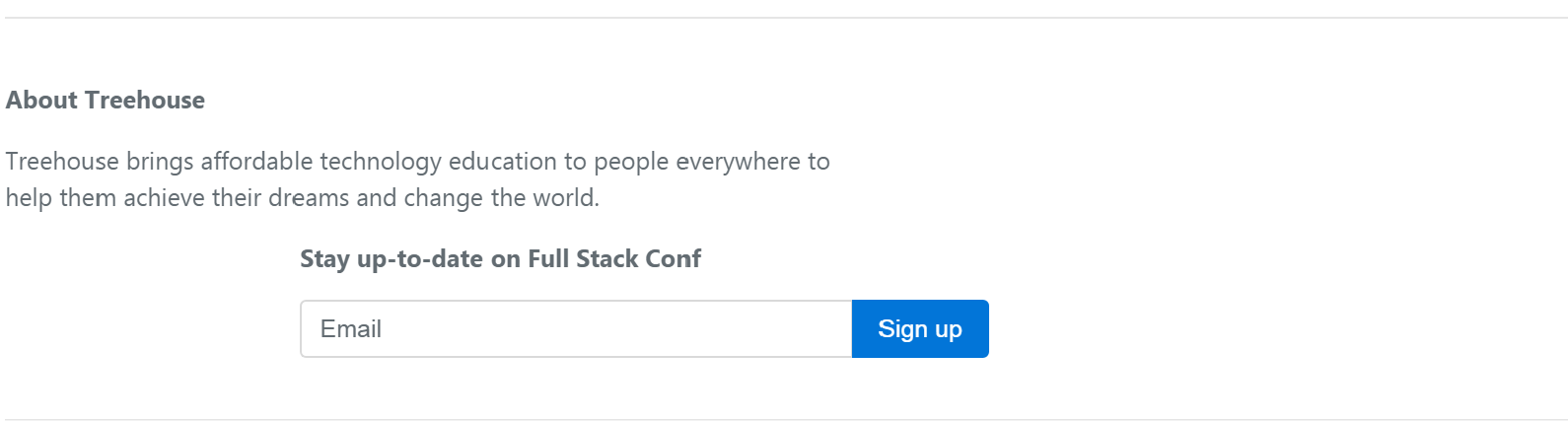
<div class="row py-4 text-muted">
  <div class="col-md-6">
    <p><strong>About Treehouse</strong></p>
    <p>Treehouse brings affordable technology education to people everywhere to help them achieve their dreams and change the world.</p>
  </div>
  <div  class="col-md-6 col-xl-5 offset-xl-2">
    <p><strong>Stay up-to-date on Full Stack Conf</strong></p>
    <div class="input-group">
      <input type="text" class="form-control" placeholder="Email">
      <span class="input-group-btn">
        <button class="btn btn-primary" type="button">Sign up</button>
      </span>
    </div>
  </div>
</div>
However at my screen width the signup column is pushed below the About Treehouse column. My viewport size is 1229 × 638.
Is this a design flaw?
Screenshot of what it looks like on my browser:
3 Answers
Alexandre Meurant
6,525 PointsI have another way to do this :
Just add "justify-content-between" as a class in the row :
<div class="row py-4 text-muted justify-content-between">
Shane Oliver
19,977 PointsBootstrap has max columns of 12. You are declaring 13 columns. Col-md-5 + col-xl-6 + offset 2. Reduce the offset to 1 to make your columns jusity on a single line
Briain Corroon
13,689 PointsI realise that but this is the code that is given by the instructor to push the content across a very large screen.
<div class="col-md-6 col-xl-5 offset-xl-2">
Pedro Esteves
13,125 PointsYou still have to put the col-xl-5 class in the other div (the one that refers to the About Treehouse content).