Welcome to the Treehouse Community
Want to collaborate on code errors? Have bugs you need feedback on? Looking for an extra set of eyes on your latest project? Get support with fellow developers, designers, and programmers of all backgrounds and skill levels here with the Treehouse Community! While you're at it, check out some resources Treehouse students have shared here.
Looking to learn something new?
Treehouse offers a seven day free trial for new students. Get access to thousands of hours of content and join thousands of Treehouse students and alumni in the community today.
Start your free trial
Edward Jasper
Courses Plus Student 4,981 PointsPre-Interview Code Test Please Help!
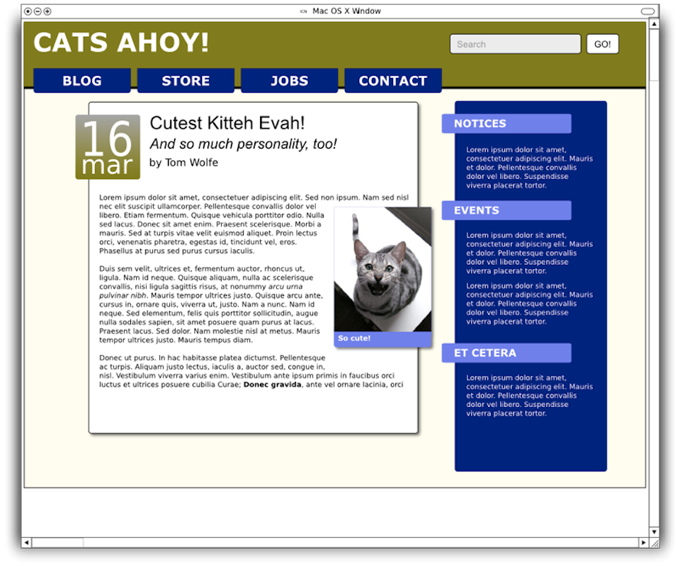
Hello Everyone, I am a very new developer but I have secured an interview for a position as a Junior Web Developer with a great company that can teach me a lot. They sent me this code test, and I am having trouble with the date font and the text around the cat image.
If you have any advice on how to make my mark up more semantic and/or add html 5/css 3 tags that would be awesome! Be honest! I'm so excited to start this journey!
The reference width of the page is 960px, but we'd like a responsive design on a flexible grid.
You should only need one image, located here: http://bit.ly/zzsCXU. Do not resize it with an image-editing tool. It should scale with the page, but be no wider than 150px when the page is 960px wide.
The body text is not important, and you can generate more of it here: http://lipsum.com/? * Do note that there are a couple of inline style changes in the main body text.
Use HTML5 and CSS3 to as great an extent as you can, but remember that the page should display in some form on IE 7.
Do not assume that the text in the HTML will have the correct capitalization to match the style on the image.
Strongly favor progressive enhancement and semantic markup.
In the Search box on the top right, make the word "Search" disappear when the user focuses on the input in as many browsers as you can.
The font families are Verdana and Arial. The colors are #808000, #000080, #fefeee, #7070f0, and the gradient under the date goes from #a6a6a6 to #808000. The corners have a radius of 4px. The shadows extend for 4px with a 2px blur.
Do your best and have fun!
2 Answers
James Barnett
39,199 PointsYou are taking the img out of normal flow by positioning it, instead use *negative margin-right & z-index.
For the date, don't you a <br> their it's non-semantic
- use a
<span>set todisplay: block - set a
font-sizefor the number - tweak the
line-heightfor both.date&.date > span
Edward Jasper
Courses Plus Student 4,981 PointsThis is perfect! Thank you!
