Welcome to the Treehouse Community
Want to collaborate on code errors? Have bugs you need feedback on? Looking for an extra set of eyes on your latest project? Get support with fellow developers, designers, and programmers of all backgrounds and skill levels here with the Treehouse Community! While you're at it, check out some resources Treehouse students have shared here.
Looking to learn something new?
Treehouse offers a seven day free trial for new students. Get access to thousands of hours of content and join thousands of Treehouse students and alumni in the community today.
Start your free trial
Gina Bégin
Courses Plus Student 8,613 PointsResponsive CSS not aligning photo correctly below 660px and paragraph isn't aligned
Two things:
- The photograph should center once the screen size falls below 660px. I tried adding the following code to the responsive.css sheet, but nothing changed:
@media screen and (max-width: 659px) { .profile-photo { align-content: center }
- The paragraph flows outside of the alignment and underneath the photo — how do I keep it all justified in a straight line without it breaking out (at all sizes)?
Here is my about.html:
<!DOCTYPE html>
<html>
<head>
<meta charset="utf-8">
<title>KG Showroom | Kitchen & Bath Design in Central Florida</title>
<link rel="stylesheet" href="css/normalize.css">
<link href='http://fonts.googleapis.com/css?family=Montserrat:400,700|Open+Sans:400italic,600italic,700,600,400' rel='stylesheet' type='text/css'>
<link rel="stylesheet" href="css/main.css">
<link rel="stylesheet" href="css/responsive.css">
</head>
<body>
<header>
<a href="index.html" id="logo">
<h1>KG Showroom</h1>
<h2>Kitchen & Bath Design</h2>
</a>
<nav>
<ul>
<li><a href="index.html">Portfolio</a></li>
<li><a href="about.html" class="selected">About</a></li>
<li><a href="contact.html">Contact</a></li>
</ul>
</nav>
</header>
<div id="wrapper">
<section>
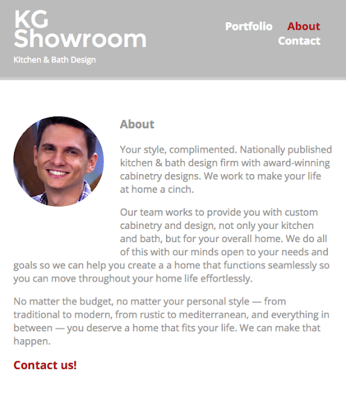
<img src="img/nick.jpg" alt="Photograph of Nick Pettit img square 200x200px in wxh" class="profile-photo">
<h3>About</h3>
<p>Your style, complimented. Nationally published kitchen & bath design firm with award-winning cabinetry designs. We work to make your life at home a cinch.</p>
<p>Our team works to provide you with custom cabinetry and design, not only your kitchen and bath, but for your overall home. We do all of this with our minds open to your needs and goals so we can help you create a a home that functions seamlessly so you can move throughout your home life effortlessly.</p>
<p>No matter the budget, no matter your personal style — from traditional to modern, from rustic to mediterranean, and everything in between — you deserve a home that fits your life. We can make that happen.</p>
<p>
<h3><a href="contact.html">Contact us!</a></h3>
</p>
</section>
<footer>
<a href="http://twitter.com/kgshowroom" target="_blank"><img src="img/twitter-wrap.png" alt="Twitter Logo" class="social-icon"></a>
<a href="https://www.facebook.com/KitchenGalleryShowroom" target="_blank"><img src="img/facebook-wrap.png" alt="Facebook Logo" class=" social-icon"></a>
<p>© 2014 <a href="http://ginabegin.com" target="_blank">Gina Begin</a></p>
</footer>
</div>
</body>
</html>
And my responsive.css sheet:
@media screen and (min-width: 480px) {

  /*****************************
  Two Column Layout
  *****************************/

  #primary {
    width: 50%;
    float: left;
  }

  #secondary {
    width: 40%;
    float: right;
  }


  /*****************************
  HOW TO FIND EXACT WIDTH OF COLUMNS
  3 (2.5 + 2.5 <margins on either
  side of elements) = 15
  100% (size of page) - 15% (number
  pulled from margins above) = 85%
  85% / 3 <number of columns) =
  28.33333333 <Do NOT Round Off
  *****************************/


  /*****************************
  Page: Portfolio
  *****************************/

  #gallery li {
    width: 28.3333%;
  }

  #gallery li:nth-child(3n + 1) {
    clear: left;
  }
}

  /*****************************
  Page: About
  *****************************/

.profile-photo {
  float: left;
  margin: 0 5% 80px 0;
}


@media screen and (min-width: 660px) {}

@media screen and (max-width: 659px) {
  .profile-photo {
    align-content: center
  }
}


  /*****************************
  Header
  *****************************/

  nav {
    background: none;
    float: right;
    font-size: 1.125em;
    margin-right: 5%;
    text-align: right;
    width: 45%;
  }

  #logo {
    float: left;
    margin-left: 5%;
    text-align: left;
    width: 45%;
  }

  h1 {
    font-size: 2.5em;
  }

  h2 {
    font-size: 0.825em;
    margin-bottom: 20px;
  }

  header{
    border-bottom: 5px solid #ccc;
    margin-bottom: 60px;
  }
}
Not sure if you need index.html and main.css to troubleshoot this, but I can grab those if needed.
Thanks!
3 Answers
Joshua Holland
2,865 PointsI noticed one small problem with your media query. You are missing a closing curly brace after your property. You need 2 of them. One is for the query and the second is for the property. It should look like...
@media screen and (max-width: 659px) {
      .profile-photo {
              align-content: center
      }
}
Hope this helps!
Gina Bégin
Courses Plus Student 8,613 PointsJoshua Holland Sorry about that! I could see how that would be confusing. So you're not seeing any other items that I could fix?
Joshua Holland
2,865 Points@media screen and (max-width: 659px) {
.profile-photo {
align-content: center
}
}
Is missing a semi colon after the center property.
Gina Bégin
Courses Plus Student 8,613 PointsGood catch! It didn't fix it, but definitely missing that. I can't figure out what's going on with this silly thing...
Gina Bégin
Courses Plus Student 8,613 PointsGina Bégin
Courses Plus Student 8,613 PointsHmm... I'm showing there is a closing one there. It looks like it's the same to me?
(Copied from my code above):
@media screen and (max-width: 659px) {
  .profile-photo {
    align-content: center
  }
}
or
I could very well be blind though — it's happened before!
Joshua Holland
2,865 PointsJoshua Holland
2,865 PointsOh my bad. I was basing my answer on the media query that you typed out in your question and not at the one in the actual code. Guess one of the curly braces got lost in translation. You're right, it looks correct in the actual CSS file.