Welcome to the Treehouse Community
Want to collaborate on code errors? Have bugs you need feedback on? Looking for an extra set of eyes on your latest project? Get support with fellow developers, designers, and programmers of all backgrounds and skill levels here with the Treehouse Community! While you're at it, check out some resources Treehouse students have shared here.
Looking to learn something new?
Treehouse offers a seven day free trial for new students. Get access to thousands of hours of content and join thousands of Treehouse students and alumni in the community today.
Start your free trial
Lisa Crowley
4,793 PointsResponsive dropdown navigation not playing nicely with box-sizing - what now?
I'm putting together a very basic dropdown menu with HTML and CSS. It's relies on a media query so that when the browser is more narrow (such as on a phone) it collapses down to a single "Show Menu" button to expand more options.
However, the line items in the hidden dropdowns don't expand their width to match that of the parent line item they're under. When I remove the box-sizing from the CSS, it behaves fine, but I want to keep it.
This is my first foray into more responsive work, so it's a little confusing. I'm basing my work off an existing tutorial
My issue:

My HTML:
    <!doctype html>
<html lang="en">
<head>
    <meta charset="UTF-8">
    <title>CSS Only Navigation Menu</title>
    <meta name="Description" content="Meta Description"/>
    <meta name="viewport" content="width=device-width, initial-scale=1">
    <link rel="stylesheet" href="responsive.css">
</head>
<body>
    <label for="show-menu" class="show-menu">Show Menu</label>
    <input type="checkbox" id="show-menu" role="button">
        <ul id="menu">
        <li><a href="#">Home</a></li>
        <li>
            <a href="#">Short</a>
            <ul class="hidden">
                <li><a href="#">A much much longer choice</a></li>
                <li><a href="#">Shorter</a></li>
            </ul>
        </li>
        <li>
            <a href="#">Longer Nav Choice</a>
            <ul class="hidden">
                <li><a href="#">Tiny</a></li>
            </ul>
        </li>
        <li><a href="#">Average</a></li>
    </ul>
</body>
</html>
My CSS:
/* Base Styles -------------------- */

* {
  box-sizing: border-box;
}


/*Strip the ul of padding and list styling*/
ul {
    list-style-type:none;
    margin:0;
    padding:0;
    position: absolute;
}

/*Create a horizontal list with spacing*/
li {
    display:inline-block;
    float: left;
    margin-right: 1px;
}

/*Style for menu links*/
li a {
    display:block;
    min-width:140px;
    padding: 0 20px;
    height: 50px;
    text-align: center;
    line-height: 50px;
    font-family: "Helvetica Neue", Helvetica, Arial, sans-serif;
    color: #fff;
    background: #2f3036;
    text-decoration: none;
}

/*Hover state for top level links*/
li:hover a {
    background: #19c589;
}

/*Style for dropdown links*/
li:hover ul a {
    background: #f3f3f3;
    color: #2f3036;
    height: 40px;
    line-height: 40px;
}

/*Hover state for dropdown links*/
li:hover ul a:hover {
    background: #19c589;
    color: #fff;
}

/*Hide dropdown links until they are needed*/
li ul {
    display: none;
}

/*Make dropdown links vertical*/
li ul li {
    display: block;
    float: none;
}

/*Prevent text wrapping*/
li ul li a {
    width: auto;
    min-width: 100px;
    padding: 0 20px;
}

/*Display the dropdown on hover*/
ul li a:hover + .hidden, .hidden:hover {
    display: block;
}

/*Style 'show menu' label button and hide it by default*/
.show-menu {
    font-family: "Helvetica Neue", Helvetica, Arial, sans-serif;
    text-decoration: none;
    color: #fff;
    background: #19c589;
    text-align: center;
    padding: 10px 0;
    display: none;
}

/*Hide checkbox*/
input[type=checkbox]{
    display: none;
}

/*Show menu when invisible checkbox is checked*/
input[type=checkbox]:checked ~ #menu{
    display: block;
}


/*Responsive Styles*/

@media screen and (max-width : 760px){
    /*Make dropdown links appear inline*/
    ul {
        position: static;
        display: none;
    }
    /*Create vertical spacing*/
    li {
        margin-bottom: 1px;
    }
    /*Make all menu links full width*/
    ul li, li a {
        width: 100%;
    }
    /*Display 'show menu' link*/
    .show-menu {
        display:block;
    }
}
5 Answers
Jeff Lemay
14,268 PointsYou'll need to add a few styles to make this work:
Add position:relative; to the parent list items (Home, Short, Longer Nav Choice, Average). This will allow your absolutely positioned child menu to be contained within its parent.
Add width:100%; to the child menus (li ul which currently has the property display:none;)
You'll also want to remove the 1px margin from the child menu list items ( li ul li { margin-right:0; } )
Lisa Crowley
4,793 PointsThank you so much for taking the time to respond! I really really appreciate it.
For your first suggestion, would I be changing the <strong>position: absolute</strong> to <strong>position: relative</strong> for the ul?
/*Strip the ul of padding and list styling*/
ul {
    list-style-type:none;
    margin:0;
    padding:0;
    position: absolute;
}
Changing it to relative introduces a new issue - if the content within the child menus are longer than the parent, it will force the width of the nav to expand.
Jeff Lemay
14,268 PointsI would change that one to relative and then add absolute positioning to only the child menus.
ul {
    list-style-type:none;
    margin:0;
    padding:0;
    position: relative;
}
li ul {
   position:absolute;
}
Jeff Lemay
14,268 PointsScratch that last message, I see what you're saying. One sec.
EDIT: Nevermind, it appears that does work. The child menu will expand outside the parent menu's size
Lisa Crowley
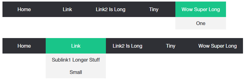
4,793 PointsI think I'm getting somewhere! No more being pushed to the right. The new issue is that it looks like the child menus are expanding way too far:

I've attached my most recent CSS just for reference including your suggestions.
/* Base Styles -------------------- */

* {
  box-sizing: border-box;
}


/*Strip the ul of padding and list styling*/
ul {
    list-style-type:none;
    margin:0;
    padding:0;
    position: relative;
}


/*Create a horizontal list with spacing*/
li {
    display:inline-block;
    float: left;
}

/*Style for menu links*/
li a {
    display:block;
    min-width:140px;
    padding: 0 20px;
    height: 50px;
    text-align: center;
    line-height: 50px;
    font-family: "Helvetica Neue", Helvetica, Arial, sans-serif;
    color: #fff;
    background: #2f3036;
    text-decoration: none;
}

/*Hover state for top level links*/
li:hover a {
    background: #19c589;
}

/*Style for dropdown links*/
li:hover ul a {
    background: #f3f3f3;
    color: #2f3036;
    height: 40px;
    line-height: 40px;
}

/*Hover state for dropdown links*/
li:hover ul a:hover {
    background: #19c589;
    color: #fff;
}

/*Hide dropdown links until they are needed*/
li ul {
    display: none;
    width: 100%;
    margin-right:0;
    position: absolute;
}

/*Make dropdown links vertical*/
li ul li {
    display: block;
    float: none;
}

/*Prevent text wrapping*/
li ul li a {
    width: auto;
    min-width: 100px;
    padding: 0 20px;
}

/*Display the dropdown on hover*/
ul li a:hover + .hidden, .hidden:hover {
    display: block;
}

/*Style 'show menu' label button and hide it by default*/
.show-menu {
    font-family: "Helvetica Neue", Helvetica, Arial, sans-serif;
    text-decoration: none;
    color: #fff;
    background: #19c589;
    text-align: center;
    padding: 10px 0;
    display: none;
}

/*Hide checkbox*/
input[type=checkbox]{
    display: none;
}

/*Show menu when invisible checkbox is checked*/
input[type=checkbox]:checked ~ #menu{
    display: block;
}


/*Responsive Styles*/

@media screen and (max-width : 760px){
    /*Make dropdown links appear inline*/
    ul {
        position: static;
        display: none;
    }
    /*Create vertical spacing*/
    li {
        margin-bottom: 1px;
    }
    /*Make all menu links full width*/
    ul li, li a {
        width: 100%;
    }
    /*Display 'show menu' link*/
    .show-menu {
        display:block;
    }
}
Jeff Lemay
14,268 PointsAdd position:relative; to the li selector (line 18)
Jeff Lemay
14,268 PointsActually didn't need to change the < ul >'s position:absolute, only needed to add position:relative to the < li >. Sorry bout that.
Lisa Crowley
4,793 PointsNo worries, I'm just appreciate for the help.
The width of the child item + things getting nudged to the right seems to have been perfectly resolved!
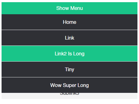
However, sizing the window down so that it has been reduced to "show menu" instead of the full nav, I can see that the child menu falls behind and doesn't push content down to make room for it. It looks like this is coming from the position: absolute on li ul. If I remove it, the scaled down version looks fine:
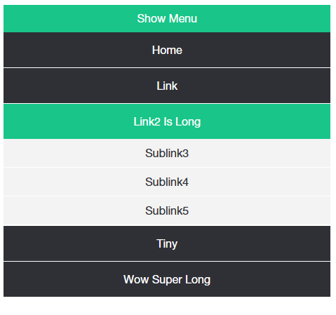
Without the absolute positioning though, the nav expands to the right to accommodate longer child line items.
With the absolute positioning added, that issue is resolved, but the child items now hide behind the nav.
Is this something a z-index would resolve? Or does the absolute positioning not cooperate because it doesn't allow the rest of the nav to push down and expand to accommodate the dropdown content?
Jeff Lemay
14,268 PointsThis is something a media query would solve. You already have one that starts at 760px. Since you added position absolute to the child menus (ul), one of the properties in your media query is being overwritten and not allowing the child menus to show. Around line 110ish, update the ul selector to include another selector for the child menus (don't forget the comma):
ul, li ul {
        position: static;
        display: none;
    }
This makes the child menus expand when you hover over the parent items (you're basically just changing position from absolute to static).
(it works off the code I've been demoing)
Lisa Crowley
4,793 PointsIt looks like this did the trick! I am so immensely appreciative for your help and for taking the time to troubleshoot with me.
I also really appreciate you taking the time to explain the why behind each suggestion. Now I can really get to work trying to apply what I've been picking up from my lessons, haha.
Jeff Lemay
14,268 PointsHappy to help, enjoy the journey!