Welcome to the Treehouse Community
Want to collaborate on code errors? Have bugs you need feedback on? Looking for an extra set of eyes on your latest project? Get support with fellow developers, designers, and programmers of all backgrounds and skill levels here with the Treehouse Community! While you're at it, check out some resources Treehouse students have shared here.
Looking to learn something new?
Treehouse offers a seven day free trial for new students. Get access to thousands of hours of content and join thousands of Treehouse students and alumni in the community today.
Start your free trial
James Barrett
13,253 PointsResponsive height using vh and jumbotron in BootStrap 4
Hi there,
I have a website which is responsive in width: https://i.gyazo.com/9cc34a84eaf92653861e260f7302279a.png
However it has come to my attention that in small mobile devices my website is not responsive in height (for example, the iPhone 5 as shown in this screenshot:
https://i.gyazo.com/685eeaa9207cc51d87f65af4626286c6.png
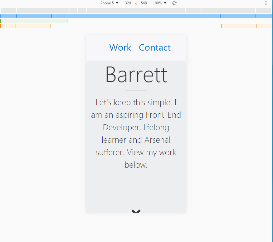
My approach for the design of the jumbotron is that it should take up the browser's entire viewport until they begin scrolling down.
HTML:
<nav class="navbar bg-faded navbar-fixed-top">
      <ul class="nav navbar-nav">
        <li class="nav-item">
          <a class="nav-link" href="#">Work</a>
        </li>
        <li class="nav-item">
          <a class="nav-link" href="#">Contact</a>
        </li>
      </ul>
    </nav>

    <div class="jumbotron jumbotron-fluid no-margin-bottom">
      <div class="container text-xs-center">
        <h1 class="display-3 m-t-1">James Barrett</h1>
        <hr>
        <p class="lead">Let's keep this simple. I am an aspiring Front-End Developer,
        lifelong learner and Arsenal sufferer. View my work below.</p>
        <i class="fa fa-2x fa-chevron-down" aria-hidden="true"></i>
      </div>
    </div>
CSS:
/*****************
   Navigation
******************/
.navbar {
  text-align: center;
}

.navbar ul {
  display: inline-block;
}

li {
  font-size: 30px;
  padding-left: 4px;
  padding-right: 4px;
}

/*****************
   Jumbotron
******************/
.jumbotron {
  margin-bottom: 0;
  height: 100vh;
  display: flex;
  flex-direction: column;
  justify-content: center;
}

.lead {
  font-size: 1.7em;
}

hr {
  width: 25%;
}

.fa-chevron-down {
  margin-top: 100px;
}

@media screen and (min-width: 768px) {
  .lead {
    font-size: 2em;
  }
}
Any tips on how to keep this jumbotron responsive? Or is there a defect in my code?
Thanks, James.