Welcome to the Treehouse Community
Want to collaborate on code errors? Have bugs you need feedback on? Looking for an extra set of eyes on your latest project? Get support with fellow developers, designers, and programmers of all backgrounds and skill levels here with the Treehouse Community! While you're at it, check out some resources Treehouse students have shared here.
Looking to learn something new?
Treehouse offers a seven day free trial for new students. Get access to thousands of hours of content and join thousands of Treehouse students and alumni in the community today.
Start your free trial
Lauren Clark
33,155 PointsResponsive Queries not working Correctly on Mobile Devices
I've followed the CCS & HTML classes on here, bit of a newbie, only been designing websites for around a year. Started out just hacking up Wordpress themes, this is my first website from scratch - no framework.
http://www.wishawmusiccentre.co.uk
Pretty sure I've got the correct responsive queries in there, I realise this is FAR from perfect was a little rushed but if I can get the mobile version to look correct on all devices I'll be happy with it.
Works fine on iOS, and android/chrome and tested fine in FF, Opera & Safari. It looks odd on Windows phone and a couple of people have reported seeing this:
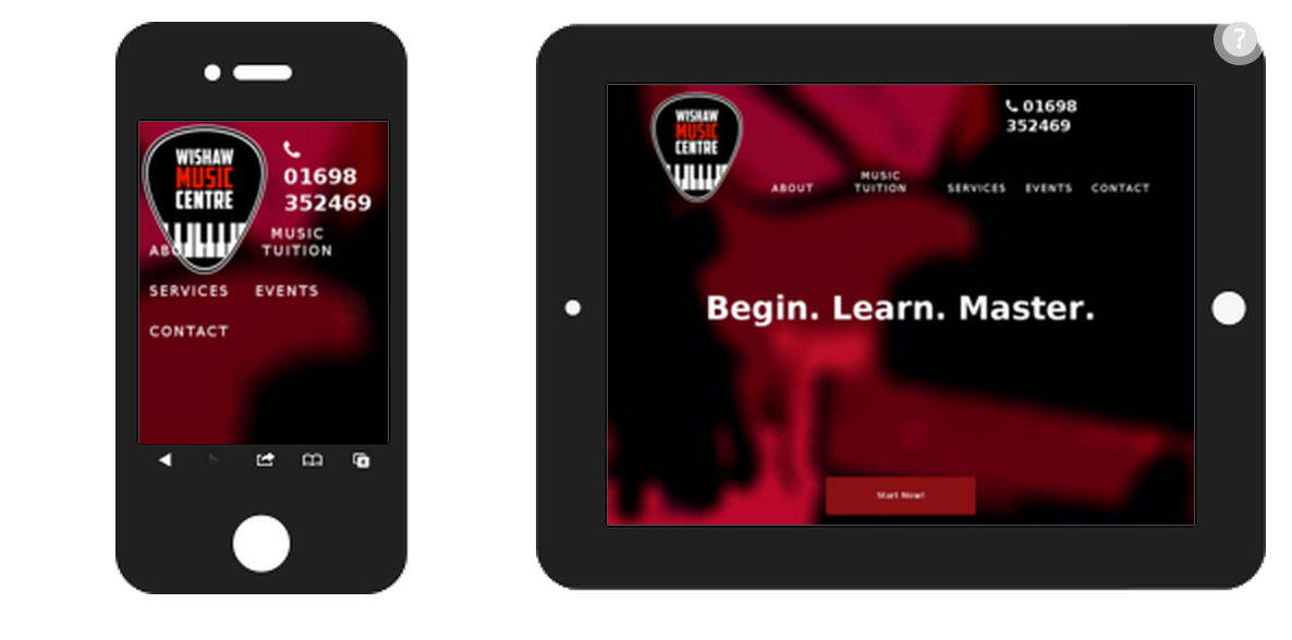
It should look like this

I've tried some bug fixes for Windows Phone including some Javascript to force the correct device width and the ms prefix for the viewport.
@-ms-viewport {
        width: 600px;
    }
Any light you can shed would be much appreciated!
2 Answers
Tim McMillan
10,191 PointsWhere did you put the ms prefix? I don't see it in your style.css file.
Lauren Clark
33,155 PointsDown the bottom under media queries.
/* ------------- Media Queries --------------- */
 @media screen and (max-width: 71.875em) {
    @-ms-viewport {
        width: 1100px;
    }