Welcome to the Treehouse Community
Want to collaborate on code errors? Have bugs you need feedback on? Looking for an extra set of eyes on your latest project? Get support with fellow developers, designers, and programmers of all backgrounds and skill levels here with the Treehouse Community! While you're at it, check out some resources Treehouse students have shared here.
Looking to learn something new?
Treehouse offers a seven day free trial for new students. Get access to thousands of hours of content and join thousands of Treehouse students and alumni in the community today.
Start your free trial
Carson Clark
2,159 PointsResponsive web design issue.
I am on the section "build a three column layout" and I'm at the end of it. I'm trying to correct the awkward spacing I get (see picture below) and I'm not sure how. I've applied the code that the instructor was but it's not helping for some reason.
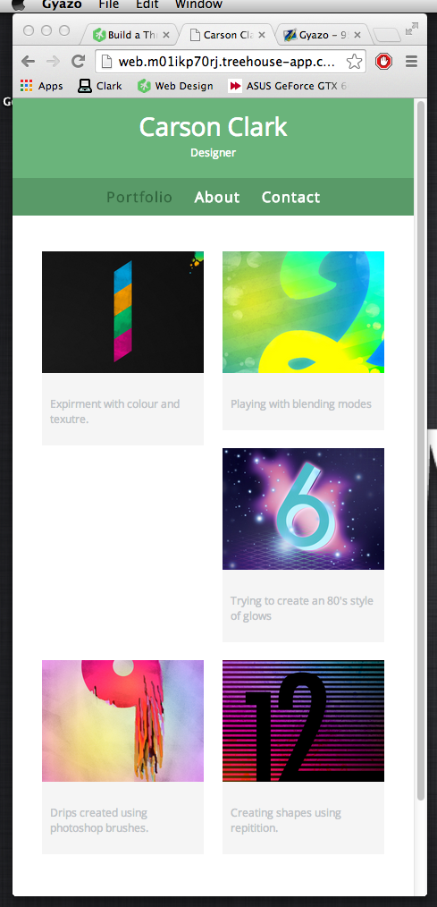
Picture of the layout I'm trying to correct: http://i.gyazo.com/cf475cc70498f7f7480dd0f84777b38c.png
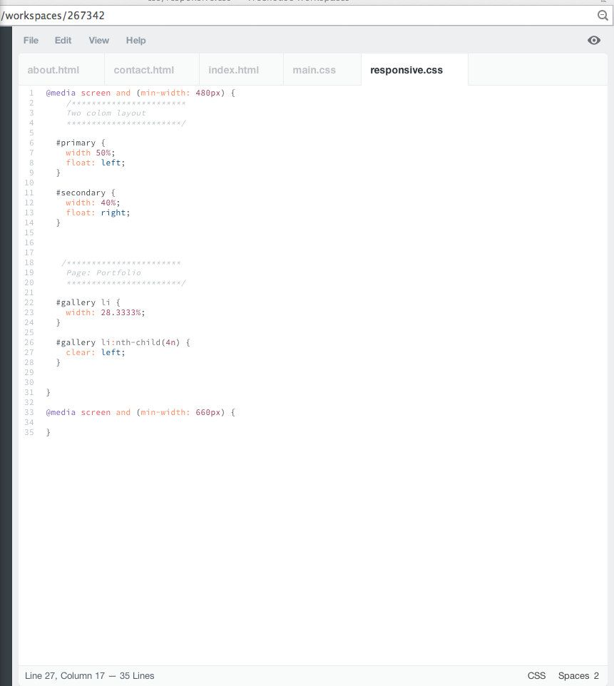
Picture of my code: (css) http://i.gyazo.com/044d8c816aeee491fad9d3b1ac51782d.png
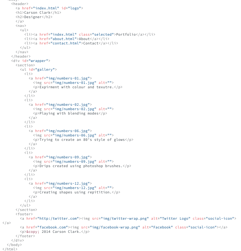
Picture of code: (index) http://i.gyazo.com/647c4ded5d0573fb26e272508df95d13.png
I am not sure where to go from here! Please help!
Thanks TTH.
8 Answers
Jason Anello
Courses Plus Student 94,610 PointsHi Carson,
I think part of the confusion here is that the solution in the video for this problem :nth-child(4n) was specifically for the 3 column layout. This doesn't kick in until you're at 480px or above. Since your screenshot shows the 2 column layout your browser width must have been below 480px when taking that screenshot. As you've discovered, the problem exists for the 2 column layout as well but requires a different :nth-child expression.
Also, you should take a look at the Teacher's Notes for this video. 4n was not the correct expression for 3 column layout. 3n+1 is correct.
The problem is that we have variable height items due to the captions. Some will be longer and wrap to more lines making those list items extend down farther. Since the 3rd item doesn't have enough room on the first row it is pushed down just enough until it can fit. So it's pushed down below the 2nd item so that it can slide left but it stops when it hits that 1st item which extends down lower. Since that 3rd image now fits inside the container it stays right there. Floated items are only pushed down the minimum needed to fit inside the container.
Now the 4th item can't fit in the second row so it is pushed down below the 3rd image and then since there's nothing else in its way it is able to slide all the way to the left, and so on with the 5th, etc....
By having this 3rd item clear the float, we're saying that it needs to drop below all previously floated items. So this 3rd item will be pushed down below both the 1st and 2nd image which allows it to slide all the way to the left.
So we need to clear the float on the first item of every row. In a two column layout this would be the 1st, 3rd, 5th, 7th,... or every odd item.
The correct expression would be :nth-child(2n+1) or use the keyword "odd" :nth-child(odd) Both of these are equivalent. Again, this is specifically for the two column layout at smaller widths and should go in main.css
main.css around line 118:
#gallery li {
  float: left;
  width: 45%;
  margin: 2.5%;
  background-color: #f5f5f5;
  color: #bdc3c7;
}

#gallery li:nth-child(odd) {
  clear: left;
}
In responsive.css:
#gallery li:nth-child(odd) {
    clear: none;
}

#gallery li:nth-child(3n + 1) {
  clear: left;
}
In the 3 column layout we don't want the odd items to clear the float anymore so we have to remove that clear on the odd items then we can set the correct items to be cleared for the 3 column layout. The first item in every row for 3 columns would be 1st, 4th, 7th, and so on. 3n + 1 is the correct expression to select those.
I hope that clears it up for you.
Zerui Ma
5,422 PointsI found the problem, you deleted some of the words that Nick has typed in 2nd pic, so that when the first pic display 2 rows of description, the second pic only display 1 row of description. That has squeezed the 3rd element to the right.
I have tried few ways myself, I tried to clear float of 3rd element, but then it would be a mess for 3 column display.
So I guess one quick and dirty way to fix it is to add enough white spaces after your 2nd description so that it will maintain the same behavior with the 1st element.
Or perhaps using flex layout instead of float would be a nicer solution but it's beyond the scope of your 1st lesson.
I'm pretty new to responsive web design as well, I hope someone like Nike would give you a more professional answer.
Carson Clark
2,159 PointsWhile I kind of understand what you mean I'm still unsure how to resolve this issue. Thanks though!
Zerui Ma
5,422 PointsI think Nick has provided solution in the video, maybe later on? I can't remember, but you'll need clear float specifically for the 4th element to avoid that, since the 1st element has squeezed the 4th element aside.
Here's the code you'll need:
#gallery li:nth-child(4n){
        clear: left;
    }
Carson Clark
2,159 PointsYeah he did mention that, and it made sense so I Applied it, but for some reason I still get the same result. I'm not sure why! Thanks
Carson Clark
2,159 PointsYeah he did mention that, and it made sense so I Applied it, but for some reason I still get the same result. I'm not sure why! Thanks
Zerui Ma
5,422 PointsThen I'm not sure why...
1.Did you follow all the step in the video?
2.Did you saved all your changes?
3.Did you tried to close and reopen your browser window?
Carson Clark
2,159 PointsI believe so. I can't find any errors. Yes, I'm always saving. I did now, the problem still persists. This is strange.
Aldo Merino
6,066 PointsU can give a idea when u zoom out the page (ctr -) the font decrease and it no longer take space of the 3d element of the list (where the problem take place). what i did was remove the margin and padding of the paragraph of the images.
I tough giving at the proper @media the nth-child(3n) a clear:left could solve this but still the problem show up =/
I hope someone could find a proper solve to this problem
(excuse for my bad typo, English is not my native)
Carson Clark
2,159 PointsI couldn't really understand your English! sorry man!
Aldo Merino
6,066 Pointsmy english is that bad? DX. well seems like i must take a course of english of how to type correctly, thx aniways =)
Carson Clark
2,159 PointsOk so yeah, when I remove some words from the 1st image the problem goes away so I understand why this is happening which is good! Still not sure how to properly fix this issue though.
Ryno Botha
Courses Plus Student 4,055 PointsHey try this:
#gallery li a p {
  margin: 6%;
  padding: 5%;
  font-size: 0.75em;
  color: #000 /*#bdc3c7*/;
}
Increase your margin, look at how it effects the page, should work ^^
Carson Clark
2,159 PointsStill didn't work :( This is really starting to frustrate me! >:/
Thanks for your help though!
Ryno Botha
Courses Plus Student 4,055 PointsAnother way you can fix it is by removing the Font-size:
#gallery li a p {
  margin: 6%;
  padding: 5%;
  color: #000 /*#bdc3c7*/;
}
Go to your page, and use "Inspect Element" and change a few things and test how everything effects the page ^^
Zerui Ma
5,422 PointsChanging all the style of p elements won't help... See my analysis
But just changing the style of 1st and 2nd element might help, but it might cause other issues
I think the easiest way is just adding some white spaces in the 2nd p elements
Ryno Botha
Courses Plus Student 4,055 PointsAlso change the Padding in #gallery li a p
"Inspect Elements" on your page and just change the padding, margin and font size, always the way to look for the problem ^^
Also look at these links:
http://www.smashingmagazine.com/2007/05/01/css-float-theory-things-you-should-know/
http://css.maxdesign.com.au/floatutorial/
Hope you get it working ^^
Carson Clark
2,159 PointsCarson Clark
2,159 PointsMy friend you are a gentleman and a scholar! Thank you so much!
Jason Anello
Courses Plus Student 94,610 PointsJason Anello
Courses Plus Student 94,610 PointsYou're welcome.
Adam Pielach
1,030 PointsAdam Pielach
1,030 PointsThis helped, Jason. Thank you for your correct answer. You are making a great input here, helping newbies like me. Vote up for you (not much more I can do for your help) :-)
Cheers!