Welcome to the Treehouse Community
Want to collaborate on code errors? Have bugs you need feedback on? Looking for an extra set of eyes on your latest project? Get support with fellow developers, designers, and programmers of all backgrounds and skill levels here with the Treehouse Community! While you're at it, check out some resources Treehouse students have shared here.
Looking to learn something new?
Treehouse offers a seven day free trial for new students. Get access to thousands of hours of content and join thousands of Treehouse students and alumni in the community today.
Start your free trial
Mike Kuehn
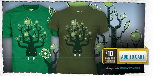
792 PointsThe color choice of the button is poor.
Green doesn't stand out against the green logo and the green price text right above it. Constrasting colors have been shown to improve conversion rates.
1 Answer
Codin - Codesmite
8,600 PointsI agree that contrast can increase conversions but I think more importantly the buttons shape/design is poor. Colour / Contrast will effect the conversions a bit but are subject to regional behaviours and culture. But actually making the button look more like a button that stands out from the general page layout would have a much better effect on conversions.
You don't want key call to action buttons looking like every other button on the website.
Like this for example:
http://conversionxl.com/wp-content/uploads/2013/01/yellow-button.png
Rachael Parekh
UX Design Techdegree Graduate 12,355 PointsRachael Parekh
UX Design Techdegree Graduate 12,355 PointsI don't mind that the button is green. I mind that the button is green with WHITE font. I think the layout is a little unintuitive as well.