Welcome to the Treehouse Community
Want to collaborate on code errors? Have bugs you need feedback on? Looking for an extra set of eyes on your latest project? Get support with fellow developers, designers, and programmers of all backgrounds and skill levels here with the Treehouse Community! While you're at it, check out some resources Treehouse students have shared here.
Looking to learn something new?
Treehouse offers a seven day free trial for new students. Get access to thousands of hours of content and join thousands of Treehouse students and alumni in the community today.
Start your free trial
Steve Brennan
3,070 PointsTopic for a simple Website.
Hi All,
I've just finished topic 3 of the Web Designer track, CSS Foundations. Right now I feel like I should be able to put together a simple website that uses tables, forms, and CSS2.
Problem is I have no idea where to start. What topic to pick, where to get images, what font's to use, etc, etc. Does anyone have any pointers for me to get going with?
Many thanks,
Steve
24 Answers
James Barnett
39,199 PointsMy advice is that now that you've covered the basics of webdesign it's time to focus in on the most important part ...
- Being able to select elements
- And position them on the page.
I had my first ah-ha moment with CSS when I figured out how to do this using floats. No absolute positioning, that would be cheating.

Source: Piet Mondrian Composition II
James Barnett
39,199 PointsAfter you've brushed up on your positioning skills as I suggested in my previous post. You're ready to make your first website.
My suggestion is to make yourself a simple "business card" site. Who you are, what you do, other info you want others to know.
Something like this template ...
For building your first site I recommend the following process...
- Make a wireframe using an online wireframing tool, something like Cacoo
- Write the semantic HTML, don't worry about the CSS yet
- Build a fixed width site
- Keep it simple to start with, don't try to solve problems you don't have yet
- Add in some small CSS3 if the design calls for it, maybe border-radius or box-shadow
- If you need a form add in some HTML5
Try to stay away from a lot of Javascript for now
Once you've got the first version fully working post it here and get some critiques on your design
Then it's time for version 2
- Make it responsive
- Check it out using the responsinator
- Then post it here to get some feedback on the responsive version
Time for version 3
- If you are sick of cutting and pasting your header and footer on every page
- It's time to add in some templating using PHP.
Very basic PHP is all you need, it makes it easier to not repeat yourself (see also: DRY). - Post it here to get some feedback on the responsive version
Steve Brennan
3,070 PointsThanks for the suggestion James. Those links you've posted look really interesting :).
James Barnett
39,199 Points@Steve - Glad to help, let us know if you've got any questions about CSS selecting / positioning.
I think creating the image using CSS relative positioning using codepen is a great exercise for everyone who is starting to learn CSS. Feel free to post your solution here.
Matthew McLennan
10,315 PointsTopic: Do you have a hobby? Favorite band? What do you do for a living? Easy way: find a local mom and pop business and make them a site for free.
Images: sxc.hu is a great site for that. Also Flickr has a royalty free sort that you can do.
fonts: google fonts is cool. The site overall should give you an idea if you should be professional or whimsical.
Colors: kuler.adobe.com. Pick a palette and stick to it.
I would love to help. Email me if you need help. I was there not long ago. A jump start from sharing ideas could take you a long way. matt@brushstone.com.
Steve Brennan
3,070 PointsThanks Matthew, I'll drop you a line if I need a hand.
S. K.
Courses Plus Student 2,497 Points@James Barnett: These are some wonderful challenges for me work on since I didn't really practice any further with HTML and CSS before jumping to PHP. Thank you.
Regarding the first example: Do you create a wrapper div? meaning we have 8 divs, or do you just position 7 divs next to each other?
One thing I also forgot is how do we treat height in blank elements if we want the website to be responsive?
James Barnett
39,199 Points@SK - Yes on the wrapper div and as it's a painting I considered those elements to be colored white not blank, so they have height the same as the others.
S. K.
Courses Plus Student 2,497 Points@james: I didn't understand the "white" remark since some divs are colored.
I don't know if this task suddenly became trivial or if there's something I'm not getting: after setting width and max-width for the parent element, assigning % of height and width makes this task super easy - I don't get an identical result, but the concept is the same..? Coloring and positioning them seems easy, at least for the first three.
James?
James Barnett
39,199 Points@SK - The goal of the exercise to learn about floats & relative positioning. The secret is that it only takes 2 lines to do that part. The rest is all margin.
The width & colors are of course easy, it's also an exercise in matching details exactly. The goal being to make the CSS version match the picture version identically.
S. K.
Courses Plus Student 2,497 Points@James: I managed to achieve quite an identical result, but your last remark about "the rest is all margin" is making me think that I did it the wrong way. Sorry for pasting these huge lines of code here, but maybe it will also help other members in the future:
HTML:
<!DOCTYPE HTML>
<html>

<head>
<title>My first layout Attempt</title>
<meta http-equiv="Content-Type" content="text/html; charset=utf-8" />
<link rel="stylesheet" href="style.css" type="text/css" />
</head>

<body>
    <div class="wrapper">

         <div id="box1">

        </div>

        <div id="box2">

        </div>

        <div id="box3">

        </div>

        <div id="box4">

        </div>

        <div id="box5">

        </div>

        <div id="box6">

        </div>

        <div id="box7">

        </div>


    </div>


</body>

</html>
CSS:
.wrapper {
max-width: 1000px;
width: 100%;
margin: 10px auto;
border: 10px solid #000;
height: 1000px;
position: relative;
}

#box1 {
width: 20%;
height: 20%;
float: left;
border-bottom: 10px solid #000;
background: white;
}

#box2 {
width:79%;
height: 70%;
float: right;
border-bottom:10px solid #000;
border-left:10px solid #000;
background: red;
}


#box3 {
width:20%;
height: 49%;
float: left;
border-bottom:10px solid #000;
background: white;
}

#box4 {
width:20%;
height: 29%;
float: left;
border-bottom:10px solid #000;
background: blue;
}

#box5 {
width:65%;
height: 29.2%;
float: left;
background: white;
border-right:10px solid #000;
border-left:10px solid #000;
}

#box6 {
width:5%;
height: 12%;
float: left;
background: white;
}


#box7 {
width:13%;
height: 16%;
float: left;
background: yellow;
border-top:10px solid #000;
}
James Barnett
39,199 Points@SK -
Sorry for pasting these huge lines of code here
That's what codepen.io is for.
Also a downside of using percentages, is that on larger screens your version is larger than the picture. If you really want to make it responsive you use media queries and ems.
James Barnett
39,199 Points@SK - Here's my codepen of my solution
S. K.
Courses Plus Student 2,497 Points@James - Thanks. I understand it is much more effective the way you've done it, but I'm not that very comfortable with combining multiple classes and ID's in my indetifiers, and think that I did get the concept.
So now I want to make this box responsive, go with ems and media queries? no use of percentages at all?
Cheers, S.K.
S. K.
Courses Plus Student 2,497 PointsOk, I have now converted all pixels and percentages to ems, except for the borders. Now, since this is not actually a website, I just want the whole "image" to get smaller as the screen resolution changes (using the breaking-points discussed in some of the videos). How is this done for shapes that should be resized all at once...?
My current code:http://codepen.io/anon/pen/tBjha
Haven't added media queries yet because I don't know what to "order" CSS to do once a screen resolution is at this or that size.
James Barnett
39,199 PointsWhat's great about this exercise you can re-factor it to get better and better.
- Such as using a color picker extension such as Eye Dropper to get the exact hex color used in the picture.
- Use an online screen measurement extension such as MeasureIt!, to get the exact dimensions
- The image is about 500px wide. So you could convert from pixels to ems using media queries when the viewport is smaller than 500px wide. Set break points for say 480px & 320px.
Another great exercise is to refactor your code to get it to be readable & maintainable as possible. You can read up about the DRY principle (Don't Repeat Yourself)
You can also read about organizing your CSS properties and practice refactoring your code to make it more organized and readable.
S. K.
Courses Plus Student 2,497 PointsThanks James, however:
The image is about 500px wide. So you could convert from pixels to ems using media queries when the viewport is smaller than 500px wide. Set break points for say 480px & 320px.
Do you mean I have to give new sizes to each one of the boxes? there must be a smarter way to go about this. Right now I'm getting a different picture whenever I enlarge or make my screen smaller. I am aware of all the nice extensions and have them installed on my laptop. Yes, I haven't applied media queries, but I'm not sure how to go about this when I'm dealing with shapes, etc...meaning I don't want any of them disappearing or getting pushed down/up..
So...what's my next step?
S. K.
Courses Plus Student 2,497 PointsYou are right, my layout is breaking when viewed in different browsers (even similar resolutions)
Steve Brennan
3,070 PointsReading round the sites that James links to, I found this exercise http://www.maxdesign.com.au/articles/process/ . It looked to me to be a good exercise to work through, so I figured I'd put it here to help others :).
James Barnett
39,199 Points@Steve - That's a great process for designing your first site. Thanks for linking it.
S. K.
Courses Plus Student 2,497 PointsSo I'm trying to do something to simillar to the Vcard James showed here, right now I'm stuck because I'm not really sure how I can make the border surrounding the nav menu (top and bottom) to take 100% of the wrapper div and "ignore" the padding:
James Barnett
39,199 Points@SK - The way the box model works, borders are inside of padding, so the solution is to change where you apply the padding.
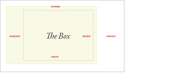
Instead of applying padding to #wrapper apply it to the child divs of #wrapper:
#wrapper > div { padding: 0.5em 0.5em; }
S. K.
Courses Plus Student 2,497 PointsJames, thanks for being patient with me.
I'm having a trouble pretty much with each additional step with this "simple" business card. Now I'm trying to add two horizontal lines for the nav menu like in the example, and I know border top/bottom may not be the best solution, but it's just frustrating me that I'm not able to do it that way.
What am I doing wrong NOW?
James Barnett
39,199 Points@SK - There's an easy solution to that.
- Change from using
float: leftto usingdisplay: inline-block - Add padding to
.nav