Welcome to the Treehouse Community
Want to collaborate on code errors? Have bugs you need feedback on? Looking for an extra set of eyes on your latest project? Get support with fellow developers, designers, and programmers of all backgrounds and skill levels here with the Treehouse Community! While you're at it, check out some resources Treehouse students have shared here.
Looking to learn something new?
Treehouse offers a seven day free trial for new students. Get access to thousands of hours of content and join thousands of Treehouse students and alumni in the community today.
Start your free trial
mattlebl
10,849 PointsWeird responsiveness issue
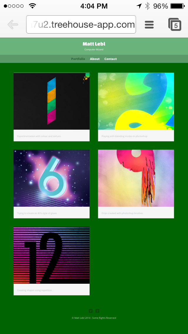
When I load up the website that I've been making by following the "Build a Simple Website" lesson on mobile, it looks as if I had a large window open, but the image is shrunk down to fit the screen. I don't know if i can type HTML here to show you some screenshots, but I'll give it a try. If you can't see them, just follow the src attribute. ;)
This is mobile:

This is desktop, with a similarly sized window:
I ASSUME that this is an issue with the retina display on my test phone, but how can I make it appear like it would without the retina (if that is indeed the problem)?
Thanks! Matt
