Welcome to the Treehouse Community
Want to collaborate on code errors? Have bugs you need feedback on? Looking for an extra set of eyes on your latest project? Get support with fellow developers, designers, and programmers of all backgrounds and skill levels here with the Treehouse Community! While you're at it, check out some resources Treehouse students have shared here.
Looking to learn something new?
Treehouse offers a seven day free trial for new students. Get access to thousands of hours of content and join thousands of Treehouse students and alumni in the community today.
Start your free trial
Wayne Myles
1,044 PointsWhat is the best way to make a three section footer stack in a column of three.
Following on from the beginner HTML tutorial I created a website mockup. The problem i'm having is making the footer responsive. When I get to a breakpoint of 590px I wanted the footer to stack in a column. At present I have a div "container" in the footer section with three nested divs 'footer1, footer2, footer3' please see css below:
HTML:
<div id="container">
<div id="footer1">
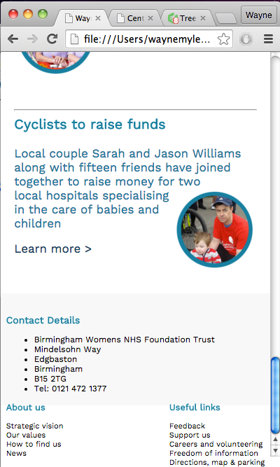
<h3>Contact Details</h3>
<ul class="contact-info">
<li>Birmingham Womens NHS Foundation Trust</li>
<li>Mindelsohn Way</li>
<li>Edgbaston</li>
<li>Birmingham</li>
<li>B15 2TG</li>
<li>Tel: 0121 472 1377</li>
</ul>
</div>
CSS:
container {
max-width: 940px;
margin: 0 auto;
height: auto;
}
footer1 {
float:left; padding: 0 2%; font-size: 0.99em; }
footer2 {
float:left;
padding: 0 2%;
font-size: 0.90em;
}
footer3 {
float:right;
padding: 0 2%;
font-size: 0.90em;
}
The issue is that this step up breaks with at the smaller resolutions with footer3 sitting below and to the right of the other divs. Link to screenshot:
http://2.bp.blogspot.com/-KGHl-Ug3G2o/Vl_gImFFK-I/AAAAAAAAAT4/Zq6YqR9zPD0/s1600/footerscreenshot.png
Please let me know if you need this explained further.
Any help would be appreciated.
Thanks
1 Answer
Shahar Polak
5,756 PointsHi Wayne,
Well I guess the first thing that I can suggest is to float all of the divs to the left, .footer3 included. The next thing will be to start adding media queries for different screen resolutions, for example:
/* Smartphones (portrait and landscape)   */
@media only screen
and (min-device-width : 320px)
and (max-device-width : 480px) {
/* Styles */
}

/* iPads (portrait and landscape)   */
@media only screen
and (min-device-width : 768px)
and (max-device-width : 1024px) {
/* Styles */
}

/* Desktops and laptops  */
@media only screen
and (min-width : 1224px) {
/* Styles */
}
And I guess that the best advice that I could give will be to use one of the common frameworks out there, personally I have been using Twitter bootstrap for the past 4 years and it is amazing! [https://getbootstrap.com]
Jesus Mendoza
23,289 PointsJesus Mendoza
23,289 PointsHey Wayne, sorry for the delay.
Try adding the following code to the top of your css file
If that does not work, go check this course and learn how to do it, it's a short course and it's gonna help you a lot.
https://teamtreehouse.com/library/css-flexbox-layout
Let me know if you need anything.