Welcome to the Treehouse Community
Want to collaborate on code errors? Have bugs you need feedback on? Looking for an extra set of eyes on your latest project? Get support with fellow developers, designers, and programmers of all backgrounds and skill levels here with the Treehouse Community! While you're at it, check out some resources Treehouse students have shared here.
Looking to learn something new?
Treehouse offers a seven day free trial for new students. Get access to thousands of hours of content and join thousands of Treehouse students and alumni in the community today.
Start your free trial
Grim Fandango
5,804 PointsWhy does my site looks so different on iPhone compared to Chrome's emulation?
Hi,
I'm wondering why my website looks so different on Chrome's iPhone 6 Plus emulator when compared to the physical device.
I have the following media query that is designed to float .main-nav to the right:
@media screen and (min-width: 650px) {

.main-nav {
  float: right;
  padding-top: 8px;
  padding-right: 20px;
}
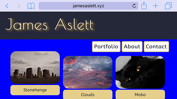
WITH PADDING-RIGHT SET TO 20px:
Chrome Emulator

iPhone 6 Plus
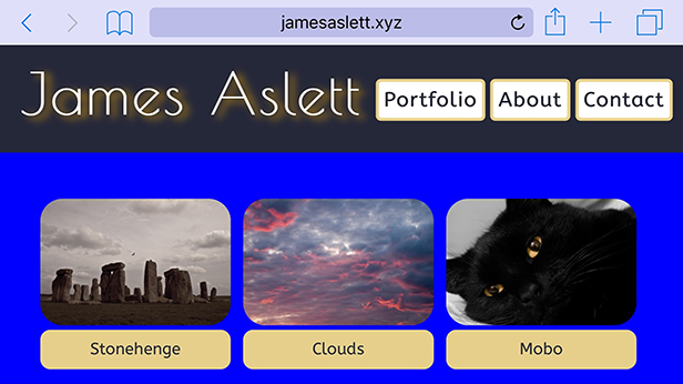
WITH PADDING-RIGHT SET TO 0px:
Chrome Emulator

iPhone 6 Plus
Why do these difference occurs, and why is the heading and nav-bar so much close on the device than in the emulator?
Many thanks
1 Answer
Colton Shaw
12,634 PointsWhat I have noticed is that the emulator is just that, it's a pretend version of the device itself. There will be LOADS of times that it is not correct, different or inaccurate as to the display on mobile. I would assume this is because the browsers on mobile might render pages differently, or the pixel density is slightly higher on the phone.
However, i would make sure you always test on the real device!