Welcome to the Treehouse Community
Want to collaborate on code errors? Have bugs you need feedback on? Looking for an extra set of eyes on your latest project? Get support with fellow developers, designers, and programmers of all backgrounds and skill levels here with the Treehouse Community! While you're at it, check out some resources Treehouse students have shared here.
Looking to learn something new?
Treehouse offers a seven day free trial for new students. Get access to thousands of hours of content and join thousands of Treehouse students and alumni in the community today.
Start your free trial
Luqman Shah
3,016 PointsWhy is there a gap above my header when I use absolute/relative positioning?
When I set the logo to an absolute position relative to my main header, it keeps creating this gap above the header. And when I try to position the logo left or right, it doesn't move with the nav's list items, so on an even wider viewport the logo is all the way stuck to the left side of the nav bar far away from the nav items and it looks really awkward. This also happened when I scrapped the idea of absolute and relative and decided to float the logo instead, still that same gap. And now I've just decided to go with inline block and that gap above the header is gone.
@media (min-width: 769px) {

  /* div {
    border: solid 1px red;
  } */

  .main-header {
    position: relative;
  }

  .logo {
    margin-top: 20px;
    position: absolute;
    left: 80px;

  }

  .main-header li {
    /* border: solid 1px red; */
    margin-top: 20px;
    margin-bottom: 20px;
    display: inline-block;
  }
Steven Parker
244,137 PointsTo facilitate analysis, please show the complete code (all CSS with HTML). If possible, make a snapshot of your workspace and post the link to it here.
Luqman Shah
3,016 PointsSteven Parker So the code is actually originally written in atom, but I transferred all the files to a new workspace, the index.html file and the css and img folders. But only thing is it won't show in the browser's preview as it would in atom. Anyways here's the screenshot.
1 Answer
Kevin Korte
28,149 PointsAre you talking about this space?
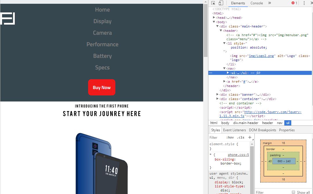
I put your logo back to position:absolute like you said.
That extra space above is actually created by the margin in your unordered list for your nav items. If you look in the dev tools, the box model diagram in the lower right shows that ul has 16px of margin top and bottom, and that 16px is pushing the rest of the content down from the top of the document.
Because the logo has absolute position, it's removed the regular flow of the html document, so instead of the navigations padding pushing against the logo, it instead pushes against the top of the document.
Hope that helps.
Luqman Shah
3,016 PointsLuqman Shah
3,016 PointsSo I decided to make the logo part of the nav items. Is that a good solution? But there's still that gap above the header.