Online Coding and Development Courses
Browse 100s of video courses and workshops in JavaScript, Python, AI, web development, design, and more.
Learn at your own pace with content ranging from beginner to advanced.
- Newest
- All Types
- All Tiers
-
All Topics
- All Topics
- • AI
- • Vibe Coding
- • JavaScript
- • Python
- • No-Code
- • React
- • Coding for Kids
- • Design
- • HTML
- • CSS
- • Game Development
- • Data Analysis
- • Development Tools
- • Databases
- • Security
- • Digital Literacy
- • Swift
- • Java
- • Machine Learning
- • APIs
- • Professional Growth
- • Computer Science
- • Ruby
- • Quality Assurance
- • PHP
- • Go Language
- • Learning Resources
- • College Credit
- Reset filters
Topics
Browse content by the topics that interest you most.
- AI

- Vibe Coding
- JavaScript

- Python

- No-Code

- React

- Coding for Kids

- Design

- HTML

- CSS

- Game Development

- Data Analysis

- Development Tools

- Databases

- Security

- Digital Literacy

- Swift

- Java

- Machine Learning

- APIs

- Professional Growth

- Computer Science

- Ruby

- Quality Assurance

- PHP

- Go Language

- Learning Resources

- College Credit

-

Front End Web Development
Learn to code websites using HTML, CSS, and JavaScript.
- JavaScript
- 49 hours
- Certificate
-

Beginning Python
Learn the general purpose programming language Python and build large and small ...
- Python
- 15 hours
- Certificate
-

Full Stack JavaScript
Learn JavaScript, Node.js, and Express to become a professional JavaScript devel...
- JavaScript
- 38 hours
- Certificate
Change Your Career, Change Your Life
With 100s of courses and more to come, Treehouse is the best way to learn how to code.
Start Your Free Trial-
JavaScript Basics
JavaScript is a programming language that drives the web: from front-end user in...
- JavaScript
- Beginner
- 234 min
-
HTML Basics
Learn HTML (HyperText Markup Language), the language common to every website. HT...
- HTML
- Beginner
- 183 min
-
Python Basics
Learn the building blocks of the wonderful general purpose programming language ...
- Python
- Beginner
- 234 min
-
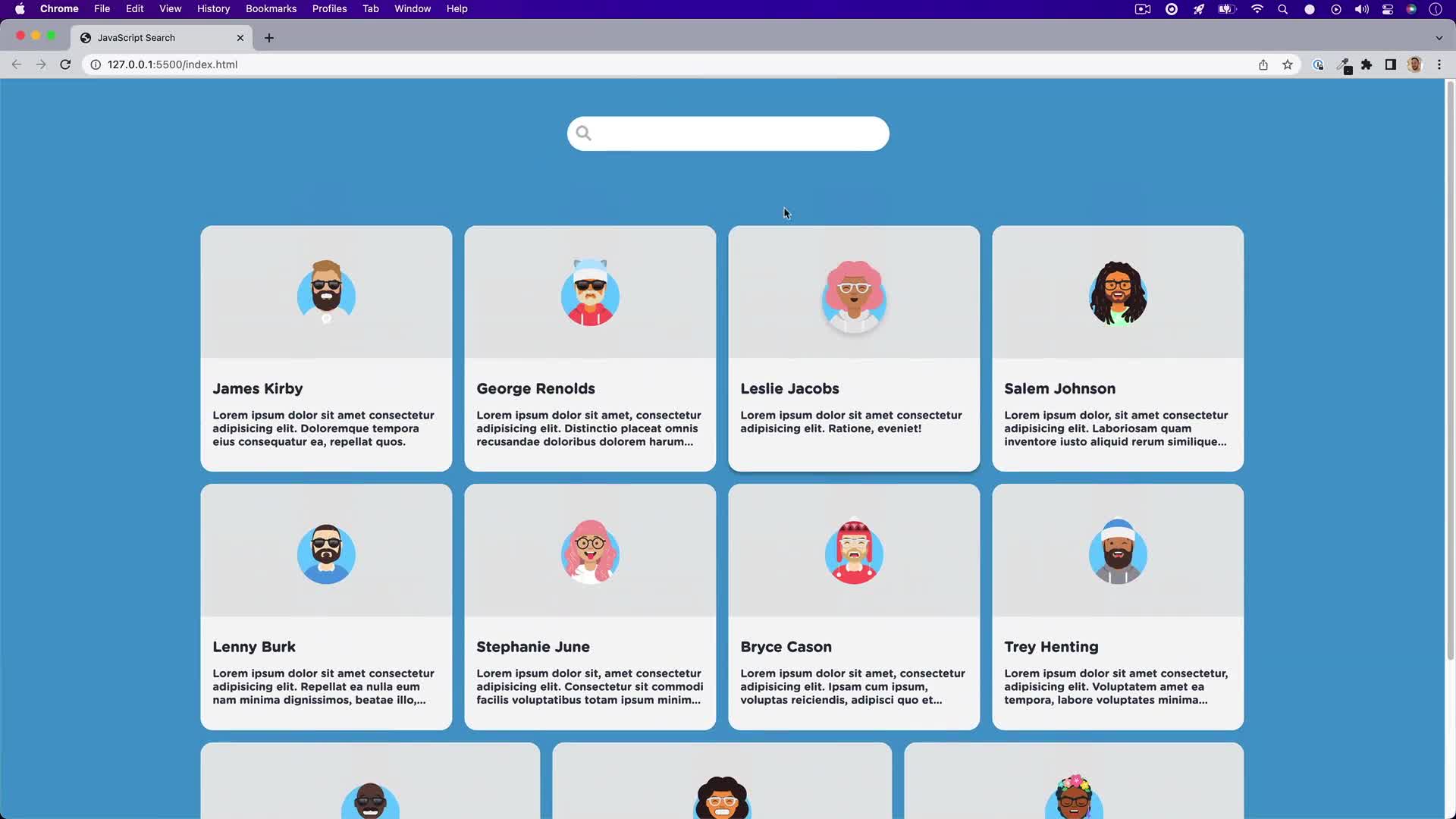
JavaScript Search
Letting users search through data in your application or website is a great UX f...
- JavaScript
- Beginner
- 9 min
-
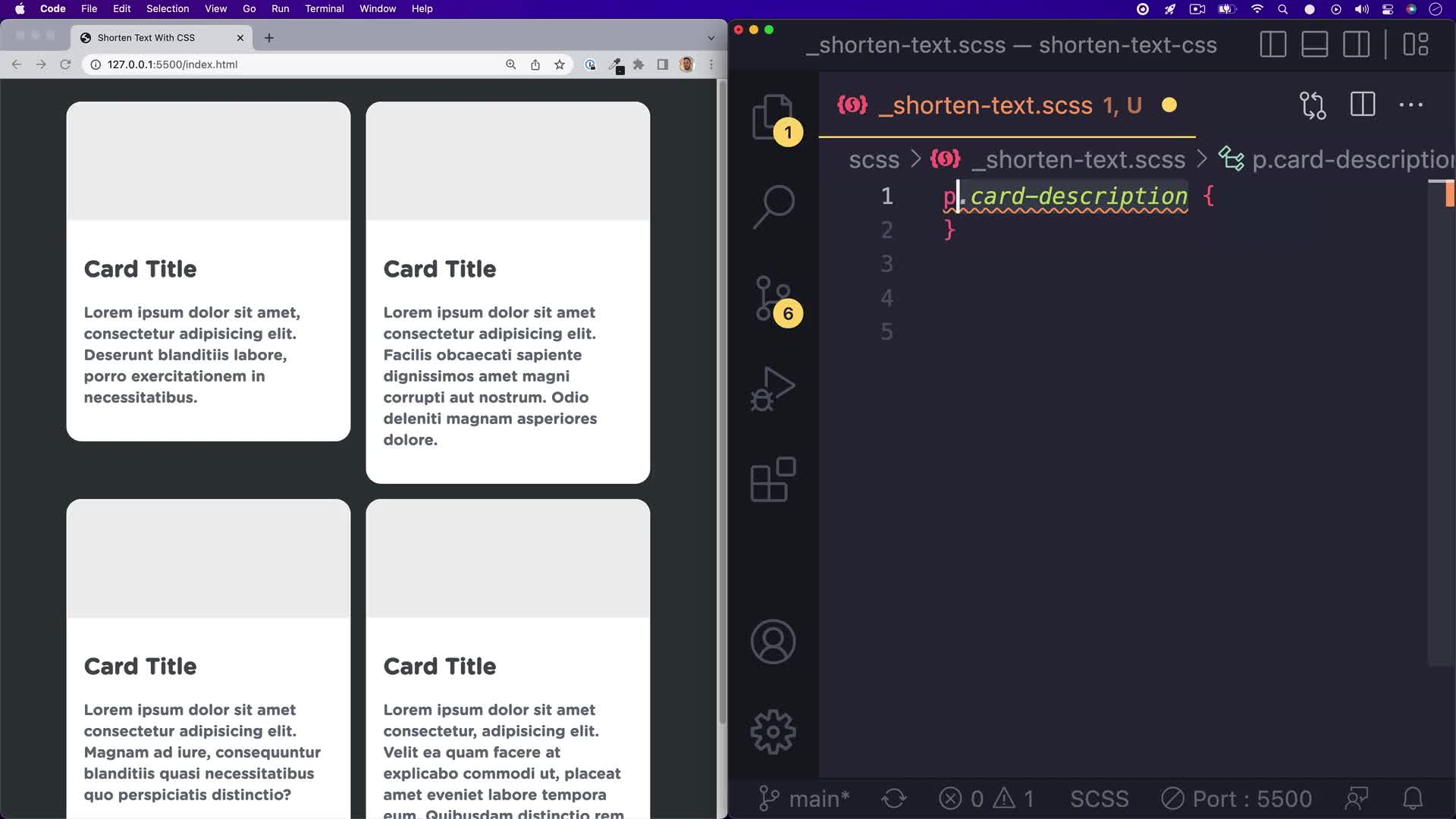
Shorten Text With CSS
Ever wondered how to shorten text with an ellipsis (...)? It’s quite easy to do ...
- CSS
- Beginner
- 2 min
-
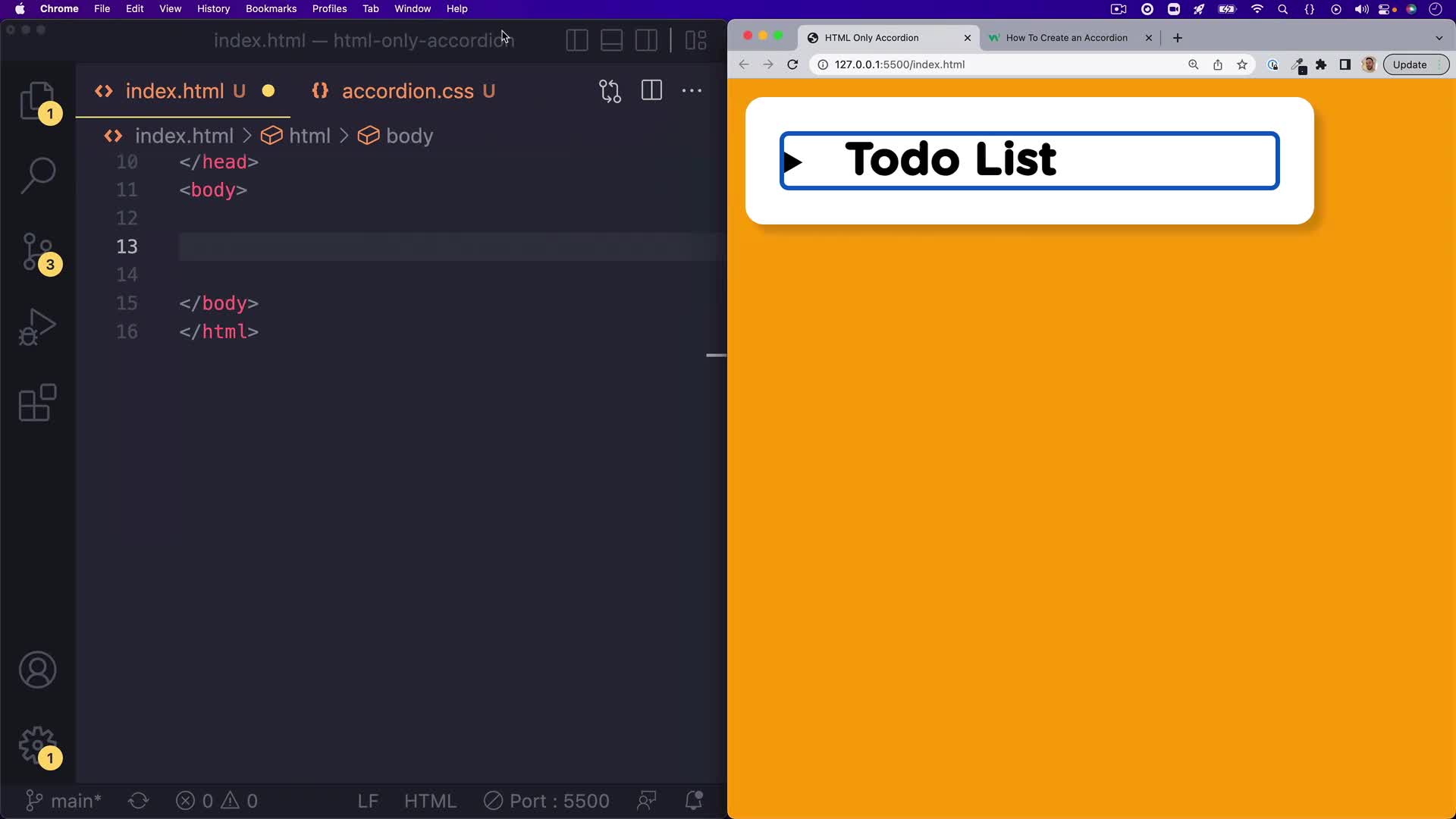
HTML-Only Accordion
Accordions are all over the web and mobile apps. They are a great way to show an...
- HTML
- Beginner
- 3 min
College Credit Tracks
Earn accredited college credits while learning in-demand tech skills.
-

College Credit: Introduction to HTML and CSS
Treehouse and UPI have teamed up to bring you CS 180: Introduction to HTML and C...
- College Credit
- 14 hours
-

College Credit: Introduction to JavaScript
Treehouse and UPI have teamed up to bring you CS 190: Introduction to JavaScript...
- College Credit
- 14 hours
-

College Credit: Programming in Python
Treehouse and UPI have teamed up to bring you CS 230: Programming in Python, a c...
- College Credit
- 16 hours
-
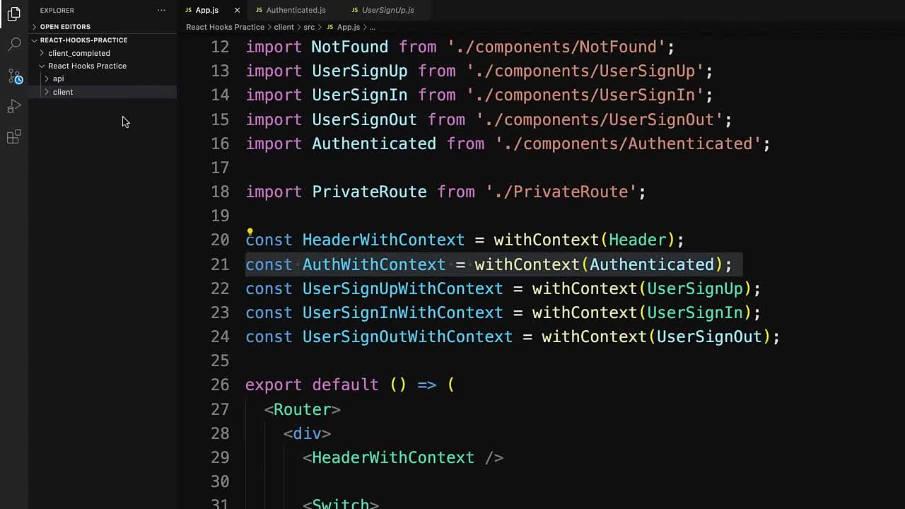
Practice Hooks in React
Practice React's built-in useContext and useState Hooks to update an app with us...
- JavaScript
- Intermediate
- 11 min
-
Practice Setting Up a Python Project
Practice setting up a Python project locally and on GitHub.
- Python
- Intermediate
- 11 min
-

Practice Classes in JavaScript
Practice building and working with classes in JavaScript.
- JavaScript
- Intermediate
- 19 min
Bonus Series
Bonus material is exclusive to Courses Plus membership and includes series covering new processes in design, development and illustration.
-
Takeaways
Got some time during your lunch break? Want to get something to takeaway?
- Java
- 9 min
-

Treehouse Live
Enjoy our full collection of Treehouse Live sessions with our amazing Treehouse ...
- Learning Resources
- 236 min
-
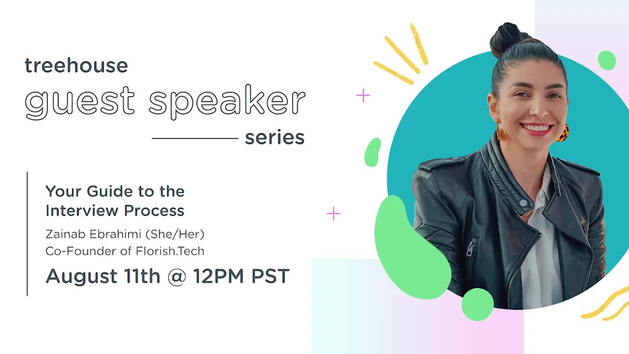
Treehouse Guest Speaker Series
Treehouse Guest Speaker Series is an ongoing live event hosted by Treehouse staf...
- Computer Science
- 407 min
Upcoming Releases
The following items are scheduled to be released soon. You can also visit our content roadmap for more info.
-

Day 8 - Writing a Spec + Thinking Like a Builder
Day 10 AI-Bootcamp
- No-Code
- Beginner
-
Day 1 - What AI Is and Is Not
AI bootcamp Day 1
- No-Code
- Beginner
-
Day 2 — What AI Platforms Can Actually Do
AI Bootcamp Day 2
- No-Code
- Beginner